Don't get me wrong, the new design looks great, but it feels like every six months they switch between having side navigation and putting everything on top. Every time they change there's a definite improvement, but you'd think they'd be able to come up with a design that works for at least a few years.
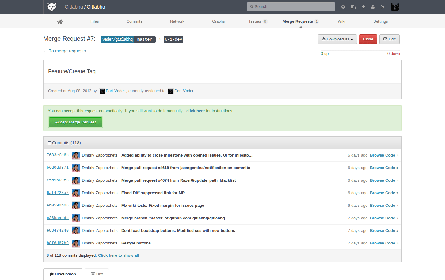
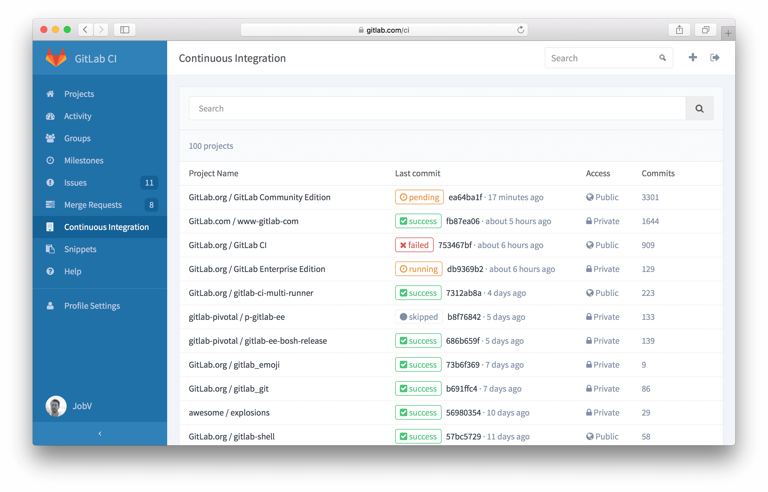
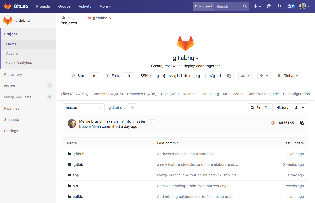
[1]: https://about.gitlab.com/images/6_0/mr_on_fork.png [2]: https://about.gitlab.com/images/8_0/ci_dash.png [3]: https://about.gitlab.com/images/9_0/navigation.png [4]: https://about.gitlab.com/images/blogimages/redesigning-gitla...
That's interesting to think about. What is the difference between the two types of users? Is it that the open source project is in no hurry and can accept a delay due to interface hassles? Is it that enterprise users are less capable and need a stable environment to function?
GitHub does ui changes too but they seem to have a decent structure to work on, not changing stuff dramatically.
GitLab had similar problems with its UI, and they've been improving it. Personally I welcome the improvements (though we use CE and not EE internally).
Solarized-dark with a white frame can be quite grating on the eyes.
The dark theme I use is Dracula[1], it's a really beautiful theme and if there was a way to view GitLab using it it'd be incredible.
I'm a big fan of your guys' work but using Github for a variety of reasons (UI is a big reason why), so I really mean it when I say the improvement is noticeable.
BTW, have you thought about talking to Zenhub to get a "Zenlab"? Given that Gitlab implements a lot more than Github in terms of Zenhub features it might be worth looking into.
During usability testing, you eventually reach a point where users start demonstrating the same behaviour. Once that happens, it’s not really worth speaking to more users, as you’re not learning anything new. You’re better to implement changes based on the user feedback you have and then re-test with different users. The navigation has been through 3 rounds of usability testing (24 users in total). Sometimes we tested with more than one prototype at once, hence us testing with a few extra users.
We conducted usability testing to get us to a point where we felt comfortable sharing the new navigation with a much wider audience. There’s still more research to come!
If you’re interested in getting involved with the research, then GitLab has a research panel you can join: https://about.gitlab.com/researchpanel/ or you can just drop us your feedback on: https://gitlab.com/gitlab-org/gitlab-ce/issues/34917
P.S. And obviously love the fact that it is a single jar file deploy.
[0] http://gitbucket.github.io/gitbucket-news/gitbucket/2016/03/...
[1] http://gitbucket.github.io/gitbucket-news/gitbucket/2016/07/...
I write add-ons for Bitbucket Server. I'm curious to know what you find unusable about it.
To see all "Merge Requests" in a project, you will find that option in the sidebar now, as that is contextual to the Project you are in.
Compare:
Gitlab final prototype: https://about.gitlab.com/images/blogimages/redesigning-gitla...
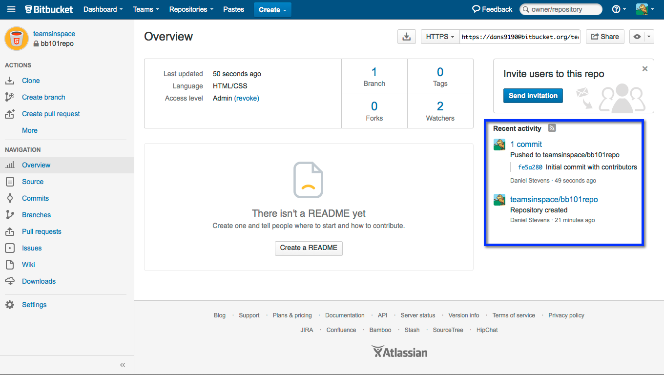
Bitbucket server: https://confluence.atlassian.com/bitbucket/files/304578655/5...
The resemblance is uncanny.
It's probably also worth mentioning that Bitbucket's also in the process of a massive navigation redesign; the "new" Bitbucket eliminates the top global navigation bar, moving some of its elements to a new sidebar (beside the context-specific sidebar) and eliminating much of the global navigation elements completely from repository pages (want to go directly from a repository page to a team or project page? You can't unless it happens to be in the repository's breadcrumb bar.). This is about as much of an improvement as it sounds like.
(Sorry, no screenshots of the new Bitbucket UI since I can't quickly produce one that doesn't have private info in it.)
Thanks for the feedback! Glad you spotted the differences between BitBucket's Design and our own. While we would love to design with a blank slate, we are not. Our users arrive with expectations and deeply implanted ideas of how things should look, feel, and behave. We have to temper exploration with practicality. The downside of that can be that the UI has a similar appearance to other platforms.
Thumbs up for creating such an awesome product and involving the community in your thought process!
Hope this will be fixed.
For the navigation, the links and buttons all work. For more complex components like dropdowns and search we require JS. We have considered server rendering for new things, but for now it is quite high effort for comparatively low gain.
If there are specific actions that you are missing, please consider creating issues - https://gitlab.com/gitlab-org/gitlab-ce/issues/new
Issue about what to render without JS: https://gitlab.com/gitlab-org/gitlab-ce/issues/32401
And I've made an issue to clarify that we require javascript here: https://gitlab.com/gitlab-com/gitlab-docs/issues/120
Aside from that, it sounds like a well thought out feature, and it's good that they're redoing it instead of just changing it bit by bit.
Once people learn a UI, they really hate deviations from it. It doesn't matter whether githubs UI is good, and it doesn't matter whether gitlab's UI is better. People are used to github, and the peanut gallery will bitch if things are different. The trick for gitlab will be in finding the UI differences that give the maximum improvement for the minimum change. That's what will give the desired sensation of "clearly better than github". Overdo it, and it'll feel alien and weird.
This is the holy grail of UI for sure. We are striving for this in all of the decisions we make on the UX team. This change required a lot more change than we would have liked but we are implementing it in a way that we hope will bring maximum effectiveness and longevity.
This used to be called the "do it like Amazon" rule, which was valid until about 2004-2005 or so.
I actually love this feature on GitHub and wish it was a universally-accepted UX pattern so I could do it places like Amazon to remove the pre-selected category in their search bar. The convenience of the backspace outweighs the space the label takes in the search bar IMO, though GitHub could have made it smaller by shortening it to something like "this repo"
GitLab should consider adding an option somewhere, that lets users override a few primary theme colors to their liking. Not a full-fledged theme engine - that would be awesome but would take a lot of time to implement - just a few light CSS overrides that are persisted in the account settings, don't require browser extensions and more tolerant to the layout changes.
Is this not at odds with https://gitlab.com/gitlab-org/gitlab-ce/issues/29835? Regardless, thank goodness they're changing it.
Edit: Appears to be the same path but with `about` subdomain
MR with fix: https://gitlab.com/gitlab-com/www-gitlab-com/merge_requests/...