As opposed to the horrible flat/white/modern design that govers Windows 10 and the web, it makes using the UI easier: Elements have clear boundaries; it is immediately obvious what role an UI component has (link? label? button? text field?); there is very little ambiguity; typography is simple and inobstrusive.
The Luna and Aero styles were actually not much worse than the classic Windows style but interesting and usable evolutions of it as they retained the properties listed above.
I am not entirely sure whether this perception stems from the fact that the classic style is objectively "better" suited for a GUI or from the fact that the Windows UIs were so predominant in the PC market at the time and left a lasting impression on people's understanding of what a GUI is/was. Perhaps it goes both ways.
I'd love a FULL faithful Win 98 theme for current Win 10. I'm 100% aware it's mostly my own personal nostalgia rather than it being "better", but it's absolutely ridiculous that you can no longer fully theme Windows and they actively block themeing from working properly now.
I'm pretty close to leaving Windows for good (having used it since the start, faithfully through thick and thin) and switching to Mint or some such, just so I can set stuff up how I want to. Windows 10 is the most dumbed down, ugly, and confusing OS Microsoft has ever put out (recently overtaking Vista for me for annoyances).
I believe from a UX standpoint the win95 UI was better. Microsoft did a lot of actual usability research in evolving the UI of Windows 3.1 into that of 95. Moving forward I believe they compromised on usability in favour of a more "sexy" minimalist aesthetic.
A particularly good example is the 3D of the old UI contrasted to modern flat UIs provides far more obvious hierarchy and hinting of what can be interacted with and in what way.
2.) Classic Shell is mandatory. How you could break the start menu search as profiundly as Windows 10 does is baffling.
Anything else like color, reflections, transparency, animations, etc. draw my attention away from what I'm doing (contained within the window frames) out into the window frames and taskbar, which I want to look at as little as necessary.
* The title bar of the active window is shaded in the accent colour, those of inactive windows are not. This makes it clear at a glance which window I'm typing into.
* Unless a developer goes out of their way to mess with components, a button always looks like a button and things that look like buttons are always buttons.
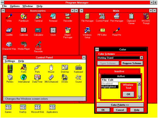
* In the control panel, you can *easily* customise the fonts and colours for things (like picking your own colours for both active and inactive title bars). Yes you can make completely horrible setups this way, or set your co-worker's PC to comic sans as a joke, but someone with dyslexia, colour blindness or other disabilities can also easily set the UI to exactly what works for them. "Themes" in later versions are both less flexible and require someone with more time and technical skills to create them in the first place.
The lack of that was one of the most baffling things about the Win10 UI --- especially when you read about what they did:
https://www.howtogeek.com/222831/how-to-get-colored-window-t...
Microsoft chose to force white title bars in an odd way. In the uDWM.dll theme file in Windows, there’s code that looks at the current theme file name and compares it to “aero.msstyles” — the default theme file. If it matches, Windows ignores the color specified in the theme file and sets the color to white.
Someone at MS thought it would be a good idea to deliberately break title bar colouring by checking for a hardcoded theme filename. It wasn't a bug, it was an active decision to do such a "hack", and presumably others who reviewed the code were completely fine with it. Besides the completely stupid decision to force titlebars to be uncoloured, it's well deserving of a WTF!?
http://www.pulpconnection.net/wp-content/uploads/2014/05/201...
Still, at least in iOS there is some backpedaling on the general whiteness and borderlessness. I suppose this is because while people are accustomed and borderless stuff looks nicer, the interface is harder and slower to use.
EDIT: forgot to add context
but as far as I remember windows since at least 95 allowed to change size of fonts of many UI elements (popups, menus etc)
Still, Windows has behavioral issues that are a problem regardless of appearance. For instance, why in 2018 in an OS NAMED “Windows” are all my window locations and sizes and screen choices borked simply by closing and moving my laptop?
win 7 is good
nt5 classic is my favorite :)
- it might not look ‘pretty’, but heck, the Windows 95 UI sure is intuitive. Buttons are very apparent, icons make sense, and what was never meant as a touch UI translates across to one incredibly well.
- at a glance, code looks clean and pretty readable. @IBDesignable support too (if only Xcode wasn’t so sluggish compiling/rendering IBDesignables...). Well done to the author for not only making a fun/cool project, but for doing it well.
https://github.com/Baddaboo/ClassicKit/blob/master/Component...
IMHO much better than the trend of making every single UI element a huge bitmap image (in multiple resolutions), such that a simple app contains dozens of images of buttons and the like which consume more space than an entire Win95 installation...
Raster images, after all, are usually loaded into VRAM by a library that converts them to some native packed texture format that are especially low-memory to hold and low-time-cost to render. Do baker vectors end up in the same format, or in the less efficient format used for expected-to-update pixel buffers (i.e. the format used for the renderings of compositable layers)?
This may change with GPU rasterization of vectors (disclaimer: that's what I work on). I don't know of any major OS vendor that's actually publicly planning to ship this anytime soon though.
(And now the show is on the other foot with Microsoft/WinObjC)
DMCA pulldown in 3.. 2..
If you are thinking of using this, consider the fact that any assets ripped from Windows are copyright infringements.
Even if you do respect the layout margins and safe area, there design needs to accommodate the change, so where the status bar was only 20 pixels, there's now a lot more space to deal with and the design needs to adjust.