GitHub is primarily a development tool, so it should be designed for developers. Hierarchies align very well with development tasks, so it's natural to use them for development tools. That other people don't grasp them is not relevant for GitHub.
Also, the three most common navigation tasks I do are "go to the code", "go to the issues" and "go to the pull requests." Those are also the first three tabs at the top of the hierarchy. I don't think that's an accident; I think the designers at GitHub designed the layout so that the most common tasks are on top and first. In other words, they designed GitHub like a tool, not a normal webpage.
With this redesign, I'm going to constantly have to find the "Issues" and "Pull Requests" tabs among a sea of others. That's not good usability.
I've thought that maybe the markdownified README should be flipped up on top, but even that I think is counter-productive. When I'm working with a GitHub project, I commonly want to load up the page and navigate to some files. If not, it's usually not much scrolling to get down to the README. But READMEs can be quite long (which is a good thing), and it would sometimes be a pain to always scroll past them to get to the files. The better solution for that is a good project page.
- greater end user customization of the UI layout
- an option to enter a different UI(contributor UI) for repositories you contribute to/own
- make the contributor UI an enhancement on top of the current UI(perhaps a new darker tab bar)
- related to the above, separating out the discovery part into a separate app
In general, I am in favor of greater customizeability in my professional tools, especially something I use as much as Github. I think one reason we as software developers don’t add a lot of end user customizability to our UIs though, is that it adds a ton of complexity to the UI code. This suggests there is opportunity to explore new UI development paradigms and libraries that have end user customizability as a primary concern, instead of a bolted on after thought. I’m curious if anyone is working on such a project.
Just one example: One of the worst platforms/applications I have ever used is built with Sencha/ExtJS, and it causes a ton of bugs and friction. But hey you can move your windows around and resize them, doesn't that make up for features that don't work?
The complexity today comes from the fact that there is much more focus and priority on getting the application to match designers' vision. Its extremely complex to offer the user customization while still ensuring pixel perfect UIs. (Emphasis on complex, its not impossible).
I guess the problem is, if you introduce a new feature in a web app, it can be hidden by the customized design of users. Or it would just appear at a random place in the UI, forcing the user to re customize around that new feature.
An example of a tool set in a similar space as GH that has prioritized customization are Atlassian Confluence and Jira. How many of us enjoy that software? More than GH?
Customization can't save software that hasn't gotten the UX right in the first place.
I think the default order would be used by anyone who doesn't care to configure it.
In some sub-tab of the User Settings panels, there could be a drag-and-drop sort list (like the one for sorting the "featured repositories" on the profile) to arrange the tabs in a different order, and a button to reset them to default.
Maybe one other setting I would add is "dark mode". The CSS is essentially already written in public Chrome browser extensions to "reskin" GitHub's UI. This is because customizing light/dark modes is gaining in popularity. It's a new macOS trend and in my experience surprisingly common in iOS apps too. Since about 70% developers trend towards dark IDEs, it makes sense to have.
Unlike JIRA, I don't think any of these settings should be at the forefront... you should just have sensible defaults and a way to customize it. GitHub Help articles are well-indexed on Google and anyone who wants to know how to change the color mode or tab order is only going to do it about once, so clicking through menus is a familiar and safer-feeling (as opposed to direct links to private UIs) UX, and it's the same as any other process like adding a SSH key, webhook, or app password.
I do think that GitHub's main user base is increasingly loving their customizability. VS Code and Atom gain a lot of traction for their total customizability and extensibility with plugins. I'm not at all suggesting GitHub go in that direction -- but, GitHub is more of a cloud-based software tool than a website. A little bit of customizability goes a long way with user satisfaction, at least to tech-enthusiastic users.
Just little feature flags would be incredibly handy. For example, default to ignoring whitespace in PR diffs (a feature otherwise only available if you know the URL trick, and can't be saved to user settings like your preferred diff layout).
It's the same amount of customizability as "how many emails do you want to display per page" in Gmail. It's enough personalization to be useful and done officially instead of through hacky, dangerous, frequently-breaking Chrome extensions to work around the things that impede productivity.
But even then, internal configuration of widgets is the same problem as before, just scope-limited...
1) Most GitHub users are more tech-savvy (and often more CSS-savvy) than your average MySpace users, and 2) Most GitHub users put a lot of value in their repo pages,
this actually seems like it wouldn't _inherently_ be the worst idea, assuming the proper precautions were in place versus bad actors. Allowing each org to fully customize their git repo almost encroaches upon (or replaces?) project websites, which already has some overlap with README files (which aren't currently prioritized). Kill two birds with one stone by giving developers what to prioritize on their repos?
I agree with this point, but it is one with a very easy fix: make them the first three tabs after "Overview" in the redesign.
Your point over how hierarchy helps programmers use GitHub feels lost on the designer. It feels as if they're designing for a different user.
The other big reason is that Bitbucket loads bunch of trackers and JavaScript from remote servers.
At least in my workflow, I visit dozens of those pages every week to, for example, choose between alternative libraries.
My own projects’ index pages are definitely a small percentage of the total. And for those views, I would still prefer this redesign that gives me a quick overview of what’s happening.
The solution I'm using currently for the git repos hosted on my personal site [0] is to show the projects file tree above the README, but allow it to be collapsed by clicking on the projects root directory. Originally, the project tree was collapsed by default, but the click through rate was quite low, so the expanded view became the default.
I would interpret the data as meaning that most people don’t care about the list of files, so it’s better for them to be hidden by default.
Correct, after it became expanded by default, the hit rate for project files was dramatically higher, showing that users did care about viewing the files. Perhaps the UI could better indicate that it can be collapsed/expanded, but it could also be that it doesn't match the common UX found on the big sites like GitHub that users have become accustomed with.
I was thinking maybe the "Overview" section of the page could be collapsible. By default, it's expanded, whenever you navigate to the repo from GitHub or direct URL. But since many links to GitHub are appended with "#readme" (for example, some package managers like npm/yarn autofill the package URL to be the GitHub repo + #/readme when generating the manifest files), instead of sending the user halfway down the page with an anchor, it could default to having the toolbar collapsed instead.
I think that would be especially better in mobile.
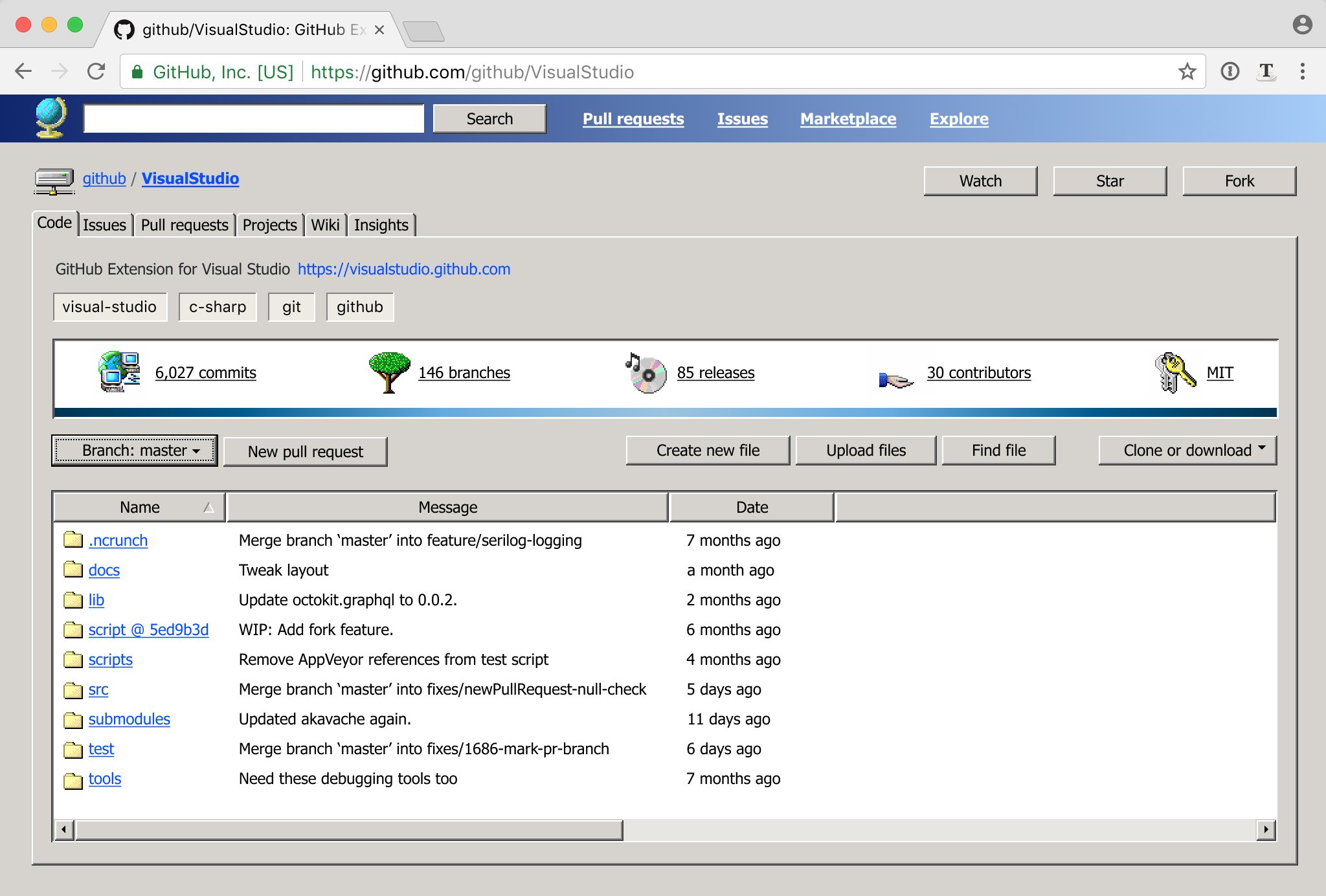
Well, I don't get any pull requests, so my most common navigation tasks are "go to the code" and "go to the releases" and maybe "go to the issues". Now there's an obvious problem: "go to releases" is in a completely different place than everything else! And since I release only once about 6 months, I always spend a lot of time trying to find the releases tab. That is not good usability. There's no reason for "releases" to be a sub-tab under code, since "releases" also hosts binary artifacts that are not in the repo.
That said, hierarchies are dangerous because they hide stuff. It's clear that github's need reviewing.
No, no, no, NO!!!11 I've had it with these "sea of floating text on an expanse of white" redesigns, seeing yet another one follow this mindless trend just disgusts me thoroughly. The lines, subtle gradients, and other affordances of the old design serve to organise and direct your eyes into the appropriate sections; without them, everything blends together into a jumbled mess and it almost looks like the stylesheet didn't load fully.
If you feel disoriented, give it a minute.
I've had to put up with such redesigns for literally years now (I don't remember when the trend started --- mid 2010s?) and I don't feel them getting any better --- and eventually get around to making a user stylesheet to make them look better than they used to.
In contrast to the article this is one of the very few redesigns of a site which I actually would like (not mine, previously discussed at https://news.ycombinator.com/item?id=17242367): https://pbs.twimg.com/media/De17PIKXUAE27W6.jpg:large
If you know someone at Github, send them a link to this article. Maybe someone there will like my ideas and eventually get to implement them
Hopefully not. "Don't make me get out the custom stylesheet editor..."
[1] Windows UI satire https://twitter.com/nikitonsky/status/1003593821723267072?s=...
[2] Honest redesign http://tonsky.me/blog/github-redesign/
It's not sexy, quite the opposite but god does it run electricity through my fingers. I feel like i would use the shit out of it.
Is it association and familiarity with the old windows UI or does it follow human nature better?
Ask any 16 year old (like my son), who came of age having no context for what the windows 95 UI even looked like. Shocker, he vastly prefers flat interfaces, ie. like the design of Notion.
The problem I see in this github redesign has nothing to do with the fact that it's flat. It's tougher to use because it's just bad design. The three columns make it insanely dense in terms of information (eliminates any hierarchy) and adds in weird red underlines (which typically mean "error") for no reason. Also the button styles are all inconsistent in the final version.
The first part of the article was great, the second part he started going off the reservation. I think he's strong in terms of a UX thinking but lacks the skills of visual designer who would better implement his thinking visually.
Windows has standardized and reused GUI elements across every application. So it's immediately clear what's a button, tabs, a subwindow, and how tab hierarchies work (notice they have a bounding box on the tab contents they will change).
Modern web-design disregards all of this because it prioritizes being visually pretty over being easily-recognizable.
Anyway the old Win UI was extremely clear in creating visual hierarchies, when not too many layers were on the screen — modern UI tends to be optimized for a way larger amount of layers, or the opposite, a hyper reduced hierarchy complexity (not the ergonomic / perceived complexity)
The guy spends a very long article explaining how things could be laid out easier to orient yourself in and then asks you to give a minute to get used to his color scheme.
When they started touching the content, I got a lot more hesitant.
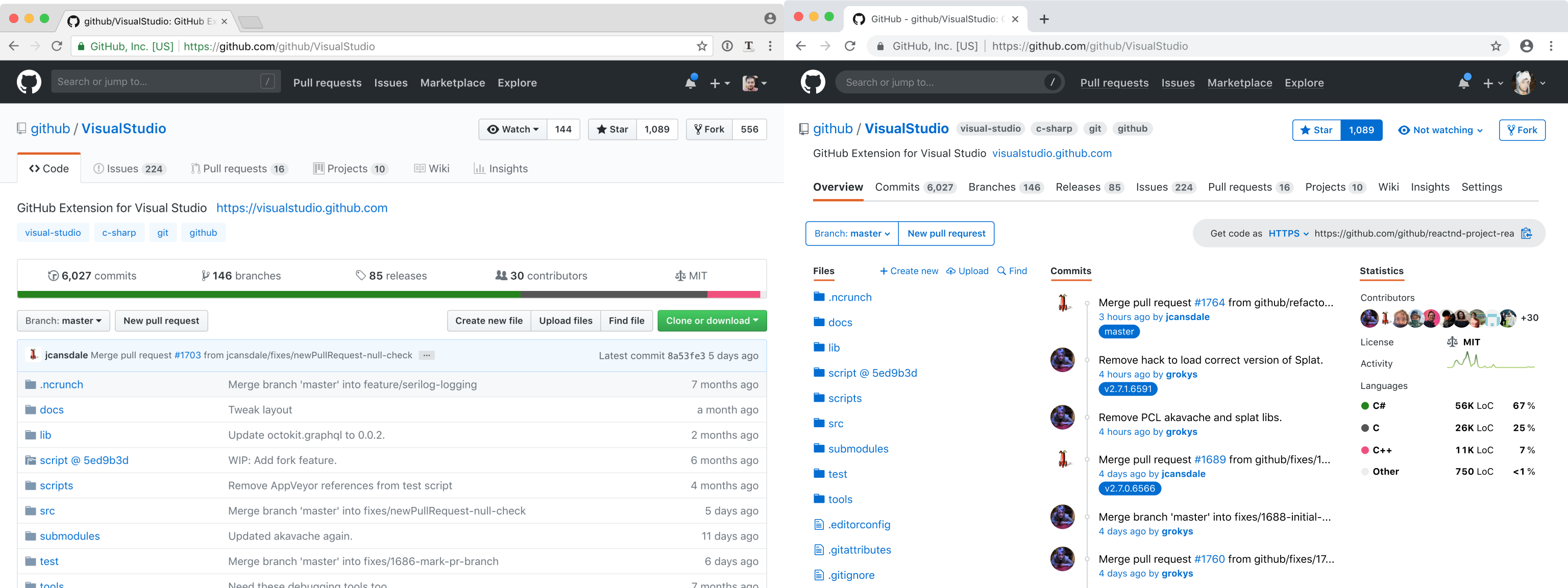
1. I can't articulate why, but honestly it's extremely useful to see the last commit message on each file. It gives me a sense of which files have changed and if my changes are still the latest ones. It's not foolproof, but it doesn't have to be. It's more psychological but still necessary in a comforting sense.
2. Second, the reason github was successful is because unlike other repository UI's, it showed the code front and center. Nobody wants to look at a commit log, which is the approach that most other repositories used to take. Github cleverly realized that people want to jump right into the code or better yet understand the code, so they showed the file browser and a README. That pattern seems so obvious to us now but it wasn't always. It's kind of laughable that the article focused so much on design but failed to get the core of that idea.
Personally, I think step 9 shows exactly where the author is a bit out of touch. He seems to see GitHub as a sort of code social media site where statistics about the repository are just as valuable as the code itself. In some cases (especially open source), I can see that being kind of true, but I think GitHub gets far more use as a private internal collaboration tool in the work place. In that case, the code itself is far more valuable than anything else and deserves the majority of the screen space.
If the first set of changes can get positive reviews here, maybe they'll get merged.
The second line could benefit from some questions about its targets and see how they align/diverge with the aims of a common vcs UI model. I wonder how this matches other UIs.
In any event, a roadmap would help so we could put this in a broader view of where and how it fits in to our needs. See also, https://github.com/isaacs/github/issues/
The commit message is a proxy for freshness, but only if you are familiar with the commit log. It is a proxy for related changes, because a commit will update the details for many files.
'Freshness' indicated by color that is more washed out the older the file achieves the first use case. A sparkline showing changes over time would indicate recent changes, hot files, related changes, and freshness.
yeah and now your 'most recent commit' is 'fix whitespace' instead of whatever your relevant commit message is. No matter how disciplined your colleagues are, commit messages describe what was done and sometimes what was done is just cleanup or refactoring.
If you would get the commit/pull req/issue list in your default view when you have commit rights on - or have been contributing to a repo, sure, seeing the commit/pull req/issue log could be an interesting information stream in that situation.
But then lastly - the other statistics? It just creates an information overload. I prefer a cleaner look with a single focussed view.
Or as I've had to do with other VCS in the past, "what was the last thing that happened to this file?" is a commonly asked question which that description answers, especially when there is a bug in it.
"What happened to this file?" is one of the most common tasks I have, and it's poorly supported by every web VCS interface I've used, including GitHub. This proposal would make the situation even worse, by hiding any remnant of changes in the file listing.
I personally care about the commit log most of the time I go onto github, or the issues, or pull requests. Not that keen on navigating to files from github.
Pride and curiosity.
If they are your changes, and they are on a big/famous project, it's immensely rewarding to stare at your name in the commit log. Making things a simple chronological list only emphasizes the most recent committers overall. The fact that you're a ninja who improved something that nobody else was willing to is obscured. It satisfies the human "mastery" motivator.
As for curiosity; I'm not going to pretend to be some compiler or JIT guru (although I wish I was). That being said, I can focus on that area of <thing> and see what people have been doing, possibly scraping off something off of that wisdom iceberg.
I have a huge amount of respect for the magical things that designers do in my company (the first video on this page[1] is a short demonstration of their utter and humbling talent). That being said, I've disclosed a pretty big idea to these guys and they're talking about ingesting bulk email into ML to learn user habits and suggest ideas. No, guys! Not only are you missing the point, but you're violating privacy!
We all do it. Developers come up with grandiose designs for shit that nobody needs. Designers come up with ideas that are technically impossible. Sales sell things that don't yet exist. Support will stop at nothing, including breaking everything, to solve one issue. Corp/management will create enough processes and red tape that nothing can get done.
I'd still take this article very seriously as Github. There's certainly things there that I wouldn't use but that design is clean and awesome.
On the other hand, showing the last commit and change time for each file is useful. Where is that information now? It's in a linear commit list, which is helpful for different purposes ("when was the repo last updated and what's up?") but doesn't serve the original purposes as well ("when was this file updated?"). At the very least, the last-changed date would help.
Shoving statistics over on the right-hand side makes the page much more crowded; expanding the space available for files and commits would work better. Notice how the commit list has messages truncated; 70-to-80-character commit messages ought to fit comfortably there.
Where does the README appear, here? That tends to be the first thing I'm looking for in a new project, and it doesn't look like this redesign took that into account at all.
The new extra-busy tab bar makes it harder to get at the things you use every day: issues and pull requests.
What else might be really cool is some kind of indicator of how often the file changes, in addition to the most recent change. Like sometimes if you see a file, maybe it was changed 2 days ago but only because someone renamed a method and that made a one-line change in 50 files. But before that, when was it changed? Does it usually change multiple times a week, or was this the only time it changed in the past month? Even if it was just a rough color gradient or something it would be pretty cool to see at a glance which are the most active directories and files in your repo.
What's nice about git is that you also get this propagating to the directories all the way up to the root, so you can quite easily see which areas of the code have been changed recently too. This isn't something normal filesystems have (for performance reasons more than anything --- I imagine if one tried to use git as a filesystem such that each file change was an actual git commit, the root directory node would be hammered with constant updates and an enormous bottleneck) but in the context of a VCS it's amazingly useful.
Exactly! It's easy to see at a glance, for instance, that the code changed recently but the documentation hasn't been updated in a long time. Or that the LICENSE file just got updated a few days ago. Or that a new top-level module got introduced.
I tend to use either "rebase" or "merge" for everything, and I expect people submitting PRs to make good commits.
> What else might be really cool is some kind of indicator of how often the file changes
That's a good idea! How about a sparkline-sized indicator of change activity over time? https://en.wikipedia.org/wiki/Sparkline
I've been staring at it for 5 minutes now and I'm still disoriented. The borders and gradients gave the design an attractive depth and by removing them you ruined for me. The whole high-contrast/no-gradient thing is also one of the reasons I dislike using Gitlab. It was all going pretty well before then, though.
On a related note, Gmail's latest redesign for Android made the exact same blunder when viewed in the compact density. Just sender/subject/sender/subject with very little indication of each one being a separate email. They spent an extra line break, rather than adding a nice horizontal divider, which would have used less space and given more visual separation.
The thing that drives me up the wall is when text inputs are not made obvious. Google in particular is notorious for not giving any indication that something is a text box, as opposed to just static text. I can't count the number of times I have tried to focus and type into something that I thought was a text field, only to discover that nothing was happening.
Removal of icons also plays into that since they were the visual hooks you could use to navigate after a little while of usage.
Then the final redesign, I’m not sure there’s anything to say about it other than that I strongly dislike it. Services like github change their image at their peril, and I just don’t think that is worth it.
I hate the two (it's actually THREE including the top black bar) navbars, I always get confused about where to look to find something or what i'm clicking on, and I've been using GH for years!
One thing I hate about modern design, and this is on github etc, is the lack of use of color. Its all monochrome to look "professional" but color coding elements by function in a page can really make navigation so much easier. In the OP, just having blue, green, and yellow underlines with a gap under code / commits / branches, releases / issues / pull requests / projects, and wiki / insights / settings tabs would make visual navigation so much easier.
You could then border the file and commit list with blue and the statistics with yellow. The parts of the page related to each "topical heading" could be highlighted with color.
The usability issue that it solves, however, is genuinely serious:
> let’s say I’m in Wiki and need to see Releases. What should I do? There’s no Releases tab visible, so I must figure out somehow that Releases are part of the Code
That's not the same thing at all because 1) you have a visual indicator (app icon) to help you find what you need, and 2) you are likely switching between windows (thus reminding yourself of their position) much more often than switching between tabs on GitHub. What you're saying is true for power users, but anyone who doesn't use the UI very consistently will still need to scan the tabs to find what they're looking for, because there is no distinct, visual differentiation between them.
That said, I agree that it solves the usability issue you mentioned, I just don't know if this was the best way to do it.
It works. Millions of people are used to it. There's other things to fix (like code review). Stop fucking around with things for no good reason.
A good amount of these unsolicited redesigns are to generate interest in what the designer can offer and provide a sample of work.
Other than posting the HN link the OP goes straight to "If you know someone at Github, send them a link to this article.”, so they probably don't necessarily care for feedback (huge assumption based on my experience with past unsolicited redsigns).
> Yes, this redesign idea upsets me. However, that doesn't make the points I raise (from the point of view of a daily GitHub user! and one that uses it professionally!) any less valid.
Your points are definitely valid. But ironically, like the OP, you end your post on a sour note.
By ending with “Stop fucking around with things for no good reason.”, for what is just a harmless redesign by someone that has little-to-no power to affect GitHub's UX, you painted the rest of your comment as unnecessarily critical. I think this is what the parent comment was addressing.
So when the few things left, that are not horrible and you depend on, are becoming target for "The Designer Treatment", you become angry.
That would make sense, but they don't actually keep that separation. The "Releases" tab is Github metadata, yet it's right by the Commits and Branches. Also, right next to the "Branch" button (git) there's the "New pull request" button (github).
I was very confused for a considerable time when people would point me to GitHub for a description of a project, because there didn't appear to be a description, just a repo. Was I supposed to build it to see what it was?
This seems very silly in retrospect, but there really was a month or two where I just didn't understand at all what I was supposed to be doing there, and I've never forgotten it.
And why? Why is it so critical that the first thing people see is the file structure, and not a description of the project? Echoing the article, I suppose it makes it "about git", but even when I'm interested enough to start poking around, I'm more likely to clone a project than browse through it on the site.
It just feels intentionally obtuse.
What this implies is that GitHub is not your project page. The README there should be more development focused, and there should be a separate project page which goes into more detail about project-level things.
I was just saying on another comment that I think the problem is GitHub, while maybe it shouldn't be, is the de facto project page for many projects, and is a major use-case.
There perhaps can't be a good solution - it's convenient enough that most small developers can't be bothered maintaining two different information sources about their work, and GitHub certainly has no reason to dissuade people from using it that way, but to prioritise the readme would make actually using the site harder.
Just one of those awkward things you live with, perhaps.
IMHO documentation websites and the like is where people should get their first feeling for a project, that is where the README should be.
It's all very well to talk about ideals, but you can't ignore reality in the process.
You're right, though, that you shouldn't have to scroll past it every time. I don't really know what the solution is, but having it there but going undiscovered is the worst of both worlds.
I visit the main page of a repo to see the Readme or to go straight to the issues/prs page. I'll use OctoTree to view code.
Quite useful when you want to point people directly at the description.
GitHub Pages makes it easy to create a separate website for the first use case, which you can link to on the very top in the description. Then the README can contain info aimed at (new) developers of the project, build instructions and the likes, which you likely don't have to go to frequently (your 2nd case).
It'd rather have it all in one place, with the landing page being the README, and the more developer focused info hidden in tabs, but that's not the current design unfortunately.
I've found a way to author project descriptions under the current layout using Org-mode. The trick is to leverage two features. One is that Github projects will use README.org files as a README file. For instance this is one of mine
https://raw.githubusercontent.com/geokon-gh/linearsystems-pa...
it shows up in the README spot https://github.com/geokon-gh/linearsystems-part2 and also in the Github.io https://geokon-gh.github.io/linearsystems-part2/
The rest of the magic is in the HTML configuration at the top of the file - particularly: #+EXPORT_FILE_NAME: index.html
So then when you export the document to HTML it turns into your Github.io root file. This way you can keep your dev-facing README and public facing Github.io page the same. It's a little ugly.. but it gets out of the way and works
I rarely care about the contributors or the commits in a github repository. I care zero about the stats. All I want are the files.
The last commit is incredibly important to me, since it lets me see if two files changed at the same time by quickly comparing descriptions.
  - Github tab icons are purely decorative
  - Because we simplified the whole header, we don’t need that color coding anymore
  - Commits often touch files for completely arbitrary reasons, so the last commit tells you almost nothing
  - Get rid of gradients, dirty washed-out colors, unnecessary separators
It would be like changing the save button because no one uses floppies anymore.
Last commit on files is one of the first things I look at when scanning a new repo.
Changing the colors is about the only recommendation I could tolerate.
I actually agreed with that one. He made a pretty compelling argument. The icons aren't universal, and I have to read the words every time anyway.
I was actually looking forward for me being hilariously wrong, and GitHub having made funnily incomprehensible icons, and he did not deliver!
That is mostly true if you are casually browsing a repository you are interested in. It is definitely not true if you are a contributor/owner of the repository.
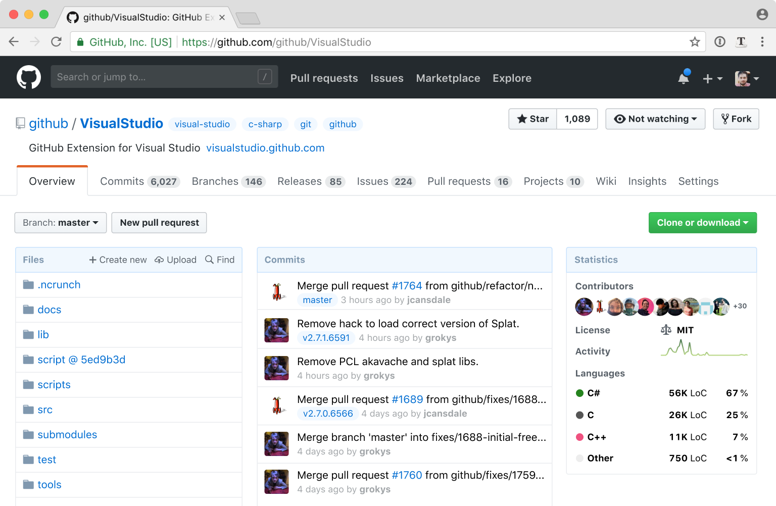
* single layer navigation: it looks busy, but it would improve my life a lot; I find the current one pretty annoying * showing statistics on the main page: this is very useful information for me when I come to evaluate whether I should use the library in my project
* list of commits: again it helps me to see whether the project is still maintained; if the last commit was 5 years ago the project might still be good, but possibly it doesn't work with the new versions of other libraries; also adding tags there is cool!
* icons added to "find/create/upload file" menu, really good idea!
* watching/not watching button
* language names right on the main page. It's very confusing to have to click on the colour bar to see what languages does the project use
And here are some things I'm not sure about:
* colours are more intensive and I feel that my eyes would get tired more easily; I like the current colour palette
* flattening of buttons looks very iOS-ish and I'm not fan of the trend
* there's no separation between columns, for a moment I thought that users avatars belonged to the files column and I didn't know why some files had user next to them and other didn't.
That's a nice experiment and I'd love to see more ideas like this, to understand the way of thinking behind certain design decisions.
On a side, I find it pretty sad that there's so much negativity in this thread. I know people are used to certain designs and don't like changes, but saying "I hate this" is very strong and I don't understand why anyone would have such strong feelings towards other person's blog post.
About this redesign: I would welcome it with all my heart. For me, GitHub won on the social side. So let's put the social side in front. I find the current project and profile pages very poor and limited. I would welcome ghuser.io redesign as well.
If I really want to scan the code, I clone the repo and scan the code in my IDE. Or I use a browser extension that displays a folder tree in a toggleable-sidebar on the left.
The current "Files" is only useful to click on the files to get to see their contents. The last commit message for each file is something I look at when I'm bored and want to waste time. I also hate to see very old commit message on very old files like LICENSE.
You're not just seeing anger about this redesign; you're seeing the cumulative hatred towards every single UI that was redesigned in this way.
Especially in today's atmosphere of excessive modesty it's far too easy to immerse yourself in a "cloud of positivity" and completely ignore everyone saying DO NOT WANT. The real danger here is someone at GitHub with that attitude may actually do it. People expressing strong negative opinions are doing so for a good reason, perhaps you should listen...
There are some good ideas, and this article does a fine job of calling out problems, but I also can't help but feel the end result is unpolished looking and would perform very poorly when it comes to usability.
* The end result feels unstructured, like elements were just tossed on the page, due the lack of strong grids either from background colors or implied by layout.
* The left and right alignments of elements is basically non-existant, contributing to a messy feeling.
* The "statistics" category will be entirely useless on small repositories, or personal ones, just taking up a huge amount of space for no reason.
* Removing the icons makes it more difficult to develop "muscle-memory" on websites you use a lot. Icons, even if irrelevant, help us pick the item we want off of the page more quickly.
That's precisely a front where GH wins (over Gitlab): it's visually calm and sparse, ideal for something that would be part of daily, thoughtful work.
I also dislike icons in general. Use icons or use text (on a button, ...) but not both, was one of the first rules of thumb I've heard about from a friend, and it makes sense. Especially these days when everything is colorless and bland. I mean if icons in the menu row had all different color, it would at least be a useful navigation aid after a while, but that's not how it's used usually.
Keep icons small, use brief text, employ information hierarchies. Don't turn everything into a jumbled mess of icons "because they look nice."
Edit: This comment is not directed towards you. It's more my frustration after spending two hours last night trying to understand the abysmal JIRA interface.
1) no one is actually implementing these changes; this is just a design exercise from someone who has no connection or influence with Github other than I presume being someone who uses it. My reading of this design work up is that it was just a fun exercise for someone with design skills; design kata if you will.
2) as a programmer who has occasionally tried my hand at a little bit of design; to my mind the design process is somewhere between fricking hard and near impossible and I appreciated the article taking me through his thinking and the incremental changes along the way. I may not like or agree with all of his choices but I really liked the insight into the process.
Obviously it's fine to not like the final design he ended up with, but given the above context I think the level of harrumphing discontent of some comments is not really warranted.
Literally applying the bland "no borders, no contrast, white everywhere" trend cookie-cutter style is not what I'd call "design skills". Sadly there are very few actual good designers out there, but their work is easy to identify because they stand out in a good way. This one just looks like another "me too" redesign.
This is a well upvoted and discussed post on hackernews, if the arguments weren't strongly in opposition, there is a chance somebody at github will be stupid enough to follow this blog. There still is even with all of this pushback.
The responsive nature of the new frontpage is garbage. Because you expect that at least 95 percent of developers using the site are doing so on the desktop. If your browser window is too small, you lose search behind a hamburger button and a navigation menu that only looks like it belongs in your hand, not on your desktop.
We're lucky this only affects the frontpage, and not within any repos were developers are doing actual work
The main thing you want to see with the repo page is the code and the readme, i don't want to see all these commit messages or stats. Irrelevant.
This actually made me appreciate Github's current design :)
Personally I feel the author’s final design is also a step backward - while I realize things have been “cleaned up”, a horizontal menu with that many options is too many - and they are not of equal value. The existing division is helpful based on real life use - not the authors idea of what looks good. I don’t need menu items I rarely touch given the same importantance of the ones I use daily - I don’t want to even accidentally read them - it wastes my time. Also, how quickly does this need an alternative solution for narrower screens? Lastly, the authors design is looks to me just like stack overflow - I don’t think it’s fair to say it’s any more modern than githubs current design which has strong and consistent visual language I appreciate as a benchmark for how other products could look and feel. Github looks like GitHub in every part of GitHub, and for me at least, that’s a good thing.
The commits box is also bigger than the files box, which doesn't make much sense. Whether a commit box even should be there is a big question. How useful is commits to the average developer browsing a repo? I think a bit useful, but not useful enough to have 1/3 of the screen width.
Stats of a repo is pretty nice, because it gives an overview of how active it is, etc. But the problem is that majority of GitHub repos are empty and not that active, so it'll make most of the repos look like ghost towns. Not something you'd want on your site.
Moving all git tabs into the GitHub tabs makes it even harder to use the UI. You have to spend way too much mental load just to find the right tab to click on. It looks better, but will be harder to use.
The "Watch" button, moving description and tags is an improvement, and I'm for a redesign of some sort.
One other thing I've never understood about the GitHub UI is why the issues search defaults to open issues. I have literally never wanted to restrict my search in that way. Maybe it's just geared towards maintainers? As a user of a project, I would rather land on a closed issue with a solution to the problem I'm seeing.
There's important metadata about the structure of a project when looking at the last commit of a group of files: do they all change together? They are more tightly coupled to one another if so. If all the files are touched by each commit, then there's an issue with the project's development process or organization of code. I also tend to run into issues frequently that were introduced by the last change to a particular part of the codebase. If I can navigate to the appropriate directory and look at the commit messages for each file, I can often be pointed directly at the commit that caused the problem and the files involved with the change.
Secondly, when developing, I'm already running the latest version or something later, so looking at closed issues contains no useful information whatsoever. I'm looking for two things: 1) What I should work on next, or 2) Is the problem I'm seeing already reported and has any work already been done on it?
Not showing open issues also has the negative UX that people will look to see if their issue already exists in whatever page they land on, and if they don't see it, create a new one. Therefore, defaulting to closed issues has the potential to raise the number of duplicate issues by some amount. Project maintainers don't like this much.
I think you misunderstand. The parent comment was suggesting showing both open and closed issues in search results, not only closed issues.
From my perspective: there's now a lot of useless tabs on the top (commits/branches/releases), the repository description will either take extra space OR will disappear and the tabs are going to shift.
- Getting rid of icons: OK
- Moving description over tabs: bad
- Shuffling tabs around: bad
- Different info instead of code details: meh
- Vanity counters: OK
- Changed style/color-scheme: bike-shedding / meh
Opinionated summary: hit and miss.
When it comes to Watch, that’s just being pedantic. Maybe non-developers expect to be shown the current state of something, but as a dev I feel that I would like that button to show the inverse, so I know what will happen when I press it. “Click Watch to Watch the repo!”. Two sides of the same coin maybe.
Actual UI things that would improve github imo: - Tree view to the side, so I can browse and preview files to the right (Octotree helps but does not remember position). - Maybe some small custom area before the files, but after the description, for putting things like build buttons, important notes, etc. - Other non-design things (better search, easier way to track conversations, etc)
That's it, nothing else about the current design bothers me.
Also black on yellow! My eyes are bleeding.
I agree. It's easy to rush to the comments and complain; I had the same initial reaction myself. But I end up agreeing with almost all points made, and wish I could give it a try interactively to give some extra comments -- and I sure hope Github take notice.
---
Some points:
1. That means we can get rid of the [files & folders] descriptions without really losing anything
- I have come to depend a lot on last modified dates for files as an indicator of both a repo's activity level, and as a maintainer it highlights where I probably need to take a look at when refactoring. Dates to me are a must. Commit message? I can live without.
2. Solution here is to flatten all tabs into a single navigational control
- This might not port well to mobile, and look clunky as a two- and three-level stack of tabs with no hierarchical relationships. Is there a half-way point that might work? I think the hierarchical relationships in Nikita's other (satiric) mockup of "Github XP"[0] are actually well represented and very clear.
Thanks Nikita!
[0] Windows XP satire (https://twitter.com/nikitonsky/status/1003593821723267072?s=...)
I also disagree with some of his comments. For example, when he's talking about finding the Releases page from the Wiki, he says, "Releases are as much part of the Code as Issues or Wiki are." A Release is one specific version of the code, so the "Code" tab is the first place I'd look for it. Issues and Wikis are project level things that evolve separately from the code, so it makes sense that they're at the project level next to the Code tab.
The only thing I strongly agree with is that the project description should be outside of the Code tab below the name.
My only notable complaint with GitHub's UI is that it scales poorly. I'd really like if they made the entire middle content area 95% of the window instead of fixed width.
- Currently, the tabs at the the top level are github-related, and those at the second level are git-related. There is a certain sensibility to this.
- Zenhub, which adds a kanban board powered by github issues, adds a tab at the top level, which makes sense according to the above hierarchy. Of course, a third-party browser extension shouldn't be a primary concern if github thinks about redesigning the page.
I honestly believe GitHub is one of the best developer tools ever made. It's a joy to use and I have a major appreciation for their conservative approach to design refreshing.
The single-navigation element looks cluttered, it's easier now with the hierarchy. The 'vanity counters' serve a purpose. Stars tells you people like it, forks tells you people might wish to change something. They are both valuable.
And the final result just looked horrible in my opinion. Design guides and standards for the 'general population' might not work in a setting where most users are 'power users'. I really wouldn't like it if Github took lessons from this blog.
And as a side-note, the fact that github's look hasn't changed much over the years is a _good_ thing. Look at hackernews - stay with a proven design.
Jokes aside, I was skeptical but I think the (2nd to last) result is really good. I see a lot of the logic behind it and I could get used to it. There is a lot of good thought that GitHub could draw from there.
The final theme changes were trash though. Something both his blog and new design fail at is contrast. I use a darkreader plugin because I'm young and don't want my eyes to crumble to dust before I die. That blue-on-white is not going to fair well when inverted (or however dark readers work).
In some sense, I think that github might consider his UX advice, but should ignore his style advice.
I see a lot of developers in that 90% get really confused because the README is below the fold. You're immediately presented with a directory structure that you don't care about.
I'd almost like to see different views for different purposes. Not sure what the answer is.
At work I made firebaseopensource.com to sort of re-skin GitHub with an emphasis on the docs, not the code. GitHub Pages is often used the same way.
I think the general criticisms here are because this designer didn't follow these 2 basic rules.
First rule of life: don’t stereotype people (“designers aren’t coders”). Second rule: check before leveling ad hominems.
Even without adopting his solution, this really gives github some ideas on problem areas to focus on. I would consider hiring this person if I were them.
The amazing designers that you really do want to find are the ones that will give you the smallest set of improvements that fix UX issues without changing the visual language of the product. If done right, most people wouldn't even notice that the site had changed at all but their daily frustration with being able to find things would decrease.
For example, the nested tab mess can be a real annoyance. It's worse on mobile, too, but the designer managed to tweak the design and completely forget about anything other than desktop dimensions. This is not really forgivable in 2018. The least possible change might be: let's try placing all the tabs together on the screen so that people don't go looking in one list for an item that's in the other. Then, making all the pages have the same navigation group containing both sets of tabs makes sense. At this point, stop!
Certainly, if the company thinks a design looks "dated", it could be updated at some other time, but ideally there would be zero change in information architecture to go along with it. Again, most people wouldn't notice the colors had changed subtly and information would be in exactly the same place it was, but ideally you'd be able to measure things like "number of users reporting that the site gives them eyestrain decreased by XX%".
GitHub certainly isn't perfect, but their UX people do seem to be fairly good. I've been using the product since it looked as it did back in 2013, and without side by side images, I actually couldn't point to any one point in time and say "that's when they redesigned the product and everything changed!".
I'm not sure I agree with this. Gradients are not bad because not everything has to have a flat UI. Also, separators can be very effective if used correctly. IMO, I think a huge part of Github's success is it's user experience compared to Google code, Codeplex and others that did not continue.
I actually use the description of commit and the time of commit quite regularly to figure out how active a project is.
If everything but the readme and maybe a contrib folder hasn't been updated in 6 years, I have concerns. Unless the commit message on one of those, say the contrib folder, indicates that adjustments have been made because the repo I'm looking at considers its work now be a solved problem space and I can see few/no issues or pull requests then I'm backing right out and looking elsewhere for a project that might address my particular problem.
Replace that information with a commit history that doesn't indicate to me where those commits got made (ie. Was it core code changes? A spelling mistake? Where are people actively working?) and a bunch of stats that I usually don't care all that much about and which are already available if I did really want them. Now the repo landing page becomea a chore to navigate.
However literaly everything up to #8 I actually think makes a lot of sense and is a small enough deviation from what is there that users aren't going to be immediately shocked.
> Why? I don’t know. Commits often touch files for completely arbitrary reasons, so the last commit tells you almost nothing. I can’t think of any case when somebody would need that particular information.
Way to shove your opinions on everyone else.
You sir are using git in a very wrong way it seems. Its not dropbox, you get to decide and see exactly what changed and why. Not just do a `git add .; git commit; git push`
Probably, while his own commit messages seem to be consistent and informative, he spent too much time looking at repos of other people, where it is not so.
Since I frequently have the same feeling when exploring potential dependencies for my projects, so yes, changing the Github UI to accept the status quo seems more logical for me, than trying to reeducate all the developers in the world to follow the universal guidelines for commit messages sensibility.
I actually use this feature frequently. I bet others do too. If I wanted to see the commits list, I can just click the commits tab.
Wanted to see see if others did too.
If your commit history is messy, then you have a different problem.
The menu is marginally better but the extra density there makes the options run together, especially as counts increase, and lacks room for feature expansion. The grey background is useful also as it gives the page sections depth and context without having to label it. A all white background with various text sizes and lengths is not optimal for supporting more than the example design and projects using more text or with longer titles will suffer.
This design doesn't take into consideration how the homepage of a repo relates to the subpages of a repo. The article mentions showing more files yet the in the current design, file view one click away from the current homepage removes most of the account meta data and shows more files already.
This design also doesn't consider the logged out view which has a large call to action banner to get an account strategically embedded at the top of the code tab. This focal point is somewhat lost in the presented redesign and would likely require rounds of A/B testing to decide on a new content breakpoint for this business need.
5/10 - needs work
In the “Get code as” section. You can see it was moved in there when solving Problem 11. It’s true that the fork and watch counts are missing though.
I have to disagree with this. I have had to change the topics and description very often on all my repos. Often the first description is the worst, because when I create a repo all I care about is getting the content up first. Later I start caring more about description and topics and particularly topics evolve over time as a project grows.
Overall I think the article was interesting, however I don't particularly like everything being squeezed as tightly together as possible. Having a few background colours or lines in a design to visually separate things out is actually quite nice. I don't mind if I have to scroll a bit further down to see more content. Scrolling is not an issue as the content is already there. Clicking is the problem. Modal popups or content hidden behind multiple server-client roundtrips is the issue. So yeah.. I don't mind a slightly longer page with better separated content.
Also his final design looks very inconsistent. Because all buttons and all other indicators look very different it is not clear anymore which is just a highlighted header (e.g. the issue counter) and which is an actual button which I can click (e.g. Watching counter).
Maybe a few good ideas to takeaway for GitHub, but I would hate them to adopt this design.
Aesthetics serve a purpose and can increase satisfaction, as well as the performance of a design, but they will never supersede functionality in a product like GitHub.
I like all the changes prior to that one though.
1. Why are the images cropped so strangely on mobile? It makes this article really hard to read.
2. Shouldn’t the title be “Redesigning the GitHub Repository Page”?
^ And a meta question for programmers, what do you do when English grammar calls for a question mark to be inside your quotation mark at the end of a sentence, but you’re literally quoting something that should not include the question mark? It’s grammatically wrong, but I’ve taken to moving the question mark outside in the case to avoid ambiguity.
English grammar doesn't call for it, not necessarily. It's a matter of style, and different style guides prescribe different methods. There's no "officially correct" way, but to me, the only position that makes sense is to put trailing punctuation outside the quotation marks, except in the case where said punctuation is actually part of the source material. Doing otherwise can change the meaning of the quotation.
If rules and correctness disagree, correctness wins. English is not prescriptive, it's descriptive.
“Redesigning the Github Repository Page” shouldn’t the title be?
AP style (at least, according to the cheatsheets I've found online; I don't have access to the current edition of the full guide) only puts periods and commas inside quotation marks-- question marks, exclamation points, semicolons, and other punctuation only go inside quotation marks if they belong to the quoted matter.
So, that makes "Shouldn’t the title be 'Redesigning the GitHub Repository Page'?" correct, according to them, at least. (This is a matter of style more than a matter of grammar, though.)
The latter makes sense because a release is basically just a snapshot of the code at a point that the developer(s) thinks it's in an acceptable state for users. Sure, it might reference Wiki pages or issues or contain binaries that aren't in the repo itself, but ultimately it's still directly related to code and at best only partially related to anything else.
As for nested tabs... how is that bad at all? Grouping related things together just makes sense. Maybe Github's current design isn't the best way to group them, but the concept of grouping itself is fine. Grouping related links together, assuming the links are grouped in an intuitive way, is far better than overloading users with a long line of different options. Maybe the current main tabs could be drop-down menus or something?
Also, as mentioned by some other people, I absolutely hate the current trend of making websites and apps be as plain white as possible. Separators, gradients, and soft colour backgrounds make it really easy to distinguish different content areas at a glance. The end result of this redesign is just a mash of text that looks like the CSS didn't load properly.
I'm also very surprised neither this redesign nor Github themselves have added a dark mode. Why do people enjoy staring at white screens for any length of time? I don't trust people who code with light themed environments.
(1) Wording. Consolidate "Create new file," "Upload files," and "Find files" into "Files: Create, Upload, Find." This is great. When you're in this zone, you are mercilessly paring down, pruning, merging.
(2) Layout. Do we need two levels of tabs? Should this go here or there? What things work well side by side? This is a relationship-analysis mood.
(3) Graphics. Borders, colors, gradients, etc. This is a creative mood, where you are building things up, giving them outline and skins.
If you just got done with Wording and then go to Graphics, you have this leftover pruning mentality. This might cause you to be overly minimalist in your graphic design, as this author was, in my opinion (and I'm a minimalist, who errs in the same way). I thought he did so great with the first 90% of the rewrite, and he echoed many of my thoughts when I'm working on something. But I agree with the rest of the people here who said he went too far in removing outlines and such that delineate components. It is a testament to Github's graphic design that it always looks fresh to me (but I agree a bit hard to navigate).
1. Nested tabs -> it's a better way to organize when you have too much content that should be grouped under the same tab. Nested tabs are found in lost of well-organized designs. I am a programmer and I do like hierarchies. I am uncertain about your statement of people normally don't like hierarchies. Maybe nested tabs don't suit your design, but I don't think it's a problem.
2. Redundant icons -> Of course when you stack them in the "intended images" with lack of spacing like that, they would cloud our views and harder to see. If you lay them out with good spacing, horizontally, they're much nicer to see. If you're using it often enough, you would remember the icons. I think you should keep the icons, push the non-regular items to a more option icon like ellipsis.
3. "Vanity counters" -> they're designed with different purposes. Out of the 3, I only care about Star and Fork. They're very good metrics and also good pride badges for public repos.
I do see there're good improvements compared to the old design like the file list, getting rid off the redundant commit description next to it, the stats.
Some thoughts:
1. I like seeing when something in a folder has been modified, and be able to spot easily what folders are active and the ones that have not been touched for years. I agree the last commit message is useless.
2. The file and directory list is currently displayed the same on the main project page and when navigating inside sub-directories. How should the sub-directories be displayed with these modifications?
For example, dividing a public library into fiction and non-fiction is something that provides arguable value (although some might argue which books should be on which side). Trying to figure out where something exists by the rules of the Dewey Decimal or Library of Congress or any of the many other classification systems out there can be maddening without experience.
Rather than starting with collapsing items, I believe it would be far more useful if there was consideration for how people use and intuit GitHub, and create the items from there.
For example: there are organizations and people who have projects, and projects contain facets like a code repository, issues, releases, and so on.
For example: the code repository contains branches which contain commits. Some commits are tagged, but all contain a file hierarchy. But since users care so much about the files, Github renders by default the latest commit in the project-default branch (such as master).
So perhaps a better view for files would be to make code itself navigable by breadcrumbs - top view is branches and tags, a branch/tag view winds up taking you to a commit history, and a commit takes you to the file view. You just default to a place inside the breadcrumbs when you go to the root of a project and select to view code.
Step 8 seems to be where it finally broke down for me. The file view lost a lot of information that people rely on and want, without consideration for why they rely on it, or how they can get it back if they need it.
The UI you propose cater to your needs. It's just that.
Why should a user without any background in coding / git, care about the branches when opening an issue? Or individual commits? Not the mention that the number of commits may change depending on the selected branch, but the issues and releases stay the same, which is something the author does not talk about.
> If you are a programmer, you might be surprised but other people normally don’t like hierarchies.
Citation needed.
One of the big benefits of a hierarchy (be it in UI design or on a political / social / corporate level) is that on any level, you really don't have to think about the levels above or next to you that much, and thus even individuals with a very limited skill set can be productive members of this hierarchy. The anarchic approach of "everything is accessible to anyone everywhere" taken here just excludes specialists from using a GUI productively.
All the popular modern interfaces don't use trees, they use lists and lists of lists. Technically those are trees, but not to users, since they're only exposed to 1 level at a time.
And regarding the "anarchy" is solved another way: searching and sorting, à la Knuth.
The most successful interface of all time, Google, has 1 input and 1 button and it returns a list of things.
In case anyone else is interested I wrote a similar style of article about refactoring GitHub’s interface a few years ago too:
I especially like the code + commit activity + stats in the overview page, when visiting a new repository the initial code view is almost never what I want to see.
I think the author is a very young guy that doesn't remember computing pre-Windows. Probably everything before Windows has used this pattern...
Even more, it's a perfect example of trying to fix what's not broken. The result will be something else, not better, not sure if not worse, but why change it?
How am I supposed to buy the argument that a programmer has a problem with understanding the difference between a fork, a like, and a watch request? Wasn't GitHub meant for programmers?
> If you feel disoriented, give it a minute. Once you are used to it, you might notice it’s actually easier on the eyes and a bit lighter.
In other words, push through the pain. You'll like it.
Commits, branches, releases, contributors belong exclusively to Code! There are no releases in Wiki. The GitHub design is perfect and it should stay like that forever :-)
I hate those designers who try to "fresh up" things every single month. Is it because they cannot create something valuable? I was just getting used to the latest icons in my IDE and next month they "fresh it up" and I have no idea what is what.
GitHub has been around for years, it gets the job done, everyone is used to it and knows how it works. Let it stay like that!
The only thing that I'm missing sometimes is file tree. But one can get it with the help of Octotree extension.
Thats one take i`d criticize on github design, it does fail to explain how git or github works, but I think the platform was designed as a hub for git users and does great on that.
I think we can agree comparing to other similar plataforms github has the most straightforward design, so much that is used beyond coding. Some people are running communities on it, with colaborative forums using issues and plain text documents formatted using markdown. Its quite remarkable.
The intent of the article was good but as some of us programmers would say: if it aint broke, dont fix it. :)
Why someone always has to create artificial problems and re-design and re-invent something which don't need any change? And it is not rare that they make things worse from usability standpoint.
A similar example (not layouting though) is also that flat design in iOS. Buttons which have no border and can't be distinguished from labels. Flat, solid colors. If you look at Windows 1.0, it looks nicer than current iOS design, it even has an innovative border around buttons, rounded! So why are designers gong back and making it worse than it had been at the beginning of graphical UI design...
I am a console guru, as such I actually run most of my github (yes github, not only git) interactions from within Vim or the "hub cli".
When I need to actually visit Github, the primary thing I do is look over the shoulders of a colleague and pointing out specific files. It is super convenient to have the "16 minutes ago" at the end of each file or directory, since I can basically just ask the colleague I'm helping to follow the "16 minute" pointer as a rabbit hole to the file in question (without bothering to remember the actual file name).
Maybe I am just really used to the current UI, but I don't really feel like I need to see the codebase, last N number of commits, and language statistics all at the same time. I prefer the current set up in that the language stats are incredibly minimalistic and the current list of commits are viewable if you click on commits.
I also think putting the navigation all one line is a bit cumbersome in that you would have to scan all of the links horizontally. I feel as though this makes it harder to find which link I need to click on.
I do like that flat design on some of the buttons but overall, I feel like the redesign is difficult to take in.
- Mobile - Github's mobile experience is less than desirable, proposing a mobile-first approach here would be amazing;
- Tabs - having a row with more than 10 tabs won't help much on improving the navigation, not to mention localization;
- Overview tab - this is a great idea, but it would depend on the user type. If you are the owner or contributor to the repository, you'd most like benefit from the glanced overview page, but if you are a regular user, you would want to see the Readme.md view to decide if the repo is what s/he is looking for or if it's well documented.
I can hardly believe the author went through and carefully tried to improve an already highly effective layout, mostly did a sound job at it (or at least made an argument for their approach), and then destroyed it all in some kind of strange burst of what the hell in conclusion.
It's like someone made a mistake at the end and accidentally dropped Github into a bad css framework or design you might buy for $5 on Envato. The separators aren't unnecessary, they're critical.
Big fan of the screenshot under problem 10 however and would love to see Github implement some of the improvements on vertical space usage.
Fun exercise, anyway.
The tabs they want to take away from the "code" screen have little or nothing to do with the other main tabs, that's why they're not cluttering up the main nav bar (which doesn't fit into the author's screenshots.
No one cares about the description of the repo if they're trying to interact with the wiki or the issues modes, that's why it's in the code/main section.
They have >500 commits on Github in the last year: https://github.com/tonsky
I think adding the readme to above the commits/stats would be a good idea. Perhaps make it ~500px and expandable.
    Problem 3: Vanity counters
    This is the “vanity menu”:
    The thing with vanity metrics is that there should be just one. One metrics is simple to understand and focus. Two or three split attention, making everything weaker.
I'd like to find a useful alternative to commit messages on the Code page that was still per-file focused.
I was going through these comments and most everyone here disagrees with one or two things and other's agree. Art is a subjective thing and I think ultimately at the end of the day it's about giving the developer more options and letting them decide what makes sense to them.
Also, how do I filter all my repositories to be the ones I created from scratch not the ones I forked? EDIT: This one is easy just use Sources Filter(strange name but ok).
With 300+ repos it is getting rather unmanageable.
Sure there is an API for creation date but that is just silly.
What they do is reading the README.md or reading code without cloning them to their machine. Perhaps commit message is not important, but the update date reflects how active the repository is.
The danger would be overcomplexity/confusion, but if designed to match eachother well with different priorities, it could work. Still, the singular view no matter who you are is certainly a nice feature that may not be worth getting rid of given how universal the repo page design is.
I'm not even going to talk about that abomination done for the content.
In any case, I would like to see a follow up article, taking account of the feedback. That is how design works... iterations
This design fits well for (1). But for 2, it performs badly. I need all the files, the commits etc if I'm working on the repository.
"Test yourself, see if you can find Releases tab without an icon and if it was harder than before? It wasn’t, was it?"
So you take them away anyways? ️
For me proposal for redesign without any experimental data presented is just an invitation to endless speculation.
I like most of it, except adding the 'Statistics' and list of 'Commits' all together; They should be collapsible, if necessary. I'd also like to see the last commit against a file, and maybe modification time.
Does this new redesign proposal enhanced the usability of these features? Not at all.
Just my opinion.
What I don't like:
- I like the "last touched" messages (but they don't have to appear on the front page I guess)
- I don't like getting rid of dividers (the final design part he does)
Please don't feel the need to redesign to "freshen" up the site. It looks good as-is.
No. It'd better should be.
- forks is important to easily find out alternatives, when a project has been abandoned
- i like the overview, but it should be more prominent ... when was the last time the owner of this repo took interest in it ?
- I agree maybe releases could be put to the top level menu, but not Everything. Now It's way too hard to parse and took me much longer to find things I need. I use the "Refined Github" extension on my firefox and that's the only tab it adds, cause it makes sense.
- Moving description and tags up top by repo name, good decision. I like that one a lot.
- This fear of hierarchies is why I struggle with many redesigns. Yeah, everything being out there is fun, but it always takes forever to find things. Once you have used the old for a week much of it is muscle memory.
- An example of what I feel is an issue that keeps sticking in my brain, your clone/download area. The Green dropdown is easy to see, Opens up to let you do all you need, and is very explicit. "Get Code As ..." Is confusing, easy to overlook, and doesn't look like where you'd download an easy .zip file or open it in a desktop app. There's gotta be a middle ground, which is likely separating the two things again. Theirs confused people looking for the clone link, somehow, but yours looks NOTHING like a download button for a zip file.
- Getting rid of the second set of tabs on the code tab honestly hurts a lot of different use cases to benefit only the use case of a casual browser. I'll often look around at projects to see if I can lend a hand, and being able to see the code color bar under the buttons allows me to see how much my skills are useful to the project at a quick glance. I know my colors, and if I see a new one, a quick click informs me. Additionally, when seeing if I can use a library for work, the easy, bit view of the license is crucial. Your design had me searching for almost a minute, and still, when I go back I can't find it immediately.
- Removing quick editing from the description and tags is a mistake too. Just cause it doesn't happen often for you, doesn't mean it should be hidden. I'm certain there'd be tons of people who get really confused by it being moved and would never think of it being put in a catch-all settings page.
- Stars, forks, and watching, I'll agree with these changes pretty easy. Makes sense.
- Please don't get rid of the colors. Add more, change em up, whatever, but don't go soulless white, black, grey, blue, hints of red. My eyes have a much harder time parsing your dense, separation-less page than it would a bright, saccharine mess that at least differentiated everything. This feels like facebook or something else lacking joy, give it a light drop shadow or background color if you wanna lose the borders! Seriously, take your end design and give each of the three columns a little border radius and a slightly offset drop shadow, add a light, simple background color on hover of each folder/file/commit, and I can at least stomach the rest of it.
uhh what? says who? where's the source of this? This is only the case if your icons don't look different enough. In the example those icons aren't great because they've overly complex and easy to mix up.
>you won’t come up with a great icon for a commit. Or a release. Or an issue. Or a license.
You can, and you also don't necessarily need to. Icons aren't only for the illiterate or first-time users... they create a signpost for repeat users to scan for without reading a word. As long as you consistently use the same icons and they make at least a little sense, they can be useful (I agree that some of Github's don't make much sense at all though).
>I mean, Icon + Label + Counter make for a symmetric and weak composition:
It's best to refrain from insults during critique, but this is flat out dumb. Completely unfounded. No evidence. The composition is "what is it" and "how many" — it makes perfect sense.
>The thing with vanity metrics is that there should be just one. One metrics is simple to understand and focus.
Again, no. This is how _you_ use it. You've done no research. I want to see forks because I want to know how many people are potentially engaged in _doing_ something with a repo. Stars matter less to me because there are some repos that just have a lot of stars because someone wrote an interesting article about it once. (I do think stars and watching is a bit redundant, I personally have no need for both but my personal experience does not solely dictate what the product needs to be)
> Watch button
Again, no. `Watch` is an action. If I click the dropdown I expect to have options for "watch". "Not watching" simply adds words and makes me put forth a little cognitive effort (minimal but it's there) to parse what the opposite of "not watching" is. You are adding the need to think more, not less.
--
Honestly I'm too exhausted to continue. This redesign isn't well thought out at all. At this point I skipped ahead to the end, and honestly it's just a garbled mess. You don't understand the product or its users. If you were my student (I'm a design professor) I'd give you credit for the effort, and the visual design is fine (though are you trying to trick me into thinking that making corners more round is meaningful?)... but there's an endless mountain of straight-up bullshit to call out here.
Fwiw- I 99% agree with try redesign (except that there are too many tabs and can't put a finger why but feel that the color changes was a negative change).
Does anybody know how those "washed out" colors help navigation?