I am not one who gets worked up over typefaces so my short take is "yet another san-serif font" but the discussion about why he chose to do things in certain ways was useful for me in appreciating how this font differs from other, similar offerings.
Personally I liked this font much better than the other opensource alternatives, especially with the number of weights it offered. I am glad it's gotten popular.
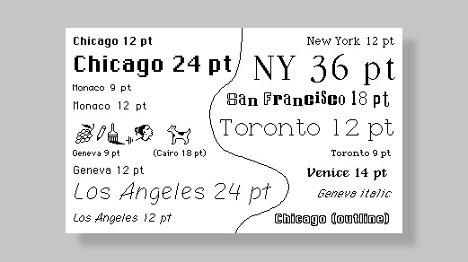
The original San Francisco was designed by Susan Kare. You can see it here. [1]
This makes me feel old.
1. https://images.fastcompany.net/image/upload/w_596,c_limit,q_...
What’s interesting is that Ikea chose to use Verdana for many of their print & in-store display material[2]. To me it looks a bit blocky and unfinished, which actually is a not a bad look for Ikea.
[1] https://www.moma.org/collection/works/139312
[2] https://www.google.com/search?q=ikea+verdana&rlz=1CDGOYI_enG...:
With that said, I share your opinion on Verdana and that can definitely have played a role in their decision.
> We'd used Roboto as our main font, and we were running up against its limitations. It was originally built to work as both a display typeface for things like titles and text typeface for longer blocks of text like paragraphs. But it was difficult to read Roboto when it was small
Emphasis mine
I've seen multiple websites (What The Font being one of them) which analyses a picture with text. They then try to guess the font being used. If you could automate this process, you might be able to scrape content and figure out who's using your typeface. I guess that is mostly interesting for a commercial typeface looking for software piracy, though.
Web crawling seems like a great idea, but probably not worth it just to get a list of customers. And it will never tell you who's using it in their app, or for signage.
> Within the first year, before making it open source, I had something that covered the 200 most common Latin characters.
Seems like most of the time spent on Inter was the result of the creator not properly limiting his scope. Later he even talks about how the Cyrillic characters in his font seem completely wrong to actual users of Cyrillic because he can't read Cyrillic. As someone who deals with multiple different scripts on my computer, I always hated the fonts that try to set a uniform style for every script when many of the designers clearly had no idea how many of these scripts worked. It really only makes sense to try to support every script for fallback fonts like Unifont. Rarely do typographic concepts translate well between scripts. If you want an example, install the CJK font "Hana Mincho" and type some English text in it: It looks atrocious.
The changelog provided on Github gives some interesting insight into development of this font https://github.com/rsms/inter/releases Not only have I found it rare to see a font with active development like this, but it's also exciting seeing changelogs that are this detailed.
I realize that not all web fonts support all languages but picking between the best ones and then supporting all the languages seems like a pain.
In general, it's hard to break browser fallback to system fonts for languages/glyphs that aren't available. (Though people will sometimes try, or make crazy bad accidents happen.)
But, you mostly only have to worry about languages your webpage is outputting anyway. If you aren't localizing to a particular language and you don't allow user content, you don't have to worry about a web font covering those glyphs. Which is why most web fonts only worry about the top few languages for download speed optimization.
Google Fonts has tools to be smarter about which subsets are downloaded in a browser. It has a subset hint where you can tell it languages you think you will need. Google Fonts also supports the use of the unicode-range CSS feature [0] to tell a browser to download subsets only if the browser encounters characters in the associated Unicode ranges.
My wife thinks every Serif font is Times Roman!