(It's true that upwards-firing lights are often used in interior decoration, but these are almost always to illuminate walls and ceilings above us which then bounce light down to the contents of a room. Also, some techniques in photographic and studio lighting do use some up-firing lights, but these act as shadow fill, never as the primary light source—except when an unusual look is intended.)
To the extent that we expect a certain left–right orientation, this will almost certainly be predominantly a matter of consistency with prior graphical user interfaces. The near-universal standard of a top/left lighting metaphor goes at least as far back as the original Apple Lisa/Macintosh which cast its 1-bit, 1 pixel shadows to the bottom/right.
The fact that people of near-identical cultures can natively integrate either left-hand driving or right-hand driving suggests to me that there's no inherent reason why it needed to be one way or the other. Had the first interfaces begun with a top/right lighting metaphor, we'd probably be all as native to that as British people are with right-hand-drive vehicles.
#20 Fool Yourself into Seeing 3D -https://books.google.co.uk/books?id=K6bjvFUcedgC&pg=PA57&dq=...
(It briefly mentions Susan Kare's work who designed the first 3D buttons in Windows 3.0 -- 1990!)
There's another effect going on here which is visual affordances: not only does the button "pop out" but we immediately see it as something we can push. That's from the psychologist James Gibson in 1977.
There are a ton of cognitive quirks that are useful to know when designing interfaces. The pop-out effect is one of my favourites.
My CSS-fu is very basic, so it might need further tweaks to make button presses look right.
But yeah this is cool :)
Someone mentioned how much they miss beveled buttons and how every button would be cooler with a beveled edge so I thought "well how about making everything beveled then", then I got a little carried away...
Anyways, mine is utterly impractical. I don't know how but I managed to make the site sluggish with just CSS. It's probably also broken in Chrome. This looks extremely cool in comparison!
Also to be even more Windows 95-ey I recommend making the top links (new, past, etc.) look like a tab bar! (I really like the way the footer links look like a status bar.)
[1] https://chrome.google.com/webstore/detail/stylus/clngdbkpkpe...
  {
    "name": "Hacker News 95 Extension",
    "version": "1.0",
    "description": "Hacker News 95 Extension",
    "permissions": ["activeTab"],
    "content_scripts": [
      {
        "matches": ["https://news.ycombinator.com/*"],
        "css": ["hacker95.css"]
      }
    ],
    "manifest_version": 2
  }
As an alternative you can post (or link) your style at https://greasyfork.org/ which newly supports Stylus user.css style format or even self-host the file somewhere (github perhaps). Seems PR is opened already: https://github.com/chowderman/Hacker95/issues/2)
{ "name": "Hacker News 95 Extension", "version": "1.0", "description": "Hacker News 95 Extension", "permissions": ["activeTab"], "content_scripts": [ { "matches": ["https://new.ycombinator.com/*"], "css": ["hacker95.css"] } ], "manifest_version": 2 }
Then in your Chrome Extensions settings, find the option to "Load unpacked extension" and point it to your directory.
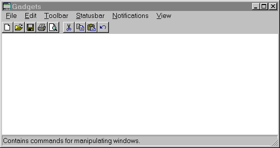
Hacker95 seems to get the Windows 95 buttons wrong though, showing them as 'sunken', and not giving a clear impression of being clickable.
Although I prefer a more balanced approach on the spectrum of pure function and pure form, pure function beats pure form any day
If you're using a system that has the font, all you need to do is specify it by name.
Funnily, in last few months on macOS Catalina i've got more kernel panics than in prior 13 years on Mac and 8 years of Windows combined.
My current and previous laptop have been fine, but I used to have issues all the time on a much older laptop, and the issue back then, I forgot exactly which piece of hardware it was, but there was a bug in one of the drivers that was patched in an update, I think it was 10.4.9 or 10.4.10 that had the issue, a known issue at the Apple Store; but they couldn't do anything about it from behind the Genius Bar. Generally if you're getting kernel panics though, there's either something wrong with a piece of hardware or with the driver for it, although it could be any kind of kext causing the issue if you have any 3rd party kexts installed.
This looks excellent (from the screenshot). It reminds me of a mid-late 90s Windows Usenet newsreader, which I wouldn't mind if every web forum looked like.
https://www.reddit.com/r/chrome/comments/1ymfgw/user_stylesh...
(The comment there that removing this "is going to help increase speed significantly in the future" is pure BS. If anything, user stylesheet functionality was handled in native code --- just adding another CSS to the page --- which makes it far more efficient than going through the whole JS/extensions route.)
Ironically, IE11 is the last MS browser to support user stylesheets (Tools->Options->Accessibility) but Edge doesn't.
Even in Firefox, the fact that it's named "toolkit.legacyUserProfileCustomizations.stylesheets" is ominous.
The Internet is becoming more and more user-hostile, and it's not just websites who are responsible.
win95: https://upload.wikimedia.org/wikipedia/en/e/eb/Windows_95_at...
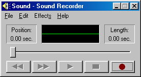
win98: https://upload.wikimedia.org/wikipedia/en/e/e7/Sound_Recorde...
My personal preference, however, would be to see Hacker News look like IRIX.
Sitting in these Zoom meetings, that's about all I think about.
Three Participants: https://mediad.publicbroadcasting.net/p/shared/npr/styles/pl...
Four Participants: https://www.feelingthevibe.com/wp-content/uploads/2019/06/NU...
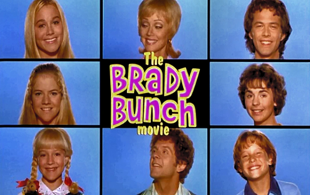
Eight: https://vignette.wikia.nocookie.net/thebradybunch/images/3/3...
Nine: https://i.pinimg.com/originals/0b/a1/b6/0ba1b63cf281efbe48eb...
Silly.
Sorry.