Basically, anyone who’s ever had a greatest hits compilation seems to get their “actual” studio album art replaced with the art of that compilation album at random.
For example, off the top of my head, when I’m in the album section for Low, “Heroes”, or Lodger (three David Bowie albums with iconic cover art and even better music), the only image on the page is for a different, shitty compilation album that I’ve never owned, listened to, or have any interest in whatsoever.
But things somehow get worse as you’re listening to the album. Each song gets a different cover, seemingly at random. In fact, on “Heroes” alone, an album originally with ten songs (my reissued version has two extra), I have FIVE (5!) different album covers, (one of which is the original, attached to only the fifth, tenth, and bonus songs).
I’m so baffled by this decision and literally cannot conceive of anyone, sane or otherwise, asking for this or even thinking that it’s anything other than the worst possible way to handle album art.
If anybody at Apple Music is reading this, please prioritize the song from the actual album in search results. It kills me to be bumped into Greatest Hits or compilations so often.
At the launch of the iphone, everything was skeumorphic. The cover flow clearly emulated flipping through a stack of records or CD books.
Now that people don't have physical media, the metaphor changes. The new design treats the cover art like an avatar on a forum or social media site -- a small thumbnail to identify the music.
Additionally, the original iPod/iPhone typically used internal storage in your Library. Under the Apple Music era of streaming, this may be a decision to shave a few % off of bandwidth costs by only pushing lower-resolution images. And then the choice being made to not upscale low-res to screen-width and incur blurriness.
I happen to enjoy both and treat them as different experiences. I'm fine if the expectations around digital change as long as it's still accessible.
Every single item in the digital world down to a pixel (off of the `pt` points system) we see online is skeuomorphic inspiration off of something! Typesetting and the alphabet is skeuo off the typewriter systems/foundry, buttons––of course skeuomorphism, web-page and scrolling follow from pulp and physical scrolls, header, footer, body inspire off of letterheads.
Anyone who claims 'skeuomorphism this, but !skeuomorphism that' is a digital noob and doesn't quite understand where the world has been and how it got here.
The difference may be subject to nuance and debate, but that doesn’t mean it doesn’t exist.
Absolute dynamo of a medium.
What I do care about is a current "About" tab in Spotify, a WikiPedia page, or maybe a well-maintained webpage for/by the artist.
Not meant to be an indictment of visual art of this type, just suggesting that perhaps the "vector" needs to shift elsewhere.
Good example is the backgrounds created by Cryo Chamber for their YT postings: https://www.youtube.com/watch?v=SbKDlzQgIwc
However, there are nonetheless lots of people like myself that primarily listen to albums, maintain their own digital libraries, and use streaming platforms as a glorified "trial" platform for new music. I find those who tend to listen to music like I do really care about high resolution album art (and by extension the quality and accuracy of track metadata).
Frankly, since both needs are so widely different, I'm not sure there's any one solution for both. Goodness knows Apple Music tries, but to OP's point, it's clearly not succeeding in this effort.
It will be amazing how much information there is and to learn about the thought process of the artist while creating the album.
> use streaming platforms as a glorified "trial" platform for new music
... and it seems like the skeumorphism has changed from being a digital analog of a personal record library, to being of a record store. The "library" aspect of it has become more like just the featured section of the store.
Maybe cover art is less meaningful *to you*. FTFY. To the author it is meaningful.
Today UX/UI teams are making decisions for everyone and not allowing anyone to deviate from those decisions. Less and less apps offer users a choice via a settings UI. To me the fix is simple allow users to customize their UI.
That's not really relevant. The author might find any random thing meaningful, including keeping an ant farm at home.
The point is whether it's meaningful enough to many people, justifying the claim that Apple should have given it some special prominence.
Cover art is no longer useful for music discovery or intriguing fans when an album "drops". Those were UX/UI things last ... century. Now they aren't. They're vestigial embellishments at best.
Unless you have proof this is moot.
The author admits they're in a niche:
> The fact of the matter is that nobody cares about cover art.
So they're aware that really most people don't really care any more. Like most people these days I listen to music for the music, not the physical media artwork.
Unless you are on the Apple Music team and have access to some study how would you know that?
It's not like he can customize the UI in the 2012 version of Music app. He just by chance liked it like that.
This might be too broad of a generalization. I find a lot of cover art quite interesting, and I hope it remains prominent. I think a (dis)like for cover art might just be a personal preference.
When I listen to music on Spotify or whatever, I do still pay attention to the cover art and spend a moment to just admire it if it catches my eye.
In an abstract sense, the association of visual art with music, is, of course, a good thing that I'm sure is here to stay.
UPDATED TO ADD: Perhaps the abstract concept of "album" is what needs to go the way of the dodo.
Whether artists have enough material to justify an album-length release is a different topic.
I think the last CD I bought was in 2005, and there was a 7 year gap before I bought my first vinyl. I had completely forgotten that albums used to come with lyrics, trivia and pictures of the band.
Do you listen to full albums or just mixes/random?
I see it much less important for the latter but significant for the former. For a lot of the albums I listen the cover art complements the music/message of the album. I really like it and it enhances my music listening experience.
The app no longer cleanly and easily divides music into Songs/Artists/Albums/Playlists as top-level tabs, instead shunting them into menu items within one such tab. The older apps (pre-iOS 7?) even let the user customize which top-level tabs they wanted to see (e.g. Composer).
Again, I bet a lot of this pain would go away if I started using Apple Music, but I'm bothered by a loss in UX.
Pre iOS7 was done under a person who understands and is passionate about Music. Steve Jobs.
iOS 7 was the first major UI redesign Apple had with iOS, all lead by Jony Ive. Going from Hardware Industrial Design to everything "Design". Throwing out everything that Apple UX, UI, HID had over the years. Basically Jony Ive hated Skeuomorphic design ( Previously Lead by Scott Forstall ) so much he throw everything out. Not sure if he just hated Scott or the design. Or possibly both. But it took Apple years to finally walk back on all those decisions. ( The same to Apple Store, but that is another story )
Apple Music was initially just Beats. The whole App design was about that stupid "Next Song" they keep promoting, also from Beats. It was Jimmy Iovine's idea that the computer / iPhone would magically know your mood and play the next song. And somehow Eddy Cue was sold into it. If you ignore the marketing crap, what Jimmy Iovine wanted was for people to discover new music. By either using AI, curated playlist or Apple Radio. For a long time Apple Music doesn't even have repeat the same song button. And the whole UI was designed for you to "discover" music. As a true music nerd this may have been OK, for normally user this is just stuffing random piece of music in front of their face. It wasn't until a few years later they finally accepted defeat and accept the fact the users knows what they want to listen. And what song or artist they are looking for, as well as repeating the same god damn song hundreds of time.
That is how we arrived at today's Apple Music UX. Which might have been OK for any other company and consumer / user. But in my view, still a bloody pile of crap. Instead they are so focused on the social justice aspect and keep telling the media how Apple's paid out to music labels are 10% higher than Spotify. And continue to push Free Trial hoping to push for higher services revenue.
Nope, I just finished a 3 month trial and it never got any easier. There is no way the person in charge of this app actually uses it day to day (or maybe they've just never used Spotify?)
My biggest grievances:
- Wouldn't be ready to play what I was last listening to immediately, esp if data service was low (Spotify seems always ready to go, even if I haven't explicitly downloaded a song to cache)
- Awful recommendations -- Kept playing songs from the first Tyler, the Creator album when I was listening to vapor/synthwave radio (I like that album but they do not go together!)
I've tried Apple Music and Deezer and both just suck at keeping moods. Apple will go from calm piano to noisy experimental hip hop within 2 or 3 tracks.
Spotify recommendations, while still flawed (really every recommendation algorithm should let a user tune some parameters based on mood, like how much new stuff should be included), are by far the best I've heard.
In other ways they are completely outclassed by Spotify, but their mood-respecting recommendations are the best I've seen by far.
However, my problem was (was it in iOS 9?) when they moved Downloaded from a permanently set toggle switch to a folder you selected. Which brought you to the exact same view as Library but with only the music on your device. And if you leave the app you may or may not end up in that same view when you return. It made more sense as a setting that you had to deliberately set or unset, not as a "view" of your content where the default was to use more bandwidth and play things you'd deliberately deleted.
Tesla can read your music from USB flash drives. This is wonderful, because they have a premium audio system (used to cost $2500) and you could play high-quality music.
You could load a drive with FLAC or Apple Lossless music and play it back without MP3 lossiness and artifacts.
Yet album art? they do not care.
Here's a thread on how the USB player is a buggy unsupported mess. It recently lost the ability to display album art, but there are plenty of other problems (like no playlist support or any number of other problems)
https://teslamotorsclub.com/tmc/threads/comprehensive-usb-bu...
This thread has > 2000 posts going back 5 years and it is updated almost daily.
The comparison should really be usb vs phone+bluetooth, the radio and streaming.
A USB flash drive is: bigger, holds the music you want to play, skips and seeks instantly, and "theoretically" can be organized how you like it.
I say "theoretically" because there are plenty of other bugs with tag grouping and sorting that disorganize your music for you.
I just wrote a python script to retag all my music. As to FLAC/Apple Lossless - it's nice not to have to resample the music too.
Anyone has the source for this?
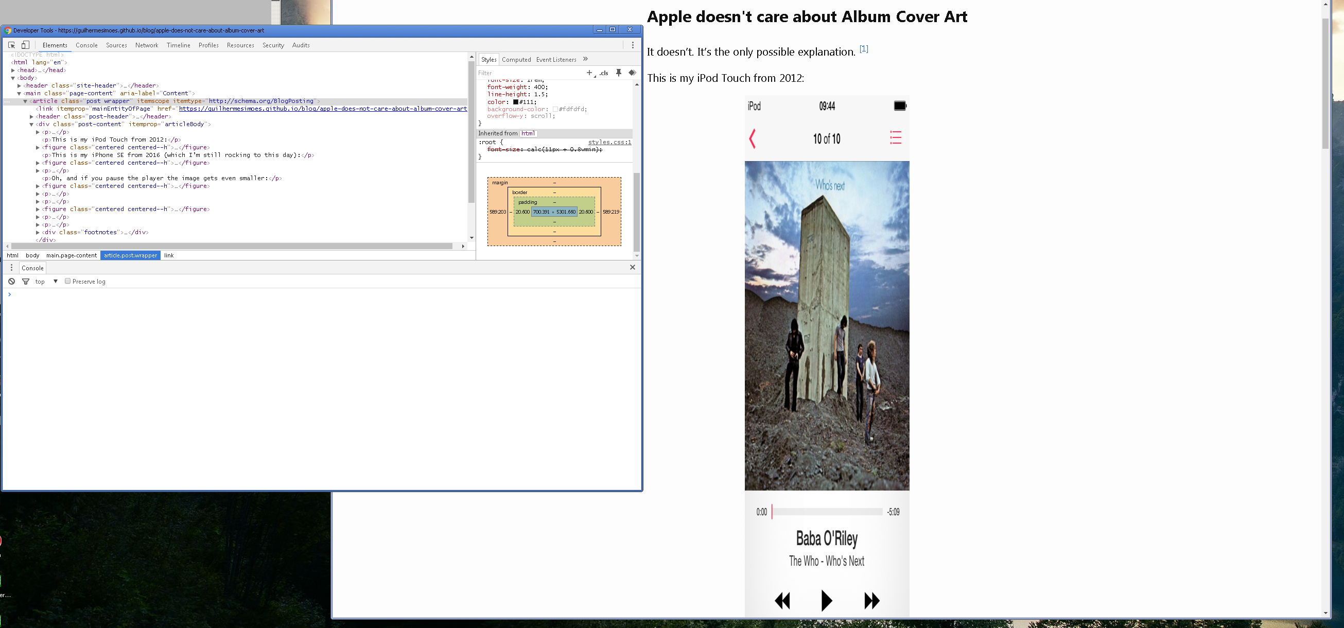
I too bought an iPod Touch back in 2008 because of how the player UI treated album art: as actual 'art', and deserving of a full-width display on the screen. I would meticulously tag my music library with the correct album art files precisely so that they would be displayed nicely on my portable player.
I think one reason the art got smaller is due to phone screens getting larger and higher-res. A full-width image spanning the iPhone SE would be 214 x 214 px. But on the iPhone 12 it would be 390 x 390px.
That would take up a lot of the screen's real estate, perhaps leaving less available for UI controls. Also, if digital album art tends to be low-res to begin with, it would look pixelated if displayed at full width on a high density pixel screen.
Digital album
Unfortunately the alternatives are even worse.
Remember when you had to make software updates through iTunes? This was probably the worst piece of UX ever in a mainstream OS, even worse than clicking "Start" to shut down the computer in Windows. So quality steadily declining is not an accurate description.
Take, for example, iOS 7 which came out 7 years ago. On the one hand it brought some sorely needed modernity, on the other, it replaced a well-polished, albeit dated, style. However, on its own UI-wise it was really bad. Subsequent releases have had tremendous improvements to its many faults while introducing others, and I can't see how that could be called "a steady decline."
This is seen in many areas outside software, so I would imagine it exists here as well.
[1]: Both age as in their physical age, as well as age as in a "have been users in this ecosystem longer" sense.
Now no one at Apple has that intuition.
I think this is becoming less and less true. I think Mac OS isn't as good as people say it is and Windows is better than people say it is. I can't speak either way to desktop Linux.
Windows works for people because they are used to its idiosyncrasies. You know how people think their browser icon is to open the internet? It's the same with Windows, to most it's what makes the computer, they don't know otherwise. And these idiosyncrasies are taught in schools and universities in computer classes. How to use a computer has become how to do stuff in Windows and MS Office. Brings back memories from my childhood when I was the "computer expert", helping my parents and their friends fix problems in old Windows 98 and XP. At least the old windows ui was somewhat consistent.
My OS is supposed to be a tool, and windows is super annoying unless you literally download Enterprise edition. Mac is okay, and I’ve been pretty pleased with how capable Linux Mint is, as long as things don’t randomly get broken (looking at you, package manager corrupting and acting weird for weeks before I finally googled and fixed it).
(I wholeheartedly agree that Windows has been getting better in many respects, but the hostility of that experience felt really stark to me. Quit using Ubuntu for the same reason.)
The M1 is the absolute best mobile processor on the market, soundly dominating what’s available from intel and it was just released. For mobile computing Apple is very far ahead. Could we have had something better? Maybe, but better than the best is a lot to ask and these advances came largely because of the iPad and iPhone. Without apples focus there, we wouldn’t have the M1 chip.
You also bring up chromebooks which are a google product and we’re predated by “netbooks” pushed by intel. From my perspective Apple is the only company of those 3 that has not resisted selling underperforming hardware. I don’t know of any chromebooks that perform as well as the iPad Air.
Linux desktop is still a tinkertoy.
Linux on the desktop has been serving me very well for over 2 decades as my daily driver both at home and at work.
I remember as a kid walking through the aisles of albums, floating around certain genres, and deciding on what to purchase purely because of an album cover. Band I had never heard of, well, look at that cover!
I don't many kids that had money to drop on something based on the art alone. We needed money for magazines and concerts too y'know.
Why should it? One of the reasons it shouldn't touch is because it artificially creates a full-bleed line that separates the content and conveys that they are disconnected when they aren't.
"Why can’t I read the album name from the cover?"
It can't be read because that's apparently what the artist intended. Many album covers don't even have the album title printed on it.
"why can’t I see that The Who took a piss on the monolith?"
You can't read everything even on 1:1 replication of the album; but your phone is unconditionally smaller than an actual album cover.
"So much creativity, imagination and artistry thrown in the bin for no good reason."
It's not throwing anything away; it's making up for numerous design constraints.
I'm perfectly happy with the larger of the inset album art screenshots, but the smallest I agree is much too small.
The only thing I managed to get to work was if you can find the album in the itunes store, and match all the metadata, you can get the automatic metadata logic to set it properly for you.
But he has some esoteric versions of albums, and he wants to use those album covers that itunes doesn't have in their db.
I owned players from Sandisk, Toshiba, Sony and Creative, and they were all dead simple. Just drag the folders on to the player icon. If the folder contains an image, that's the album art.
I owned a ton of unofficial B-sides compilations and live bootlegs, so this was the only way.
Might be worth suggesting he upgrade his tooling to more hobbiest level stuff.
He's also pretty engrained in iPhone and iPad stuff. So the end zone is the album art still has to load in iTunes to show up properly on his phone.
Upgraded recently and I'm shocked at the regression, it actually feels so slow compared to iTunes and having to go into an album page and back to album menu rather than just rolling the album open in-situ like on iTunes is insufferable.
Things for music library users are just being made worse and worse to make it more consistent with how Apple Music works.
No care if it's better for the user or not.
It is sort of sad, because some of the best pieces of music over the last century have been albums where the songs are tied together in some sort of progression - these are often called concept albums. The Wall, Ziggy Stardust, American Idiot are a few examples that come to mind. Soon there might come a day when nobody actually takes the time to listen to an album from start to finish.
The "album" in general has long been an industry contrivance. Most musical acts would be much better served if singles and EPs were the most asked of them in terms of recordings. Because they're trying to fill "albums" (~44 min LPs or ~60 min CDs) there's tons of filler recorded all the time. Some is literal filler pulled from a fakebook and recorded just to put another track on an album.
Even with bands I love I can rarely make it through entire albums without skipping at least half the songs. I've been making playlists for decades (mix tapes, then CD-Rs, then iPod playlists). I'd much rather an artist release five good songs as an EP and sell it to me for five bucks. I'll bundle all the EPs together as an "album" if I want.
I think like all art having limitations actually enhances creativity, since it makes the artist cut things out and decide what is truly important.
So realistically it can vary on the artist and they should probably customise their delivery based on a particular format. Singles/streaming for individual tracks, vinyl for something slightly longer, CDs for longer, and then maybe USB stick holding a really long flac file for those epic progressive sessions.
We don't disagree. My point is most artists are incapable of making a good full length album let alone a "journey of audio". This isn't necessarily a knock to those artists, just statistics.
My issue, such as it is, is the whole concept of an "album" comes more from record studios than musicians. A majority of albums are just a few singles wrapped in filler which is sometimes not even performed by the artists.
Even if all physical sales stopped tomorrow artists that can make full length albums would continue to do so. Much like a concept album and radio play, such albums might not do well with streaming services. Aficionado "DJs" would still include the more stream/radio friendly tracks on their stations and playlists. They will continue to exist though.
For the "journey of audio" type albums I think Internet distribution ends up a superior channel to physical distribution. For one it's much easier to make a multimedia experience. Even if it's just visual stills to go with the audio. It's also much easier to provide alternate experiential mixes, say for instance a full binaural mix for listening on headphones or surround sound and a more tailored stereo downmix. Artists can also make two-way transactions like providing stems to let fans produce remixes like Radiohead and Nine Inch Nails have done in the past.
However, it still feels very limited. They're all looping cinegraphs, they don't 'do' anything.
For an example of a genuinely imaginative liner notes experience, check out the floppy disk that came with Billy Idol's ambitious 1993 effort "Cyberpunk": https://www.youtube.com/watch?v=Mjl6As2lRGU
> And why can’t I see the album name anywhere on the UI? ↩
is also a problem. Apple is trying hard to destroy the concept of an "Album"
E.g. for Outkast's Speakerboxxx/The Love Below, I see tracks 1,2,3,6,8,9,10,12,13,15,17,19. Track 16 is on another album by "Outkast featuring Kelis."
I just want the tracks that are on the CD to show up together as the same album.
ID3v2.4 fixes many of the issues. But very few progs use it or default to 2.3. Plus the way an album can be sliced and diced for metadata is truly breathtaking.
Then add into that some of these programs try to use some form of acoustic id to try to find where it belongs. Which does what you are talking about. So you resort to setting the file read only so the program will not mess with the tags.
Then on top of that many of the online sources can be in bad shape for bands or releases. AC/DC is most certainly not alternative. But it is tagged that way in some databases. So data quality goes all the way from 'someone spent a lot of time getting this right' to 'someone uploaded whatever was in their mp3 library and called it a day'. Also even the data printed on the pages that came with it may have spelling errors and differences in spelling for individual tracks and artists. Some artists have 3-4 different aliases which one do you put it under without messing everything up or leave it stand alone and you forget you even had it.
Also differing releases is a pain too. Some albums have 40+ releases. Which one do you actually have. Does it really matter?
Alternatively, as crooked-v mentioned, you can give all the tracks the same Album Artist. In your example, it sounds like “Outkast” should be the Album Artist for the whole album.
Personally, I have always been an album listener; just go start to finish. Occasionally I'll throw on a playlist I made or something curated by the streaming service I am using, but it's rare for me.
Hanlon's razor: "never attribute to malice that which is adequately explained by stupidity"
Complacence/Apathy might be apt substitutions for stupidity in this case.
Why though? Honest question.
Even then they aren't picking albums or artists. They are served mixes from a bottomless carousel of user-created or algo-generated playlists. Most of the songs sound similar, as every playlist is designed to capture a specific mood. The artist becomes interchangeable. The album the track is from becomes meaningless. There's always something further down the playlist that sounds exactly like it.
Anecdotally, I have a friend who collects rare underground CDs from the mid-2000's because vinyl hadn't been revived yet and digital streaming wasn't big yet, so some bands who were only active during that time only ever put out CDs. And personally I have a few dozen vinyl albums that came out in the last 10 years.
With the vinyl revival, I expect album art will still continue to be important to niche music collectors, and any artist who releases in full-album format (many artists just do singles now, so that won't apply to them I'm sure).
I also hate that despite there being a "lyrics" tag lurking in every track it is never pre-filled when I buy music off of Apple's store, I always have to go visit dodgy lyrics sites and cut and paste. Admittedly this is more a problem with the entire setup for distributing music digitally, I would bet money that even if a musician does stick lyrics into their uploads, it will get stripped out somewhere along the way when it's transcoded into whatever format you're actually buying.
Edit: It seems like a kind of UX paternalism has crept into the software industry. In the Winamp era it was possible to radically customize your music player (even making it massively ugly if you want). Over the years, more and more configuration options have been removed so now you get "dark mode" and that's basically it. Nearly all other options are chosen for you either by designer hubris or, more likely, the vendor's commercial priorities.
I used to buy cds and vinyl all the time bc of the packaging. If spotify totally did away with cover art I'd be annoyed, but enough to stop subscribing? Nah.
I would offer it's a generational thing. If you came from vinyl or early CD, with books with lyrics and recognisable artworks you've just got expectations or wishes that aren't being fulfilled anymore. No value judgement, I get that young people discover music wholly differently. There's survivorship bias in there as well, but I know the labels, recordings and albums I want my song or aria to be from by picture. And I'll probably listen to those specific albums and recordings until I pass, so 50 more years of caring for specific album art here.
Folks complaining about Apple and art are just preaching to the choir, the vast majority of users could care less, and thats what frankly Apple and Spotify are catering to, micro thin Jony Ive devices that are one micron wide and cost $1k, small album art is a distant secondary consideration.
Speaking of which...
What I mean is: I want to listen to the Brandenburg Concerto or The Wall from start to finish and in order. Not possible for so long I gave up.
The other aspect of this was wanting to import a sizable music library from Windows Media consisting of dozens of CD’s I own. A total mess, including the aforementioned problem.
Apple? Has anybody (maybe except cover designers) cared about Album Cover Art ever since the transition to CD? And it went downhill with Napster etc. downloads (zero cover art 99% of the time), and later with official stores and streaming (small cover art).
Heck, with video games, good TV series, Netflix, internet, social media, youtube, mobile versions of the above, and so on, available the last decade or so, I think people (including the younger demographic) care less about music than ever since the time of Elvis. It's just not as big as a cultural deal anymore as the "escape" it represented for some kind up to the 80s-90s, now it's just one more thing in a whole range of available diversions...
I know of at least one artist who did a simplified album cover for their streaming content, but for the physical version of the album you open up the cover and see the full work of art that was left out of the digital version (hard to explain, but you get the idea). I think that's a really cool way to bridge the physical-digital gap and reward people who like collecting albums as a form of physical art.
Based on the Kickstarters I've seen, it's not easy or cheap for bands to produce a run of vinyl records. And even then, the finished product is expensive to purchase and ship. More so than a T-shirt or a concert ticket, which are higher-margin products by far.
That said, someone developing art for music no longer has to stick to sheets and 2D, Spotify or Apple Music can provide visualizations and info with the music that can do far more than the album art can. Tool was dealing within the confines of a jewel cd case, but that’s no longer a constraint.
I always wondered why Apple didn’t integrate something similar into the player
Here’s a selection of album covers from my screenshots at the time (I used a different font as my system font for several of them): https://imgur.com/a/6rZ3JSY
But it's not like artists care either. 99% of artist websites just have low resolution pictures as well.
I recently bought an LP, mainly for the album art, and when I unwrapped it at home I realised that they apparently sent 72 DPI files to the printer.
I just don't get it. They make all this elaborate artwork, and then they only let you see thumbnails.
[1] https://www.nytimes.com/2020/02/11/style/amazon-trademark-co...
I personally like Spotify's approach to evolving album art, where artists can use full-screen video clips or other visualizations (mostly taken from their music videos).
Compared to the "all-streaming" future, however, sure, I'll take iTunes over that any day.
I've just looked at Baba O'Reiley on Apple music on my iphone plus 8 and the artwork is as wide as the text/controls.
- Why does the album art on the lock screen have to be so small I can barely make out what is playing?
- Why can't we have what was on the back of the album too? (And the gatefold for those slightly over indulgent double albums).
I would switch in a heartbeat to a service that gave us the latter!
As for the back of the album, I agree as well! But I would consider that an extra. Not to mention that I would want to update my album collection to include that back cover, and finding a good front cover is already hard enough
Personally, I wouldn't use a music player to view album art.
"For the love of money is the root of all evil"
https://i.imgur.com/AFvhdNB.png
(Except the "it becomes smaller when pausing" part, of course)
I'm not saying it's bad and IMO it's fine, just that I don't think it's really different from Apple music app.
What a stupid, meaningless thing to rant about and what a stupid meaningless thing to upvote on HN.
Because the last 2 times I asked for credits, they sent it to the wrong account even if I gave them the correct name, address and phone number... once they even sent a technician to the wrong address because I was using their connection when I asked for support.
This isn't some generic "they don't care about the mac anymore" refrain, but I think there is a major sea change underway at the company. I think I will write soon about all of the hints, as I see them.
I've noticed Apple does best PR wise when they do the latter, but it's hard for me to find examples of them doing that recently.
It's not really a great place to work.
I would venture to say that 80% of that doesn't translate to an increase in revenue. How many people bought a 2019 Mac Pro because of the speaker inside of it?
They're slowly but steadily trimming this "waste". The products are becoming merely "great", but no longer insanely so. The age of Sane Apple, perhaps.
Apple seems to be significantly more focused on building revenue (especially from services) than on building the most insanely great things that can possibly exist (with revenue as a side effect).
Another example is the fact that they introduced an end-to-end encrypted messaging system that rapidly became a widespread standard... then backdoored it for the FBI (via the non-end-to-end-encrypted iCloud Backup). That isn't so much an indicator of Apple's new values... except that the KB article about what is and isn't e2e encrypted in iCloud is designed to deliberately confuse and mislead people into thinking the situation is better than it is. That's very un-Apple, if you ask me.
Apple used to be "the computer for the rest of us", the pirate-flag-flyers. Now they primarily make Facebook/Candy Crush client hardware.
This comment is obviously a massive oversimplification, and I want to write properly on it in detail and at length soon.