Some feedback:
1. All interfaces presented were graphical user interfaces for desktop personal computers. However, there's a wide world of user interfaces for computers beyond conventional point-and-click GUIs. A command line interface, for example, is still a user interface, and in fact there has been much diversity of command line interfaces besides Unix and MS-DOS. For example, I remember reading in The Unix Haters Handbook critiques of the Unix shell, comparing it to the CLIs of other operating systems such as VMS. It would have been cool to have learned about the history of various CLIs and how they evolved. Regarding other user interfaces, there are touchscreens and voice, and even among GUIs there have been models that were not heavily influenced by the Apple Macintosh and Microsoft Windows, such as Symbolics Genera, Project Oberon, and Plan 9's 8 1/2 and rio GUIs.
2. Some highly influential GUIs are missing. For example, as influential Windows 95's UI was, its look and feel clearly shows influences from NeXTSTEP, the first GUI to introduce the gray, 3D, beveled look that Windows 95 embraced.
This page also seems to focus not on UIs, not on GUIs, but just on GUIs for personal computers. No discussion of the tablet->PDA->phone->small device UI evolution at all, even though that UI route has now had profound impact even on laptops. Where's the Newton?
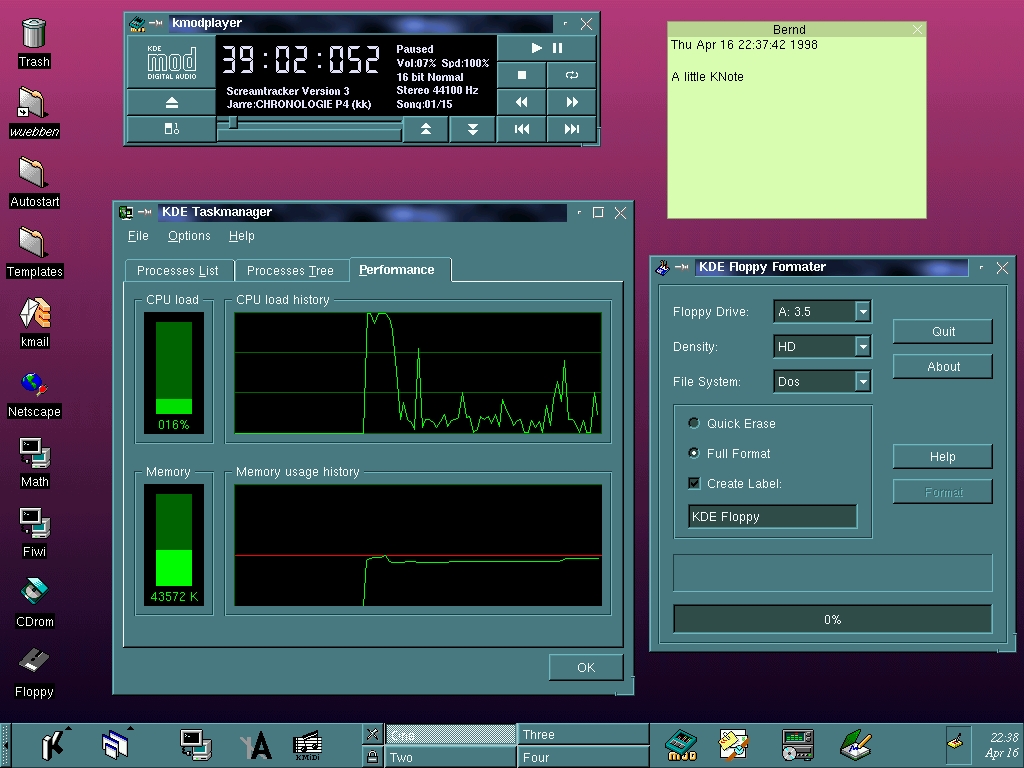
Though the KDE one was copy/pasted from the initial KDE email.
When the NeXT was announced I thought it had been influenced by Randy Smith's (Xerox Parc) ARK (Alternate Reality Kit):
http://worrydream.com/refs/Smith%20-%20Experiences%20With%20...
But it might just have been a coincidence.
(the panel on the right lets you select a "component" like "Notepad" and see how it looked in each system)
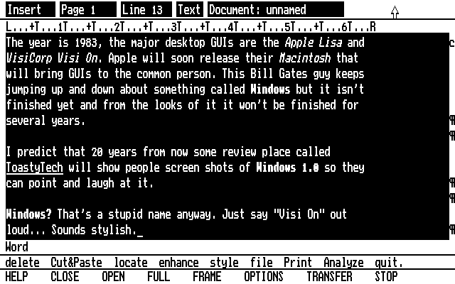
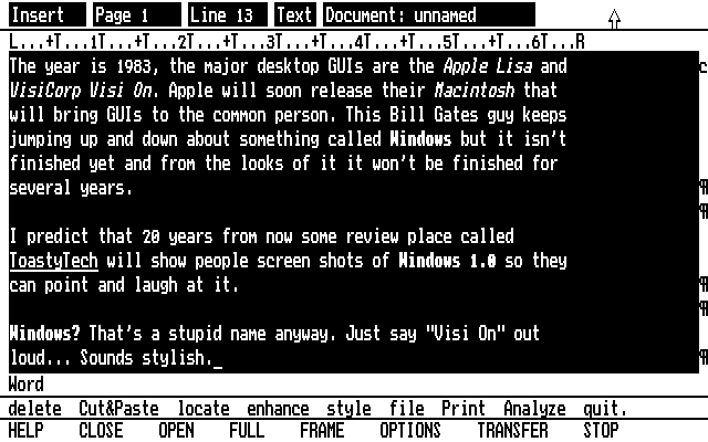
  % curl -s https://guidebookgallery.org/pics/gui/desktop/full/lisaos10.png | sha256sum
  7f4216c0c688c8d6942ddf6457300df7c8f86106729ec4e11c0f6a7d37fd89e5  -
  % curl -s https://history.user-interface.io/img/apple-lisa/desktop-with-applications.png | sha256sum
  7f4216c0c688c8d6942ddf6457300df7c8f86106729ec4e11c0f6a7d37fd89e5  -
Both the GUIdebook Graphical User Interface Gallery and Nathan Lineback/Toasty Tech's GUI Gallery are significantly more comprehensive than the linked-to page.
Speaking of communications, there's things like Strowger switches (https://m.youtube.com/watch?v=xZePwin92cI&t=111) which I think count because that's what people were interfacing whilst using the phone (this became crossbars and relays in the 1910s and 20s respectively)
Relays and telephone tech btw is how Electro the smoking robot from the 1939 world's fair worked (https://m.youtube.com/watch?v=AuyTRbj8QSA)
Even if we want to limit to computers, we have batch versus time-sharing flow, teletype versus graphical terminals and along those lines you have the work of groups like Evans & Sutherland in the 1970s (such as the line drawing system 1 https://en.wikipedia.org/wiki/LDS-1_(Line_Drawing_System-1) ) or Scientific Data Systems which was later acquired by Xerox. You also have the world of analog computers, the most famous of which is the slide rule.
Even then you can go back to the 19th century Jacquard Loom, which even has a solution to "Hello World" on Rosetta Code (https://rosettacode.org/wiki/Category:Jacquard_Loom)
Then you have specialty machines such as the Fairlight CMI synthesizer with the lightpen interface (https://m.youtube.com/watch?v=iOlPCpSmhRM&t=40) which really laid the groundwork of most DAWs to this day. For music there's lots of things. The theremin which you all know about but also things like Nikolai Voinov's "Paper Sound" https://m.youtube.com/watch?v=Mmejo9WL2gY
You also have 1970s CAD computers, many of which were built by large companies like Mercedes, Nissan, Ford and General Motors (https://www.cadazz.com/cad-software-history-1970s.htm)
Then there's video compositing systems as well such as the lightpen based CMX-600 from 1971: https://www.youtube.com/watch?v=PTUdHncIbq8
The history is way richer then this. Nobody has really given it a good general effort IMHO. Maybe I'm the guy? I hope not. That's a lot of work.
[1] https://www.youtube.com/watch?v=GYIPKLxoTcQ
[2] Baecker, Ronald M. (1969). Interactive Computer-Mediated Animation. PhD Thesis, MIT. http://publications.csail.mit.edu/lcs/pubs/pdf/MIT-LCS-TR-06...
Also mind the use of a mouse in another video animation software from around 1970, by Marceli Wein and Nestor Burtnyk, running on a SEL 840A in Canada, three years before a mouse was used at PARC:
Opening the start bar on my Windows 11 I literally have no idea what's going on.
All the "apps" at the top of my start bar are things I've never used and I don't think I've ever even installed. Stuff like Tiktok and XBox.
Then below that I get recommendations, but I don't want recommendations, I just want to find the programs and settings I'm looking for.
I'm not even sure if can get to setting from the start bar anymore, and if I'm looking for the programs I've installed it's behind another click.
I guess it looks nice with all the tiles and transition effects though.
This is less so the case with actual tools and UI’s used for productivity.
Of course when you look at recordings of user behavior for interfaces you realize how dumb the majority of all users really is. And how without those tiles advertising “Xbox” and “TikTok” those users would probably fail to find those even if they were looking for them. ¯\_(ツ)_/¯
One of its fictional products was the Infernosoft Auto-optimizing Keyboard. As you use it, it measures your usage and optimizes itself in response. It makes frequently-struck keys larger and moves them closer to the center of the home row.
If that sounds like a good idea to you, then you undoubtedly have a bright future in today’s software market.
It's a shame that there are so many stupid users that it's profitable to cater to them rather than leave them behind and cater to the experts.
You seem to have this assumption that the Windows 11 start bar is made for you. I'm pretty sure the truth is that this menu is intended to drive sales and maximize profits for Microsoft.
Once you have the right set of premises you can see why it behaves this way and the design is actually fairly decent. (Not great, but don't worry, they are improving it every release)
Nowadays buttons look like plain text labels half the time and every app has its own inconsistent style and even I, someone who has used computers for a long time and use them daily, sometimes have trouble seeing what’s what on a UI.
This. I miss the practicality of these designs. It feels like designers today make changes to justify having work to do to maintain their jobs, and don't actually care about user experience, and in fact many are actively user hostile (see 'dark patterns').
Actually using it was a pain because it was so unstable, if only it had been combined with a proper preemptive multitasking OS.
Things were fairly unified, even though the standards didn't integrate everything. You knew what would open a new dropdown, and what would open a new window, at a glance. There was no need of any implicit knowledge.
Don't worry if there isn't a text box to type into, or if the text box at the top of the menu isn't selected. You don't need to click on it, just start typing. This has worked ever since Windows 7 (or maybe Vista).
And maybe to help find those applications.
And offer a streamlined mode for applications where you just need a quick response where the application doesn't open a new window but just provides a response in the same invocation-dialogue.
Maybe apps could even take modifiers or specifications when invoked, so you don't have to hunt and peck around in menus and additional dialogues after launch.
Maybe there's a place for this?
You can turn off recommendations, remove the default apps, add any other app including settings, set the size, etc.
Once you spend a couple minutes setting it up, it's less cluttered than any previous Windows OS.
It's not just the start bar though. There are similar things all over the OS. For example, if you right click a document in Windows 11 one of the most common things you might want to do, "copy" isn't there. Well it is there, but now it's behind this little anonymous looking rectangle icon at the top* of the context menu and is no longer clearly listed as "copy" in the menu.
Maybe I'm just getting old... But I find UIs are just generally getting more confusing and assume more of the user. For example, back buttons on browsers don't say back anymore, but are just an arrow, because everyone knows what that arrow does, right? And that's probably fair, but even still, I like the explicit text label so I know for sure what I'm clicking is what I'm looking for. The three dots for accessing a menu might be a better example as my parents actually do get confused by that
* The icon can also randomly appear at the bottom of the menu because who cares about predictability when designing UIs anymore.
Not really. When you turn off recommendations, the app icons are hidden but the space for recommendations stays there! Yes, just a big ol' block of whitespace with a prompt to turn recommendations back on. It takes up like 30%+ of the start menu.
It's a dark pattern.
Scrolling to see more content fading in is such a bad UI practice. Completely negating all the natural reading experience.
Ironic - a website about user interfaces has a UI so bad that I could but glimpse the content.
And all the screenshots are stolen, as mentioned in other comments. This guy is just a hustler.
Similarly where's GEM?
https://en.wikipedia.org/wiki/GEM_(desktop_environment)
I'm sure there's a bunch of others missing for "The History of User Interfaces"
Not only did Amiga have preemptive multitasking. The window system ("Intuition") ran behaviour and redraw of apps' widgets in its own task, making them responsive even if the apps owning them were lagging. Compare that to Windows 3.11 of the day, where the entire GUI would hang while waiting for an app to redraw anything in one of its windows.
That is, even in the context of desktop graphical UIs I expected Englebart's oN-Line System (NLS), Sutherland's Sketchpad, X Windows, NeWS, and/or NeXTStep.
Broaden that and there's smartphone UIs.
Or Raskin's The Humane Environment (THE).
EDIT: OPEN LOOK tried to "fill the need for an easy to use desktop for Unix workstations, similar" long before KDE 1.0. There's also the Common Desktop Environment.
(HPUX's SAM not included ;p )
https://sourceforge.net/projects/cdesktopenv/
There's also a 4DWM clone as well https://docs.maxxinteractive.com/
Even foregoing simple UI such as the handle of a hammer, or even the mechanical interfaces of yesteryear such as the differences between a Curta calculator and the original Burroughs adding machine, or a Jacquard loom and so forth...
Limiting ourselves to just binary digital computers we're still missing a lot at this site. IBM 1401 card punch machines... the IBM 360 operator console... the VAX DCL, the original UNIX sh, etc., etc.
(The merits of Xerox SDD in turning the experimental odds and ends of Alto developments into a consistent user interface are generally underappreciated.)
1. The MS Windows 7 Task Manager look very similar to the KDE 1 version (from the late nineties): https://history.user-interface.io/img/kde-1/task-manager.jpe...
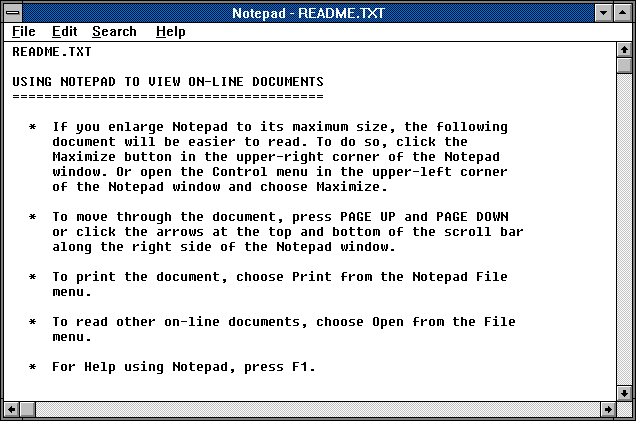
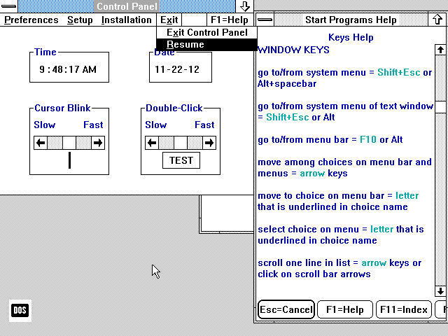
2. In 1990, Microsoft referred to plain text files on the local system as “on-line documents”: https://history.user-interface.io/img/windows-3.0/notepad.pn...
Until Win10, the NT OSes had that same basic task manager with the cool looking green graphs. WinNT 3.51 had a much more crude looking task manager
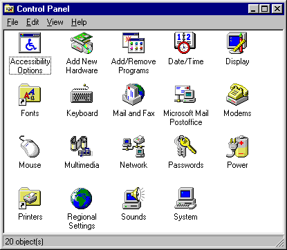
Windows 95: https://history.user-interface.io/img/windows-95/settings.pn...
Windows 10: https://i.ibb.co/SQkQNJw/Windows10.png
https://en.wikipedia.org/wiki/GEM_(desktop_environment)
https://en.wikipedia.org/wiki/Canon_Cat
That would be good. I'd also like to see something that's at a much lower level, basically an catalog of specific ways of accomplishing specific basic tasks in a particular UI, current or historical. I've switched between different OSes, and each time I sorely miss some very particular thing (e.g. Windows' very useful line-based Home/End key behavior vs. Mac OS's totally pointless document-based behavior). I'm sure even dead-end OS's had very good ideas like these that have been subsequently lost.
My weird dream is that some day someone could use a catalog like that to combine all the best ideas into something that's as close to perfect as possible.
This is a quickie, copy-and-paste job from publicly available sources. Mostly accurate, except for calling the Alto keyset "the Alto keyboard." As some of the comments point out, it's quite incomplete.
The back of the internet is broken...
Very cool site though.
A lot I would say, even on a much smaller time scale.
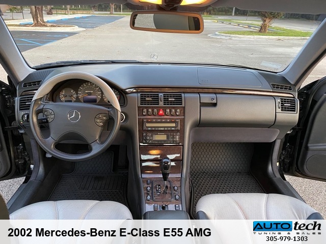
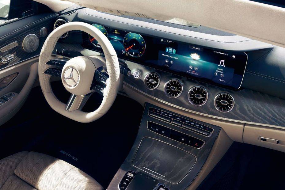
The features are completely different besides the very basic odometers which anyway look very different and present much different information. A modern car not only has much more features, but even the way of consuming the old ones is radically different, and not just because of the switch from analog to digital, e.g. steering wheels have seen a massive amount of analog buttons and levers.
2002 Mercedes Benz E class interior[1]
2022 Mercedes Benz E class interior[2]
[1] https://autotech-miami.com/images/watermarked/3039zg.jpg
[2] https://imgcdn.zigwheels.my/large/gallery/interior/17/481/me...
There's only so much efficiency and clarity that can be squeezed out of a GUI.
Familiarity and consistency are themselves powerful elements of UI/UX.
Upshot: stop fucking with the interface.
Apple, renowned for design, has essentially only ever offered two GUIs, "Classic Mac" (1984--1999) and "Aqua" (1999--2022) Note that the second has been in use longer than Classic, by over 60% (23/16 ~= 1.64).
Good UIs don't change.
Apple have tweaked at the edges, changed some of the styling and colours, and added features (e.g., workspaces / virtual desktops). But a user of the Classic Mac could sit down at a modern OSX system and figure it put pretty quickly.
(I'm actually not a fan of the interface, though I generally use one based on a precursor / ancestor of it, WindowMaker, based on NeXTStep from the NeXT Machine.)
I used to be among those Linux users that wanted to make the GUI look cool™. I spent a LOT of time browsing gnome-look.org and at the height of Vista popularity, the Aero knockoffs were everywhere.
I believe Windows 98 and ME were omitted because this is largely a presentation of the evolution of GUIs. Windows 98 and ME did not substantially differ from Windows 95 in terms of their look-and-feel; the same can be said about Windows NT 4 and Windows 2000.
The only differences I remember are quick start icons in the taskbar, and gradients in window title bars.
https://guidebookgallery.org/guis
This seems much more comprehensive, has screenshots of specific UI elements and controls to view different tabs within those screenshots.
Edit: Interestingly, there's no representative image of this to be found in image searches, but here's a screenshot of a third party tool: https://www.google.com/imgres?imgurl=https%3A%2F%2Fimg.infor...
From Softimage, ALIAS|Wavefront through Maya to Blender etc... This UI model is interesting.
I personally started on Softimage on the SGI (Also, I didnt see IRIX in the list).
But Softimage had one of the most novel UIs of its time.
Is "workbench" truly a different metaphor from "desktop," or is it just a different word used to avoid legal hassles?
I liked seeing the hardware in the first two pictures. It gave an idea of what it was like interacting with the computer. Do you think you could add this for some of the other interfaces, even multiple form factors if they existed for the operating system?
The title promises more than is delivered: computer user interfaces existed before the GUI, and interfaces to physical machines in general have existed for centuries, and a lot of those antecedents have influenced present-day computer interfaces.
I just recently collected old screenshots of Facebook, Twitter, and other popular sites from 2010 and before. Looking back, all of them have a certain charm I would like to bring back in future personal projects.

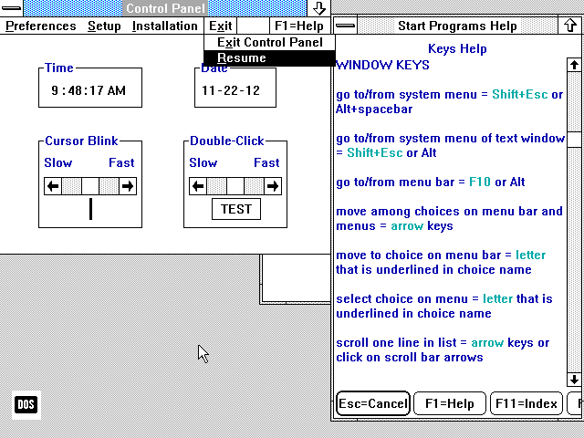
.jpg#mw-jump-to-license)