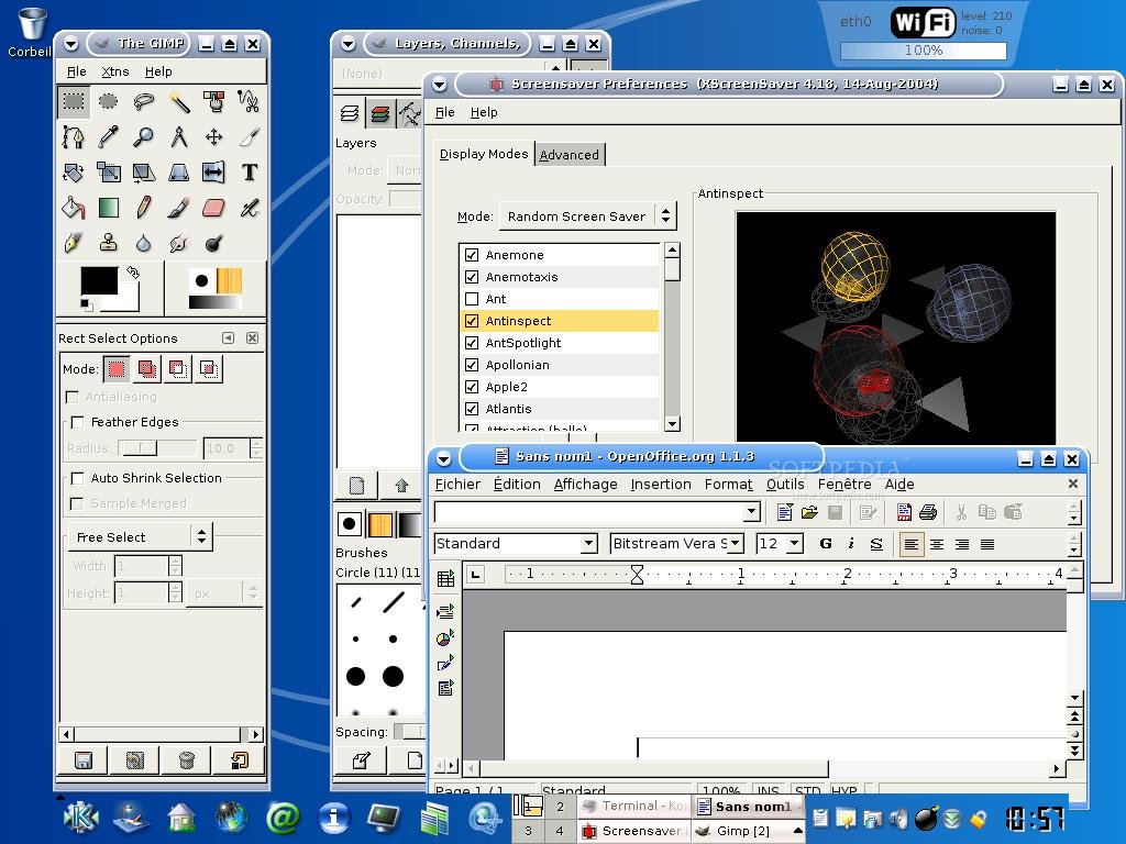
Below are two examples of "looks fine":
Case #1. Thin non-antialiased fonts sirca Windows 95:
http://i1-linux.softpedia-static.com/screenshots/Arch-Linux_...
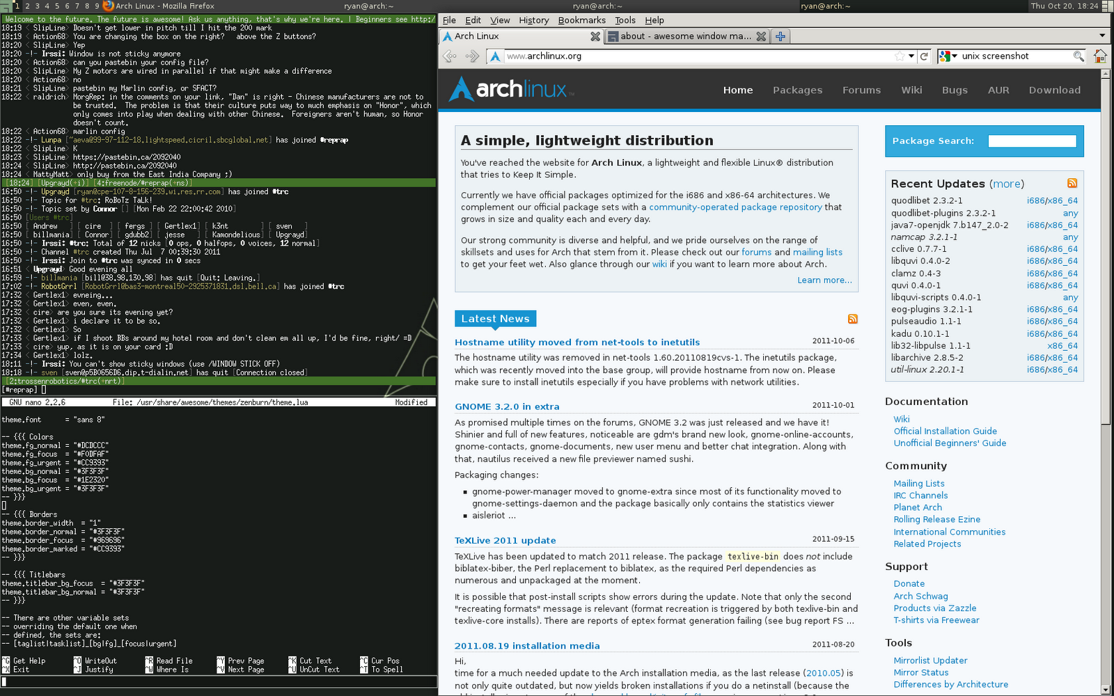
Case #2. Default Arch anti-aliasing with poor quality:
http://1.bp.blogspot.com/-JZ2dKqaJUYw/TqCuVyI3WDI/AAAAAAAAAj...
Just look at "archlinux" rendering in the URL.
And this is how Ubuntu looks by default:
http://www.documentingreality.com/forum/attachments/f111/334...
Notice the excellent typeface they developed themselves, consistent and high-quality anti-aliasing, etc. This looks gorgeous on a modern high-DPI screen. Group #1 thinks this "looks blurry" and Arch works fine for them.
Simply put, It is technically impossible for Arch to provide you with the best font experience because their freetype is compiled with, hm... parts of code removed. The parts that are responsible for hinting, bytecode interpretation and subpixel rendering. And the way they ship Open Office and Firefox (well, last time I checked) makes their fonts non-configurable at all, since they ignore system/global version of freetype.