Now a whole bunch of people who haven't seen Google's test data are adamant that their redesigns are a usability disaster.
Unless something has radically changed within Google, I'd be very reluctant to question any of their design decisions. I'd be doubly reluctant to call them arrogant whilst panning their design based on nothing but instinct and supposition.
The desktop environments show this best: c.f. Gnome 3. Also Gnome 2. And Gnome 1 for that matter (vs. KDE2). And KDE4. And KDE3. And Windows Vista. And OS X Lion.
But at least they have provided the functionality to go back to an old style look (albeit i had to dig around a bit and the average user may struggle, GMail settings are not the most user friendly IMO). I very rarely use it, but I still struggle with the ribbon style menu in MS Office, and that's been around for years!
(I'm still not a fan, as I can't use my old custom color scheme, but that's another matter)
I've had some thoughts on this recently, and wholeheartedly disagree. We spend aeons engineering stability into every other interface within a software ecosystem, since it's supposed to improve stability, reduce surprising breakage, improve engineer efficiency, discoverability, etc., but when it comes to interfaces in the user plane, it's like the only established methodology is FUCK YOU Driven Development.
In these systems, and Gmail, the user is not considered an intelligent, complex actor in the system, but instead something more like a child sitting in a cinema whose only criteria for synchrony is to be repeatedly dazzled by confounding changes to the way it interacts with the system.
This is fundamentally wrong in so many ways. Not least, the user is the main purpose for the existence of these systems (er, right??), and yet the user's interface to the system is the one most likely to functionally break without warning.
You cannot address the reliability of the entire system without considering the last mile - dropping a change the size of the Gmail redesign on millions of users without a multitude of small iterations, or with a huge amount of fanfare and warning, is an unmitigated disaster for the reliability and efficiency of the overall system.
I don't give 2 fucks how much of the scientific method was abused to create the new system up to that point, if it doesn't comfortably fit the millions of delicate tendrils that have grown between my mind and it, then from the user's perspective the change is much closer to an abject failure.
I suspect in years to come this will be an increasingly important area for study, and I pray the outcome to some extent will simply be that corporations will need to give up achieving quick feel-good wins by arbitrarily fucking with the user-machine interface, although I could be wrong. We could always be further reduced to that mindless entertainment-only child in the cinema, responsible only for the most basic direction of the outcomes of our interaction with the overall system, the tacit attitude of the large corporations as they drop huge changes like this without warning.
The outcry we hear over these changes isn't just bored people being picky, it's the sound of a trillion dying neurons in a million interconnected biological systems. Much as a fully grown cat wouldn't fare well being stuffed into a jar, the users here suffer just the same. Thin the cat's diet slowly over time, widen a border here, replace some text with an icon there, and the small bits of death and shrinkage that occur over time will mean that cat will soon be ready to contentedly purr its way into that jar and fall into a dreamy slumber all of its own accord.
You seem to be suggesting that having to learn something new is like having your brain die. That seems inaccurate. Isn't learning a (not very) different interface more like having to exercise a muscle a little bit that you were hoping not to exercise? I mean, not a cool thing to do to your users if the new interface is worse, but not inherently a bad thing.
It's the sort of thing that happens when a priesthood in a field comes to possess the One True Knowledge. They start to issue statements like "you can't trust your intuition" and "you don't understand this enough to like it yet"
OS X Finder UI is a mess anyway, so changes that make it easier for non-technical folk are probably net positives.
I don't have a good public example in mind, but the users at my employer often flip with volcanic rage when applications are changed -- even godawful VB5 legacy apps. Usually you can discern the "I hate change, and am typing up a memo of complaint" arguments versus "you made things worse" arguments based on who is complaining.
With respect to GMail, when people like pg who get the big picture are saying that the UI sucks, it probably sucks.
this very website proves that that is not necessarily true.
That isn't a usability disaster. That is a habit/memory disaster.
What it's not is incontrovertible proof that the new one is "bad". It might be great, but it's still a net loss of productivity while the users learn it.
If we take what you say is true every redesign is good, which is patently false.
A perfect example is the Office Ribbon UI, an unmitigated disaster. Also putting Vista in your list there, mmmmmm. Wasn't exactly a great redesign was it.
The Google redesign is also pretty much a disaster.
Are you kidding me?
use ms office daily, love the ribbon.
And that applies whether or not the change has merit. It's inherent in the process. So any analysis of a UI that starts with an "I HATE THE CHANGES!" blog post is flawed and (in the scientific sense) biased. Show some testing, write your own rant, or just sit tight.
I think two things are entirely possible here: One, that in reaction to Bowman's high-profile indictment of Google's design culture, there has been a shift over the past few years toward Apple-like, auteur-driven design at Google, that was misapplied in this case, or (I think more likely), every detail of the new Gmail UI was extensively tested by itself, but there was no final arbiter to say "you know what? This one part sucks; let's change it despite the data."
That said, I have trouble believing that changing the buttons from labels to icons could have possibly tested as an improvement. I'm with the OP; I have to mouse over every button and read the tooltip to find the Report Spam one.
My facts may be slightly off, but Brin essentially gave a lot more freedom to designers. As part of the Google redesign (or +ifying), Brin gave all the design responsibilities to the same division that's been producing some Google's commercials. This is undoubtedly a division that appreciates design more, but arguably doesn't appreciate the data as much.
After this, we all saw the obvious redesigns across Google's products. With such a drastic redesign, I am doubtful they did any large scale a/b testing that they typically do (for individual features or otherwise).
Its pretty evident something changed, and I personally have no doubt it's due to changes in the way Google goes about design. They've swung from one end of the spectrum (data obsessed) to another side that's too focused on 'artsy' design.
that also explains why my any of my searches failed to come up with any sources. anyways, if anyone wants to go here: http://googlesystem.blogspot.ca/2011/10/more-about-googles-n... it explains some of it. The division I was referring to is Google Creative.
That's not overuse - that's just bad use :-) There is nothing to stop people split testing radical redesigns.
The page has since changed again, I believe, and it's even more of a mess. Scanning the page while scrolling is nearly impossible unless you've very carefully placed your mouse pointer over elements that do not expand on hover. (It's really maddening and I barely use the page anymore because of it.)
I may be wrong. To confirm whether things changed or not, we'd need to get Google insiders to speak out on that subject.
At least, we can see there was a significant increase of "Gmail interface sucks" articles when the new UI came out. That has to represent some part of the users, to the least.
Personally, I don't mind the new interface that much -- once it's in compact view and you change to a darker theme. They did make some significant improvements for folks who live in multiple Google Accounts, and I think the Google+ integration is pretty slick.
But, there is no way that incessant testing produced metrics leading to the default white-on-white theme and non-compact view configuration. Maybe they surveyed people with poorly chosen questions or did something else that caused the testing to fail. But they didn't do a meaningful usability test that involved using a mail app.
GMail originally moved email UI forward with the conversation view -- I think they saw this new look as a similar thing, and pushed it out.
From my experience, the new design is horrible for usability. The lack of definition between the menus and the content makes it much more difficult for me to pay attention to the emails. --I've had to switch to a theme, which helps a bit, but in my opinion it's still much harder to use than the older design.
edit: As for knowing what you've acted on, I always archive an email when replying. There's a Labs feature called 'Send & Archive', which makes this easy.
To make a 'good' product, you've got to make some tough design and feature choices on your users' behalf. Case in point: Microsoft vs. Apple. Microsoft are well known to test extensively with "real" users, and Apple, well…don't!
http://farm7.staticflickr.com/6034/6310566055_4a5f5d4a53_b.j...
http://farm8.staticflickr.com/7100/7117915617_c0c8cab3fc.jpg
http://farm8.staticflickr.com/7100/7117915617_c0c8cab3fc.jpg
Any other wrong advice you'd like to try to contradict me with?
The: Gmail, Unity, Gnome, etc.. redesigns that we've been seeing recently all seem to have a pattern. A lot of these designs are benefiting and emphisizing the designers desperate attempt at garnering attention and acclaim rather than helping the users. You can tell by the constant tweaking of things that were never broken (the Start button), critical and heavily used elements being hidden or tucked away behind several clicks for the sake of "minimalism", incorrectly correlating a sterile white page with "simplicity". And they won't stop until the whole page is white and empty with one button and a line of text.
These designers are doing whatever makes them look off the wall bat-shit-creative (of the Lady Gaga variety). Many of these designers have stopped caring about a/b tests and the users and are focusing their designs solely on how it makes them look to the community. They want to be the next Steve Jobs, now that he has passed. And they are going to mimic his arrogance, take his risks, and think it will get them to his level. It will not, it's just pissing us off.
On a shallow level, and to the untrained eye, these redesigns are pretty and minimalistic but on a deeper level they are deeply flawed. Explaining to the average person why the new gmail UI is abnoxious is like explaining to the average person what's wrong with Michael Bay's films.
In WebStorm, they completely removed the scrollbar in the code editor, and replaced it with this "hidden until you mouseover it" slider thing. That means you have no visual cue where you are in a document, scroll-wise. And no way to quickly grab the scrollbar with the mouse since you have to hover and wait on the right edge of the screen before you can see where you're headed.
Making it worse, they have (normally) really useful gutter over there that displays colored bars describing the health of your code. Those are cool, but they now live on top of the scroll bar so even when its visible it's still pretty hard to find it.
Compare that to their (awesome) ReSharper plugin for VS.NET that preserves the original scrollbar and adds that helpful gutter bar next to it. You can quickly see the health of your code AS WELL AS where you're scrolled in the document. Perfect.
I filed a bug against WebStorm about this and had it immediately closed as "by design". Worse UI. Intentional. And not even a setting you can uncheck to fix it.
I actually uninstalled my paid copy of WebStorm as a result. It'd be an awesome product, but all its advantages are wiped out by not being able to navigate around files at times when I have a mouse in my hand. One bad UI choice to turn a good IDE into shelfware.
I doubt Google would let a group of self interested ego fueled creative's override rational principal and analysis. Especially considering this is a flagship Google product with 350M users.
>On a shallow level, and to the untrained eye, these redesigns are pretty and minimalistic but on a deeper level they are deeply flawed.
I'm a designer. I've never properly critically analysed the new Gmail design. But I haven't felt the need to. For me it just functions really well.
Am I missing something?
I feel like Google has suffered from a similar problem - the solution to every UI problem these days is minimalism. Remove borders, accents, highlights, colors. On the surface it looks clean and simple but scratch beneath that and it seems to have no soul and no reason to exist.
I think the same issue goes directly to functional aspects as well - the functions and features on the page should feel alive as if they are speaking to me. I should be attracted to them, immersed in them, like they've been incorporated as parts of myself - but I'm not - I can barely differentiate them from the inactive, static parts of the page. Most of Google these days feels like I am filling out an IRS tax form. At best it is boring, at worst it is aggravating.
I'm looking forward to when we get through this new style of design from Google.
Interesting observation... this is something I struggled with as well coming from a coding background and trying to do design -- at the individual element level the colors seemed great, but pulling back to the larger picture everything looked washed out. Did you ever come up with a solution for this?
Think about it (loosly) the way you think about inheritance in OOP. What is the parent, what are the ancestors.
All elements on pages have a priority. That priority should be the guide of your visual heiarchy. This can be done with size alone but it can also be done with color.
Also black or almost black (#222-#333) as copy is always a good way to make sure your page has contrast. But again it depends on what you are doing.
I really need to finish my book on design for developers. I think I have found a way to create the bridge between being a developer and a designer. When I get to new york I will have more time.
I'd say that depends on the subject. I don't want bold decisions to try and energize my experience with my text editor.
In case you miss the old color scheme, try this Stylish theme:
http://userstyles.org/styles/64637/gmail-google-mail-classic...
Follow Jason's post to fix icons and spacing:
http://jasoncrawford.org/2012/04/how-to-cope-with-the-gmail-...
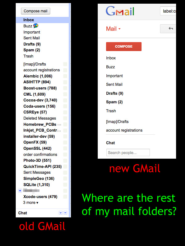
There are some good design additions in the revised gmail too, but IMHO the above is really what makes gmail feel much more cluttered and cumbersome than it was before....
It's interesting to me to see so many people grumble at interface changes whether it's Facebook or Gmail.
1. Pick a different theme. I have one with a blue background, not the default light/white one.
2. Go into the general settings, and change your star to a different colour, ie. enable the red, or blue one, or the green checkbox. Now they stand out.
3. Go into the general settings. Change the 'Button Labels' radio from 'Icons' to 'Text'.
If you're going to bag someone's interface, you should at least spend some time figuring out how you can change it...
The three points the author pointed out are some glaring usability issues that can be a problem for a big chunk of people. Just because you or I can use it without a hitch doesn't mean its a great design.
Guess what? The new design sucks far more.
I'm hoping that they'll do another revision soon to make it look more like the recently updated G+ design, which actually puts some visual separation between content and navigation (and also doesn't have giant red buttons).
Fair enough that you don't, but putting your opinion forward as fact (like most of the people here and the OP) doesn't really advance the argument. Perhaps a lot of people have trouble finding the compose button on first use?
In fact, I found it difficult to explain to my parents how to navigate the new interface. They were quite upset at the changes and were considering about how to revert to their old providers (thankfully, I set up an email forwarding domain for them years ago so they can change any time they wish). It really is that appalling!
The contrast in usability to almost any other web mail service is shocking. Check Hotmail or Fastmail.fm or even Yahoo mail and "feel" the difference yourself!
Workaround to GMail's new interface:
0. Make sure you have a browser or plugin that supports site-selective scripting, e.g. NoScript.
1. Disable scripting for google.com
Then when you login, GMail offers a "basic html" interface. This is amazingly straightforward, fast, everything clearly delineated with strong colors, all new information extremely obvious, and just the basic design that matches closely to the old design.
If Google manage to mess up even this basic interface, then I guess, I and my family will have to find alternatives, e.g. switching to mail clients or for those who travel a lot to Hotmail.
The authors criticisms are legitimate and directly related to the design, but to assume an arrogant designer is at the top pushing these changes is frankly offensive. It's the same old engineers calling the shots at Google. But now, they just seem to be trying to keep up with other well designed products, like a little kid putting on his dad's Italian suit, wondering why he doesn't look great. Pleas, don't blame the tailor.
Thanks, Google, for making me contemplate abandoning gmail for the first time. (I know, I know... it's free, right? So what right do I have to complain? I guess I'm mostly angry at myself for growing so dependent on it (and recommending it to my friends/family.))
A couple of random thoughts from usability tests I've done over the years:
* People are treating the changes to gmail in isolation. Google has changed and integrated design over all of their products. Some parts of a system can get "worse", but still help the overall system get "better". I've seen this when we culled some specialised hi-density layouts on a particular part of a larger system that pissed off some expert users who spent all their time there - but opened up the functionality to be used by a much larger population who were more familiar with the "normal" look.
* People don't know what Google is optimising for. Usability and usability testing isn't necessarily about "making things nice for the user". It's about meeting the business goal. For example I've seen users hate the fact we took some layout and colour preferences away from them, despite the fact that overall satisfaction went up, and efficiency increased even for the users who hated the change.
* I 100% guarantee that the people commenting here are not "normal" as far as Google is concerned. Does it matter if the geeks like me hate that they can see less e-mail at a time, if the other 99% of the market is jumping for joy that they're not repeatedly clicking on the wrong e-mail? Sometimes you just can't make everybody happy - so have to make a decision over which audience you want to be happy. You will generally have a more successful product if 60% of your audience goes "yay" rather than 100% going "meh".
* I spend a bunch of my time talking to "normal" users. I've noticed the general reaction to the new GMail be very different from the general reaction here. They either liked it, or just not noticed/expressed an opinion. I suspect Google cares about that user group more than it does me :-)
Also, and this is complete guesswork on my part, this feels like a first stage to me. Currently the various apps are very lightly integrated with a mostly pure visual design makeover. I wouldn't be surprised to see more functional integration appear over the next year or two as more people perceive the various Google apps and systems as an integral "thing".
You can remove the importance markers: Settings > Inbox tab > Importance Markers.
Incidentally, the new UI for video calls makes the 'end' button the same color as the background, and it is very difficult to see.
Just to take one point: the icons are confusing at first, but mail is something you daily for years, and Gmail has always been optimized for power users, so even though it might take you a week or two to get used to the icons, it's a benefit because now a greater percentage of the words on the screen are actually your email content.
Nice big text with high, but not too high, contrast. What's not to like?
To be fair to the blogger, he probably is also a victim here: he's probably reusing a theme (edit: yep, scroll to the bottom) whose designer committed the tiny-text idiocy.
At least he didn't do low contrast and tiny text like most other sites do (e.g., posterous). :)
http://qwerjk.com/revert-gmail
http://productforums.google.com/forum/#!searchin/gmail/qwerj...
Your last two points I agree with, but given they are optional and can be switched off I think those criticisms are not only misplaced but suggest a sense of entitlement similar to the designer's arrogance you bemoan.
On your first point though you are simply wrong. The thing you incorrectly call 'visual texture' is actually clutter.
The borders for individual table rows are superfluous as the baseline of the text draws that line regardless. Additional borders duplicate these baselines and demand that a user reads twice as many visual elements in order to interpret an interface.
The same is true for coloured backgrounds. If a distinction of utility has already been inferred by shape and proximity then to add an additional visual cue adds little more than another layer of complexity. This is unnecessary visual information that a user has to decode. Time that could be better spent performing the tasks they've actually come to the app to do.
I'd suggest having a read of Edward Tufte's The Visual Display of Quantitative Information and Envisioning Information to get a better grasp on these concepts.
I ended up moving to Mail.app (which isn't perfect) because of the hideous in-page scrolling forced on me in the new Gmail interface.
Desktop experience is unbeatable; snappier interface, better performance, wider access to system resources, better integration with the OS, and you don't have to rely on the browser to be open all the time. I find this advantageous especially when composing emails.
But since this new design rolled into beta I've found myself slowly depending on Gmail more and more vs. my desktop client.
I don't know why but the "lack" of proper interface design here makes it feel blazing FAST to me, which is really the #1 thing I care about when trying to keep up with a slew of email.
I never had that sense in the previous version.
Anybody else?
This regression in UI standards that evolved and stayed in place for decades reveals that there aren't enough decent designers to do the required work today. And they don't have even a moderate level of experience or common sense, or they wouldn't make such glaring errors.
That being said, I know the feeling the parent is talking about, but I never got that feeling with Gmail. It was something that worked and that's what I appreciated about it.
Why is that so hard?
EDIT: No really - why is it so hard? Better than 90% of the complaining on this page could be solved just by spending a few minutes going through settings, tweaking GMail to your liking. There's even a settings page where you can see all of your labels in one place, and set each folder to show/hide/show if unread. It's specifically designed for the parent's use case, and yet he pretends that it doesn't exist.
In the case of labels especially, gl followed by a few characters from the label, then Enter gets me to the label page before I would even have time to figure out where my mouse cursor is.
(I still use Yahoo Mail for online account signups, as well as friends and relatives going way back -- I opened the account in the 90s)
Something as basic as this is missing in gmail's default interface. Having to save and go back to drafts is cumbersome, as are other work-arounds.
https://chrome.google.com/webstore/detail/bmihblnpomgpjkfdde...
This and similar tools let hide and modify GMail with custom CSS and Javascript. Instead of trying to convince Google to behave rationally, it's easier to try to warp the new interface into something usable. I think about half the things in the article are already covered.
If only I could figure out a way to get the "stars" on the same side in the message view as on the overview...
They completely REVERSED it!!
Previously:
Blue - No new message
Orange - New chat message
Now:
Blue - New chat message
Black - No new message
Orange worked perfect -- it grabbed your attention. Blue doesn't really cut it, even worse that it is opposite to what it meant previously. BAD DESIGN. Period.
To further elaborate on taste; Engineers often refer to this as "elegance". Two bits of code can meet all specifications and requirements. Engineers with taste will feel the one which has elegance to be superior.
To take it further, just as the shortest code isn't always the best, the most minimal design is also not best by default.
https://chrome.google.com/webstore/detail/dheionainndbbpoacp...
I don't claim to be a minimalism expert, but more often than not people who talk about minimalism seems to think it's either cleaning up your house or removing stuff that "People don't really need", without figuring about what the basic needs actually are. Removing all door handles from your house doesn't make it a minimalist home.
    > I’ve certainly encountered this attitude before. Mozilla UX designers
    > like to use the example of tabs-on-top: when we moved the tabs above the
    > navigation bar in Firefox 4, many users balked at the change. But nobody
    > could give a reason why tabs-on-top was worse — they just didn’t like it
    > because it was unfamiliar.
I think that's important to remember. The UI designer is always trying to give you a mental model for how their device works, and how the parts are causally connected. The "designer arrogance" is much more understandable when it applies to people who are merely upset that their mental model is changing. That is not the case with the facelift choices of changing text labels into icons, or removing borders and highlights. Those cannot be a valid occasion for this sort of arrogance.
Now, I understand that what I am talking about is sort of a personal preferences as well, but I guess my point is that I would care more about changes to functionality in GMail than small, minor visual changes like the ones this author describes. I sort of agree with their mentality that people eventually figure out the new UI and then it is no longer an issue.
Why I love Gmail is combining 80% of the power of CLI mail clients like mutt with 80% of the visual presentation of native clients.
I process hundreds of emails a day, and that's on top of the coding work I'm expected to do. Being able to work through them with vi-style keyboard shortcuts for everything including rapid labeling is the killer feature that nothing else comes close to.
1) Try a different theme, it may help if it really affects you that much. But this is the only one I somewhat agree with as being possibly an issue; but nothing I really thought of when first looking at the new UI
2) The marker is more than far enough away to make it easy to scan through IMO. This feels far too subjective to just throw out and be like "yea this is definitely a bad change" without doing some testing first. Either way, you can disable this from settings. (Disable snippets iirc?)
3) This too can be disabled: go to settings and change it to text labels instead of graphical labels?
As much as I used to hate the new look too, I think it's improved enough since its first iteration to get out of the way and let me do my thing. Though, I still REALLY hate the fact that you can't click on the "Google" logo at the top left to go back to the main page for whatever application you happen to be at. I have no idea why they would remove that...
1) remove important markers 2) add labels to actions/buttons
Even closer revert-to-old via the Stylish plugin and CSS hacks.
You /could/ fix it, but should you have to?
I hope Apple stays competitive/serious about iCloud - they clearly have a few things to teach Google (and vice versa, of course).
Monochrome icons, no text. Ugh, horrible to use.
The "..." dots is probably an example of the latter - I'd guess that Google wants people to view entire conversations by expanding the conversation view, not by clicking "...", so they make one way much easier than the other.
I noticed people always complained about GMail having bad service (like me, when I couldn't open particular pieces of mail for a few days at a time).
How do these problems change when we become paying customers of Google? When I get a Google drive, do I get help in fixing problems? Or is that a lie I want to believe in?