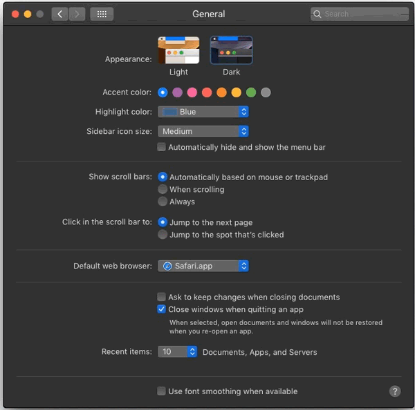
I agree that there's substantial qualitative difference between sub-pixel antialiased text and the plain render. The former takes advantage of greater lateral resolution and perceptual differences between the primary colors. That said, I wouldn't consider the absence of that technique jarring. I intentionally change bright-on-dark text to greyscale antialiasing[1], to counter the halation[2]. All the links to images in the thread and the Reddit post you linked are dead, so I can't see how the text rendered for you. Did you by any chance experience this on a MacBook connected to an external monitor, where you had the system set up to render type better on the built in screen[3]? Your point holds though, they don't optimize for 3rd party hardware. I was a bit quick to jump in, thinking you were referring to the difference between their flavour of sub-pixel antialiasing and Microsoft's ClearType[4].
[1] https://srdjan.si
[2] https://bootcamp.uxdesign.cc/why-dark-mode-isnt-a-ux-panacea...
[3] https://cdn.osxdaily.com/wp-content/uploads/2018/09/font-smo...
[4] https://damieng.com/blog/2007/06/13/font-rendering-philosoph...