Medium.com is the worst offender. Their font size is small and they disable zooming on mobile!
1. People who never adjust font size.
2. People who regularly adjust font size as needed.
The first group is helped by a reasonable responsive font size. The second group isn't hindered by it.
Is there really a significant group of people who carefully set their preset font size, but then do not adjust it as needed when they visit a page? It seems unlikely to me. Even if all webpages used your defaults, there’s still no one-size-fits-all preset to pick, since typeface, weight, layout, leading, colors and many other things also impact readability. The tool to take control of all of that is reader mode, which is a great option when a website has screwed up its typography.
I think you're missing:
3. People who set the font size once, when they configure their browser, to their preferred font size and expect, for some weird reason, that this will be respected!
> The tool to take control of all of that is reader mode, which is a great option when a website has screwed up its typography.
That would be great, if there wasn't a huge correlation between websites that screw up their typography, and websites that use an ungodly mess of nested `div`s and javascript-based content rendering that breaks reader mode.
If the user wants a different root font size, they'll set it themselves.
'Don't resize my fonts' is such a narrow view of whole range of design considerations.
I use somewhat similar formula in one project to create a common baseline font size that 1) does not break with viewport size changes 2) remain legible for baseline user 3) gives good base value to scale UI elements by rem/em units.
Of course it's also a project where the user does not have a chance to mess with font size anyway for the main user, but I'd reuse the formula elsewhere.
Wish I could query the browser if the user has specific preferences, just like with "Dark mode"
And I'm not changing the font size on every website I visit for the rest of my life just so that HN can display properly at 100% zoom.
Of course CSS actually does. I've found using font size keyword and rem units can make a UI that scales with user preferences quite possible. Not _easy_ of course, but possible.
As it seems from your post that you may not be extremely familiar with CSS, here is a ruleset that will do something close to what you wish. Font is set to 26px, not 14. You can easily change that.
Make it valid for "Everything" and it will be valid for everything but those sites that are extremely convoluted.
    *, html, body, section, article, div, span, p, i, b, strong {
        font-family: "Libre Sans" arial, helvetica, sans, sans-serif !important;
        font-size: 26px !important;
        font-weight: bold;
        line-height: 1.5em !important;
        background-color: white;
        color: black;
    }
    pre, code {
        font-family: "Libre Mono", Courier, monotype !important;
    }
   a {
        text-decoration: underline;
} * {
font-size: 23px;
line-height: 1.5em
}
a {
text-decoration: underline;
}The Dark Reader addon for Firefox is somewhat poorly named, it seems to be a pretty solid overall website customization tool. It can, for example:
* force websites into light mode
* change backgrounds to plain white and text to plain black
* apply tints in general
* force font line width changes.
Might be worth a glance. I have pretty good vision but I just use it because the way the internet is supposed to work is: send me text, I’ll render it however I want. This lets me ignore more meddling by designers.
At the browser level I've found myself wanting to reorganize layout quite a bit, and am starting to think about templating from a user perspective beyond light/dark theme. What assumptions am I making about intent in my work? How can I provide flexibility and when should I step back and just link a csv dump?
I think my ideal modern browser looks more like a crawler. Display of info loosely coupled to site content. All of the scripts I'd actually want to run pulled down on my side from public repos.
The posts.atom file has all my actual content.
What is the rest of my website for? Somehow I was tricked into writing it, but it's essentially a feed reader for a single feed.
Why can't I just serve a posts.atom and trust Firefox to know what to do with it? It already has a Reader mode.
I wonder if there are custom CSS chrome extensions that allow you to apply a font to all sites not just one.
We can fix that :D
  :root {
    font-size: 1rem;
  }
  @media (pointer: fine) {
    :root {
      font-size: calc(1rem + 0.25vw);
    }
  }
  @media (pointer: coarse) {
    :root {
      font-size: 1.25rem;
    }
  }
  :root {
    font-size: 1rem;
  }
There are good reasons to use different font sizes for body text depending on purpose. Hacker News' small fonts fit more comments on the page. A documentation site may benefit from fitting more text on the page. A spreadsheet benefits from even smaller text. The article is easier to read with larger fonts. I tried the article with your rule, it's just not as nice.
Then I changed around my "preferred font size" (chrome://settings/fonts -> Font Size). Blog responds just fine to it. Ironically many, many, many sites don't. It's actually so useless in general to change your default font size that browsers have a much more useful way of letting users have small or large text -- zoom levels.
Everybody please clamp!
I get a lot of flak that my blog [0] scrolls horizontally by default when JS is enabled, because that is intentionally weird, but it's one of the only websites I know of that is "readable like a newspaper" when full screen on an ultra-wide monitor. Some posts you can read the entire article at full screen on an ultra-wide with no scrolling at all. I'm proud of that and I like that for my own enjoyment, even if few others appreciate it.
https://utopia.fyi/ is good for these calculations
“…for font size, typographic scale, and spacing.”
The main container’s width on their website also doesn’t scale infinitely, so on a very wide screen you’d have a lot of blank space on both sides.
That being said, it might still be reasonable to set a break point (or use CSS clamps) and prevent further font-size growth beyond a certain point.
For example comparison with the OP's site:
- dynamic on : https://files.catbox.moe/qwa2az.png
- dynamic off: https://files.catbox.moe/glu3ud.png
I'm guessing it's one of these two things?
1. Designers now disagree with the result of that preexisting calculation.
2. Designers are OK with making fonts on mobile smaller than the ideal reading size so that they can fit more content on screen (doesn't seem like a very designer-y thing to do).
Edit:
Or, #3, this is an alternative to the trick I assumed was ubiquitous:
<meta name="viewport" content="width=device-width, initial-scale=1" />
Edit 2:
Scratch theory #3. The author's site and all three of the sites he cites have that viewport line.
It's because the first phone browsers had an insane default, and the standards body decided the insanity should be kept for backwards compatibility.
Having a viewport meta turns the insanity off, but only if you set the content area.
Mobile browsers do the shrinking by messing with viewport defaults, so we fix it by re-applying those defaults.
I think the MDN doc's only mistake was describing "device-width" as "100% viewport width", since that seems like circular logic.
What comically never fixed anything. But yeah, that's the rationale.
AFAIK, mobile browsers only actually managed to display non-text sites when pinch-to-zoom was invented and the sites started to include the viewport meta. And they only managed to display text-only sites by reflowing the contents. The shrinking the viewport era was a deep local minimum of usability.
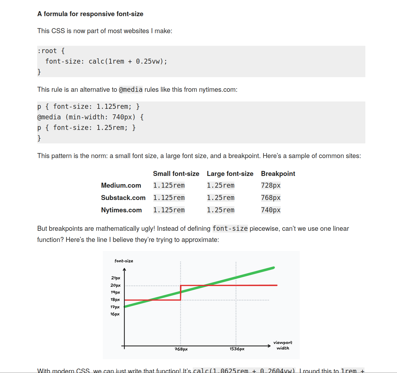
I’d suggest instead something like ~16px at 360px viewport width, and ~20px at 1600px viewport width, and clamping at these values. Slightly different curve, and capped a little more sensibly, in my opinion. (Personally, I tend to stop shy of ~20px, going more for ~18px.)
With these specific values, a verbose expression of the font-size is:
  /* 1rem @ 22.5rem, 1.25rem @ 100rem */
  clamp(1rem, 1rem + ((1.25 - 1) / (100 - 22.5) * (100vw - 22.5rem)), 1.25rem)
html { font-size: 62.5%; }
https://www.aleksandrhovhannisyan.com/blog/62-5-percent-font...
Has it gone by the wayside? Is it no longer a best practice?
The idea behind it was that the browser default font size was 16px, so if you set the root font size for your document to 62.5%, then 1em = 10px, and designers who really, really wanted to work with pixels could use ems and pretend they were using pixels without doing complicated maths every time they wanted to set the size of something – they just needed to divide or multiply by ten.
The reason for not just using pixels was partly because it was drummed into everybody’s heads at the time that ems were better than pixels (which, in context, they were, but not when you pretend they are pixels), and partly because Internet Explorer at the time was unable to resize text set in pixels when you increased the text size, which was an accessibility failure.
The problem with this idea is that pixels and ems are fundamentally different types of unit. You can’t make them equivalent using any kind of calculation in CSS. Pixels are objective, whereas ems are based on user preferences. The browser might default to 16px font size, but users can pick something else. So if somebody had poor vision and increased their default font size; or if they had a small laptop screen and decreased their default font size, 1em * 62.5% != 10px, everything the designer set in ems was a different size than they intended, and a lot of their page layouts disintegrated into an unholy mess.
You can’t convert between ems and pixels in CSS. Any calculation like this is fundamentally broken from the start. Nobody should have ever used the 62.5% hack.
Howdy, author of the article you're responding to (but not the person who originally discovered/pioneered this trick). This is not true, and my article explains why.
The 62.5% trick is rarely used on its own, but people often cite it this way, leading to confusion. In practice, you set the root font size to 62.5% (of the user agent font size) and then also scale all body text back up to 1.6rem so it's not stuck at 10px. From here on out, all font sizes remain proportional no matter what, even if a user changes their preferred root font size in browser settings. Play around with the math if you doubt it (the article offers examples).
> everything the designer set in ems was a different size than they intended
That's working as intended—your design will scale up or down, according to the user's preferred font size. If you don't like this, your only option is to set font sizes in pixels, which [you shouldn't be doing anyway](https://www.aleksandrhovhannisyan.com/blog/use-rems-for-font...) (disclaimer: also written by me).
I think you might have misunderstood my point. My point is not that font size is no longer proportional. It’s actually critical to my point that it is proportional.
The 62.5% trick became popular because designers were used to designing with pixels and didn’t want to design with more fluid units like em. They were forced to by external requirements or often they were just following trends without really understanding them. So they used ems with the 62.5% trick as a substitute for pixels but didn’t change how they designed. So they were still designing with pixels in theory, but using ems as a really bad placeholder.
So if they wanted something to be 100px wide, using the 62.5% trick, they would set it to 10em. This will not get them something that is 100px wide though. This will get them something that is 10em wide, which will happen to be rendered 100px wide only when the browser is using a 16px default font size.
What happens when that fake-100px-but-actually-10em wide element is meant to coexist with something that is actually set in pixels? For instance, a 120px skyscraper ad? The things sized in fake-pixels-but-actually-ems will change proportionally with the user’s font size, but the things sized in real pixels will not. All of a sudden different elements on the page have different ideas about what scale they should be rendered at, and the layout falls apart.
Were you surfing the web with a non-default font size when this particular practice took off? I was, and I could always tell when a site started to use it because their layouts all got screwed up.
If you want to design in pixels, design in pixels. If you want to design in ems, design in ems. But don’t use ems as fake pixels because it cannot work reliably. The two units are fundamentally different and you cannot convert between them. One is rooted in a subjective user preference that can be different on every device, one is an objective measurement.
html {font-size: 16px;}
Is 16px too large? Too small? How far away are your text size choices from being readable? You have no way of knowing because you threw that information away and decided 16px was good enough. 16px is not good enough for a lot of people.
The only way to ensure that the size of your text is readable for the user is to use a unit that is derived from their preferences somehow. That means that if you set a font size on the root element, it needs to be a unit like ems. Pixels break this mechanism completely.
Really, just give up trying to make ems work like pixels. You can’t, and everything you do to try to force the issue hurts your design. Design your text to be readable first and foremost. That’s its entire purpose for existing; to be read. If you can’t answer the question “is my body text a size that is readable to the user?”, then it’s bad design.
I ask just because not very many people seem to clamp yet, so looking for experiences.
Others commenters are right here - don’t mess up with the font size, please.