I knew what a wanted — an old fashioned looking wall with old-timey pictures of my relatives hanging on the wall. I also wanted a mantel with more photos standing on it that would run along near the bottom of the book cover.
I tried initially creating the cover in a paint program — layering elements together (wallpaper, photo frames, photos), adding drop shadows, but it wasn't coming together.
So I went to Lowe's and bought a 4' x 8' sheet of 2" insulating foam or some such, bought what looked like the oldest-fashioned wall paper, a gallon of paint, etc. In the end I messed up the lighting, but I suppose that is something I am still learning in photography. But I still liked the result.
My home studio doesn't have plain, unobstructed walls for some simple shots, and while a paper roll backdrop is a good substitute, sometimes you want a wall, or a corner, or you just want to use wallpaper.
So I built a massive construction with doubled-up cardboard sheet, girders made with pallet corners, these gigantic split pin things and hot glue, and then I spray-mounted wallpaper on it.
I also did it at the wrong time of year, when the air was still too damp and the heating needed to be on, so it didn't last an enormously long time before things rippled, because it turns out cardboard has some quite organic behaviours in moist air.
So it was almost a failure. But I'd absolutely do it again, replacing the cardboard with foamcore or thicker insulating board.
It was a really fascinating, liberating process to take that much control over the process, and I've been doing similar since, assembling my own photographic tools to a level that looks a bit like obsession.
I think maybe many software developers here don't understand the parallels between doing this sort of thing and assembling your "stack" for a few applications.
A true photographer's "tools" barely even start with the camera. There's a whole array of tools beyond that, beyond peripherals, that extend into the scene or into methodology.
Many people say this would've been easier with VFX, but I disagree. The image has highly convincing details that would take a long time even for highly talented VFX artists to nail. Instead, with a camera, you can let the world do the work for you. The studio setup is also very simple (cardboard + acrylic panel + projector + fog) and easy to experiment with. I'm pretty sure photography was the right tool for the project.
But the team making this image didn’t have it in advance. They just had some ideas they wanted to try out.
The story of how it was made is not just the story of the techniques they used, but also how they applied and adjusted those techniques to try things and see how it looked.
This image was “made” in that people built the stuff that was photographed, but it was also kind of “discovered” in that they tried a bunch of things until they discovered what they liked.
That’s possible in VFX too, but the process is different and too many iterations can quickly erase any cost advantage. This is one reason animated movies are disciplined about locking the script early in production. You can’t cost-effectively improv your way through an animated movie the way a director and actors can with a camera and a set.
But a side note on this:
> You can’t cost-effectively improv your way through an animated movie the way a director and actors can with a camera and a set.
The Jim Henson Company is working on exactly the technology that supports this, actually -- the business of live puppetry capture as distinct from, say, motion capture.
https://www.youtube.com/watch?v=gzbBdRHqGcQ
https://www.youtube.com/watch?v=uDIlylZwLJE
This kit is expensive/bespoke but I don't know that it's _that_ expensive, set against how much money goes into making movies with large-scale bluescreen work these days. And it's wholly amenable to improv.
People have done simpler realtime rigs with off-the-shelf hardware and software in the past decade: see "The Dog Of Wisdom", https://www.youtube.com/watch?v=D-UmfqFjpl0 which was made with Blender and a Leap Motion: https://www.youtube.com/watch?v=0a_M9VsZ6Lk
And now we are completely drowning in VTubers, who use software like Live2d that analyzes a webcam image and uses it to control the motions of a pre-made 2D character. I've only ever seen it done to spice up the video of people streaming video games but I'm sure there's someone doing no-budget cartoons with it. There's also Adobe Character Animator, which has been used for various TV stuff like a live performance of Homer Simpson or a few low-budget shows.
And then there's VRChat; a few thousand dollars of head-mounted display/facial capture/body trackers and you can get realtime full-body tracking. There's probably someone fucking around with making movies this way too.
At this point I'm pretty sure that you could get most of the functionality of that hand-tooled puppetry gizmo by just taking a sock and gluing a couple of ping-pong balls onto it and tweaking some tracking software.
Reminds me of the Spaghetti Sorting algorithm. https://en.wikipedia.org/wiki/Spaghetti_sort
>> contact-and-removal operation takes constant time, the worst-case time complexity of the algorithm is O(n).
How is the contact-and-removal operation constant time? How can that assumption ever be true? If you use a parallel processor like human vision or human feel (ie. which pressure nerve activates on the hand) it may appear constant, but if you use a computer it would be n right (as you would need to check n slots). Wouldn't either defy O(n)?
The point is that reality itself is highly parallel
The parameters of the scene need to be set up, yes, but then it would be just as easy to generate a few thousand frames from it. Also it's easier to version control for experimentation.
I did something similarish with water a long time ago, using a spectral renderer, finding spectral data for ocean water absorption and reflection, realistic spectral sun/sky model, and a physically-based ocean wave simulator to create the surface.
The underwater "caustic god rays" looked very nice and realistic, and setting it all up was easy once I had found the data. But it took ages to get rid of the noise.
Considering how much of current technology stems from geeks just proving that their crazy idea could work and looking for money for it afterwards, the disrespect here for another geek's craft and intuitions is wild.
Another thing is the fog rising up to create diffusion on the light. Even the best VFX in the world will only ever be an approximation to the real thing.
Budget aside, art isn't constrained or criticized by how much effort the artist put in.
All that matters is the result. A wallpaper or any other artistic creation isn't less beautiful or evocative because the artist spent thousands of hours on it.
Even without getting into semantics about "what is art", the reality is that this is promotional material for advertising. This wasn't commissioned by a rich patron to put up on exhibition for MoMA.
This isn't to take away from the artists skill, effort, creativity etc. but the context of this is inherently a business and economic decision. There's no artistic impetus, no political/social/cultural message.
It's a computer wallpaper that monopolistic megacorp funded to show off how wealthy it is. It's a very typical "look at how much money we spent" exercise to showcase success or whatever.
The proportions and composition are weird, messy, and obviously asymmetric in both axes. Both the horizontals and verticals are slightly off, which makes it feel unsettled.
It seems quite clumsily edited, with a blotchy cut-off at the left that feels claustrophobic and doesn't seem to be there for a good aesthetic reason.
IMO it would have been stronger and more powerful rotated left through 90 degrees so the light was shining down.
Disagree, HEAVILY, a ton of the biggest marvels in the world are so because of how much work was put into them.
When I saw this headline I mixed up windows versions and thought it was going to be about the Windows 11 Bloom backgrounds, which I always assumed were made with physical materials, but it seems like I am wrong about that one too, hah!
How do you let the "world" remove your greasy fingerprints from the glass?
blender: https://i.imgur.com/0BjMWi3.jpeg
original: https://i.imgur.com/GGwVibG.jpeg
blender (frame 0): https://i.imgur.com/XIV8Hma.png
original: https://i.imgur.com/GGwVibG.jpeg
Also, it includes a caveat:
> Unfortunately, due to the nature of volumetric rendering, I was unable to economically render the final animation at a high resolution with enough samples. So I had to resort to denoising, which sadly degraded the image quality and made it a bit flickery.
> Perhaps, with enough computing power, I'll be able to return to this project in the future and provide a cleaner final render.
Sure it could can/could be done but it would take a lot of time to get as good a result. Probably easier to just photograph it for real and photoshop a little bit.
The composite sounds like no picnic, either:
>With over 3,000 photos captured from the shoot, the initial stage of the composite was an exercise in patience as Munko diligently went through all of the assets and picked the best ones suited for the final image. He then dusted off his old 40 year-old designer fingers and brought them into Photoshop where he tirelessly combined exposures at a blistering 9k resolution.
He first build up the base image, which was obviously the foundation for the hero still, flushing out the core logo design with a variety of laser-infused illuminations.. These core layers were varied, ranging from minimal rim-lighting to a multitude of laser lines fanning through the central portions of the logo, lighting up the volumetric haze in a variety of artful ways. Compositing all these layers together was an extremely iterative process and was done in collaboration with Daddy Bear Art Director Ryan Vulk and Creative Director Christopher Ashworth, the two senior Directors on the Windows Brand Team.
Once the lovelies at the Windows team and up the ladder at Microsoft were happy with the aesthetics of the logo foundation, Munko then composited in the environmental passes, which consisted of separately shot layers of smoke and haze to create a very moody palette and accentuated the qualities of the practical approach.
The final touches were the lens flares, which were again shot as separate passes but were flaring the lens with a light source positioned in the same place as the laser projector, so the flares lined up perfectly with all the other passes. The final grade was applied to bring everything into the signature ‘Microsoft Blue’ palette, but still leaving a tonal range that kept everyone happy. The final 9k file was then sent to the magicians at XYZ Creative Production Agency, who specialize in high-end photo retouching and did the final optimizations on the hero image.
Capture One (the kinda sorta still industry standard tethering/photography capture software in the marketing industry, for all the high-end kit) has a really nice tool to help with previsualising compositing live.
> With Bliss, Microsoft went a step further than merely licensing it: they bought the full rights to the image meaning no company would ever be able to license the photo from Corbis again, as the image was often used as part of XP's marketing and the Luna theme is modelled around its color scheme. It was purchased for an undisclosed amount of money in the low six figures; O'Rear cannot reveal the exact amount without violating a non disclosure agreement. He did not receive the full cost as Corbis handled the sale. As a result of its Microsoft acquisition, it was permanently removed from Corbis' website and has never been available on Getty Images or other sites that Corbis cross-licensed photos to. The vertical shot was also included in the acquisition, as O'Rear cannot release it due to his agreement with Microsoft.
https://www.google.com/maps/place//@43.4246699,-79.9457692,1...
> Q: How did you come to compose "The Microsoft Sound"?
> A: The idea came up at the time when I was completely bereft of ideas. I'd been working on my own music for a while and was quite lost, actually. And I really appreciated someone coming along and saying, "Here's a specific problem -- solve it."
https://www.sfgate.com/music/popquiz/article/q-and-a-with-br...
This bit has always stuck in my head. Makes his longnow foundation work make more sense. Always find it wild that microsoft takes the time and spends the money on such tiny details in their products.
It somehow captures my soul, perhaps because i was very young when i saw it
https://www.reddit.com/media?url=https%3A%2F%2Fpreview.redd....
https://www.reddit.com/r/wallpapers/comments/bicyok/backgrou...
I'd call it an artifact of only having 16 colours to work with when SETUP boots. Obviously, most machines at the time had more to work with than that, but VGA - which is to say, 16 colors at 640x480 - was the baseline. And remember that Windows 95 could be installed from _floppies_; looking fancy is good, but you don't want to gratuitously use disk space. No multiple versions of the same image for you!
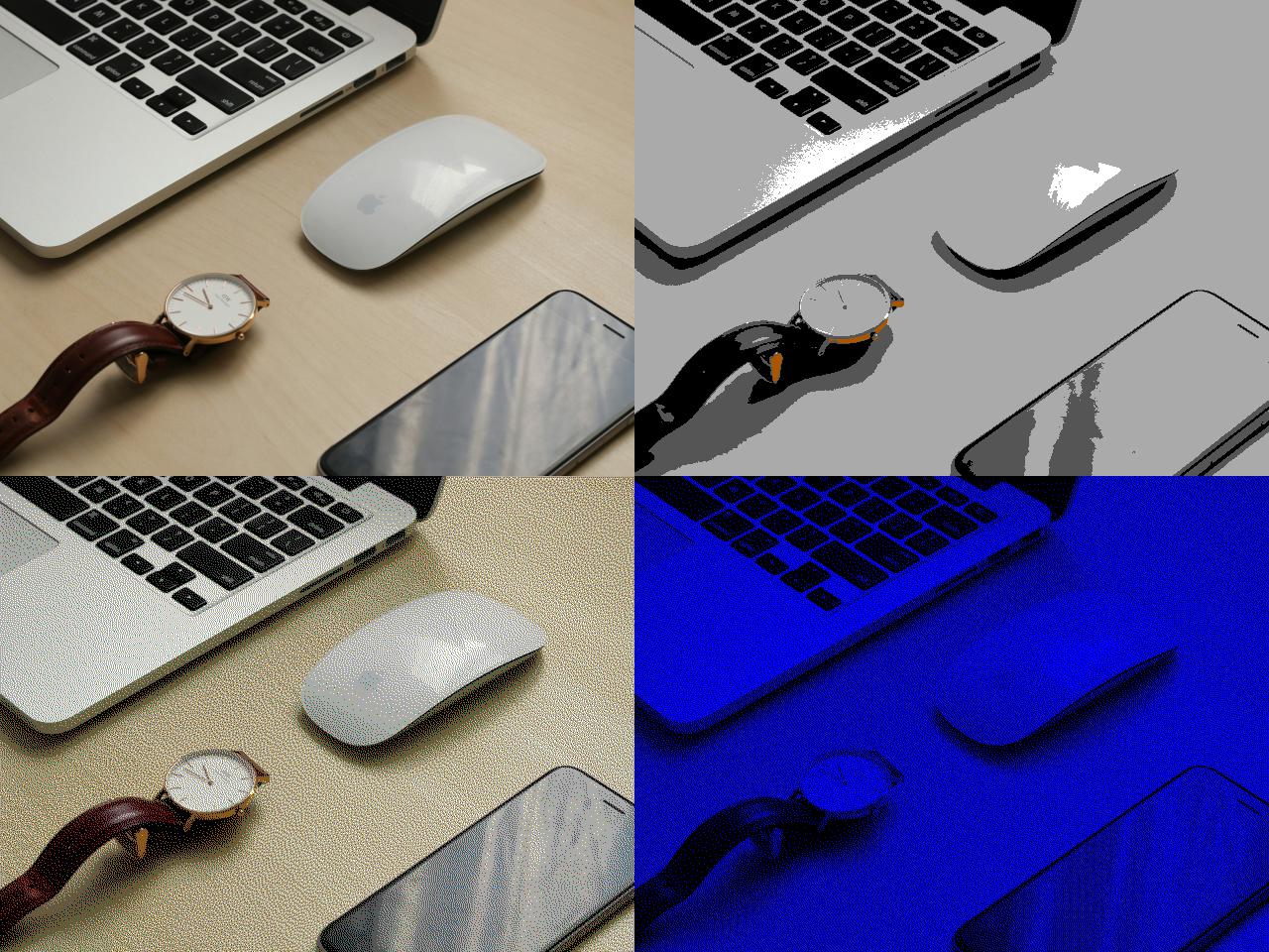
Let's take this fancy "Mac with some other random shit on a desk" image from Unsplash:
https://unsplash.com/photos/black-and-white-self-balancing-b...
Here's what it looks like with various ways of reducing it to 16 colours:
(I know, the images are small on a modern display! Each square is full-size, because we're VGA.)
Top left is the original, obviously. Top right is what happens if you just reduce it to 16 colours; it looks like nothing in particular, and it weighs in at 153K (exported in a modern graphics editor), or more than a tenth of a 3.5" floppy disk. Bottom left is what happens if you do it with dithering; you can make it look like you have more colours than you actually do, but it also weighs 153K.
And bottom right is SETUP.BMP. It only uses _two_ colours from the palette ("0, 0, 255" blue and black). That's 1-bit colour which means my SETUP.BMP when exported to an actual BMP only takes up 38.5 kilobytes.
So the answer to your question, I suppose, is "use as few colours as possible and don't waste disk space" or "dithering" or "the 90s", but often the technical limitations of a period plus time become an aesthetic.
That's the Microsoft I am used to ^^
Anyway, since it transcodes the WP into a JPEG, it has the ability to select a compression ratio. That ratio is pretty famously < 100% and as a result there's some degenerate cases where a wallpaper that looks good when viewed in the filesystem looks terrible when set to the background.
https://superuser.com/questions/1377883/how-to-prevent-wallp...
Microsoft got Windows where it is by having no sense of self-respect and willing to play the B2B race to the bottom. And it remains dominant thanks to decades' worth of legacy software that needs to continue running.
So that's cheapness and momentum.
If Windows was ever a beautiful product, it certainly isn't now. It would never become popular today in its current shape and principles.
Anyone can say that about any product. That doesn't make it true. Windows is a successful product that satisfies a need that people and businesses have. You can't fake dollar bills.
>Microsoft got Windows where it is by having no sense of self-respect and willing to play the B2B race to the bottom. And it remains dominant thanks to decades' worth of legacy software that needs to continue running.
>So that's cheapness and momentum.
>If Windows was ever a beautiful product, it certainly isn't now. It would never become popular today in its current shape and principles.
I'd rather sell a hundred million copies than convince some randos on the internet that my software is "beautiful".
Can you source this statement?
https://windowswallpaper.miraheze.org/wiki/Windows_10
It does seem that the original was replaced in May 2019 by a brighter version, although whether it was drawn on a computer or not is anyone's guess.
> GMUNK was also involved in this version, and stated that it was created under the same methodology as the previous version.
https://windowswallpaper.miraheze.org/wiki/Hero#Later_versio...
A lot of the promotional material highlights the sets, costumes and props from films on display, and they are certainly interesting, but far more interesting to me are the two floors of cinematic miniatures--diorama after diorama of physically-built miniature sets used as "virtual backgrounds" before they were mostly generated using CGI art (which I do appreciate). They are remarkable and remarkably interesting as pieces of art as well as cinema history. This story reminded me of this--sometimes the effect you want needs a tactile realism that is hard to replicate digitally, and is rarely as neat and toy-like.
What does "live-action shoot" mean in this statement? Wouldn't this just be "still photography"? When I think of live action, I think of people or at least ... action?
Although I like the 'amateuristic' style of the old Tux, I must say this new minimal penguin looks really good.
[1] https://mspoweruser.com/new-default-windows-10-light-theme-w...
[0] https://en.wikipedia.org/wiki/Good_News_for_People_Who_Love_...
It's a weird feeling. Kinda like letting go of the desktop-oriented computer in favor of window-manager-oriented. There's beauty in the former, and simplicity and elegance in the latter.
And later in life i switched to total black with dark mode for all my devices (and my eyes thanked me for it :)
My only other though is that I'm surprised this many people were needed to take that photo.
Also, waste of money. We’re talking Microsoft. It’s not like those money we’re going to be spent on charity. They paid some creative people to do creative work. We should appreciate that.
(That commercial literally had Honda execs complimenting the team on the quality of their CGI when they first saw it. Needless to say they were blown away when they found out it was real.)
Granted, MS used to actually take theming seriously. XP had an excellent marketing campaign that tied in with the visual scheme of the product. Even the OS sounds tied in with the choice of music for their commercials, “Ray of Light” by Madonna.
Now we just get the wallpaper and there’s no concerted effort to make a theme of joy or accessibility or creativity or anything.
If they wanted to, they could have easily banged out half a dozen wallpapers in an afternoon using Maya or whatever, but they chose the physical route.
* Blasting loud music * Saturated with bragging, useless testimonials * Blurring-in was more common than actually seeing the work * Cutting away from the work to a human too quickly
Maybe I'm coming off as miserable, but this video was totally unsatisfying to watch.
It probably wouldn't work so well for a "4k" monitor, but I thought it neat at the time.
I drew it by hand with a pencil and scanned it.
I had another article headline where I commissioned an artist to carve the headline in stone and had it photographed for the printer.
I scrolled to the bottom for contact information but it keeps loading stuff so I never reach it.
I’m on Windows, but I’m guessing macOS and many Linux DEs have something similar.
https://www.metaflix.com/behind-the-scenes-of-star-wars-open...
"For mediocrity, turn to AI. If you want masters, call us".
Doesn't mean you don't need to have the creative vision first. But executing it with a camera and a light/laser/fog set and all the effort that went into it, seriously, just take a talented vfx artist and you get the same result.
It's different with nature photography and especially with humans. But there was nothing natural with this image.
I think this is similar. Just like in movies, there are directors who don't use VFX as much as they could...
Disclosure: I might not have worked on The Orb but I do work on Steam Deck and other projects at Valve.
[1] https://store.steampowered.com/news/app/593110/view/41180511...
The human element is important. Because we're humans.
But until this technology exists, musicians and actors will continue being employed.
If you're just looking at the end result, yeah, same result could've been achieved with VFX with a lot less costs, but it also wouldn't have as much value.
Like a lot of things in Windows (Taskbar, Settings): Measure with a micrometer, draw with a pencil, cut with an axe. /s
Microsoft replaced it in 2019 with this one:
https://static.miraheze.org/windowswallpaperwiki/9/99/Img0_%...
I personally think the original is more interesting.
I can almost smell it immolating.
This is like a startup spending hours upon hours on logo and name instead of actually building something.
The issue is this: From Windows 10 and up, almost every interaction with the UI is a little bit broken, and I could fill pages just describing things that used to work just right in Windows 7 and earlier. It appears the Windows UI is now designed and approved by the visuals only. And now we learn about a disproportionate effort to create a visual.
So it's easy to see how a comment that points out this discrepancy, resonates with everyone who is halfway through their thousand daily cuts of UI punishment.
So, the last thing that I would want to set as a wallpaper would be a reminder of that fact that I'm using Windows.
I guess I'm jaded.
> Creative Director: GMUNK
> Managing Director, Live Action: Oliver Fuselier
> Managing Partner, Digital: Dustin Callif
> Executive Producer: Robert Helphand
> Head of Production: Amy DeLossa
> Producer: Mary Church
> Associate Producer: John Stern
> Production Supervisor: Liz Welonek
> etc ...
I mean, come on.
Would a synthetic image sufficed? Yes. Can it be worth it to invest in artists creating something nice if millions of people see it? Yes.
However, I have never really liked this wallpaper (the few times I have seen it as a non-Windows user). The random desertscapes and dynamic wallpapers in macOS are really much more appealing.
I personally find this visual quite cold and soulless, compared to previous Windows wallpapers, mostly XP's of course. For me this also coincided with Windows becoming completely useless and my moving to a Mac.
It was a time when MS was about giving users tools to do whatever they want, and not trying to coerce them down a path to be milked for $$$.
Windows 10 with WSL, Power Toys and many other things sold me on windows for development.
I still use a MacBook on the move, but if I work from home I would never swap to OSX.
Way too many things annoy me: the filesystem, the file explorer, poor windows and multi monitor handling (to this date OSX sucks with 3 monitors and switches the output randomly when coming back from sleep/rebooting), the consistent issues with unlocking cameras/microphones, somewhat questionable support of non-Apple accessories (Bluetooth headset is an example), Docker support and there's some more.
Win11 with Ubuntu22 on WSL2 is all I need.
Basically have Windows behave like Linux, where you get the bare minimum and the letting you choose what to add on top.
This drives me nuts with my Mac at my workplace. It's mostly an awesome workhorse, but when I switched to Mac I was flabbergasted that this can be an issue.
The window-management I find also rather awful. When I asked the Mac-nerds I knew they all had their custom setup that includes some third-party-tooling, the built-in mission-control or whatever they call it didn't exactly receive favorable remarks...
Honestly, I kind of feel that's the contemporary style. My employer recently moved to a new office building, and feel exactly that way every time I have to go there.
It doesn't help that it's 100% hoteled seating, so there's no "lived in" vibe to counter the sterility.
Windows is really awful, and Macs are super limited in hardware. (It might work if you only do web dev)
Fedora is literally better than both. People are just so used to repeating the linux prayer of 'debian/ubuntu/mint', that most people don't know: Debian is an outdated/old distro with limited features and lots of bugs.
Fedora is up-to-date, loaded with codecs and drivers, works with Nvidia, and has a 10/10 pro-consumer experience.
No ads, no harassment, smooth, fast, everything just works.
It's not like they weren't aware this wouldn't work for the majority of the desktop marketshare. They didn't try to mitigate this by detecting your card and defaulting to x11. They did not apparently care. Evidently causing friction and getting the ecosystem to switch was more important to them then my machine working with their software.
I'm sure Fedora is great, but I think it's poor form to recommend it to people new to Linux.
Not sure what to recommend then.
For example
https://iso.500px.com/iphone-6-milky-way-wallpaper-interview...
Also the Ariel videos of nature and cities for Apple TV and Mac is another example.
Windows feels so corporate and boring tbh
And that's fine. That's all it has to be. Something aesthetically appealing and universally brandsafe. But it's not not-soulless.
Have you ever read a F500 companies press release about a (re)branding or new logo or something? Where they retell the story the branding consultants told the executive suite about what the new image means and the vibe it embodies? But the end result is just bland nothingness that doesn't standout from the pack at all?
That's the energy in every Apple attempt to show personality. Hypercalculated and ultimately meaningless.
To each their own. I personally have more than enough nature around me; I prefer it to not also invade my computer.
At least you are aware you are a fanboy. Its the first step to freedom.
And then photoshopped. /s
You always need 2 programs in Windows to do a thing right. /s
It gives it character and helps ensure you'll get good artists to work on it. Though now I wish they'd made that clear by making the intermediate shots desktop defaults.