Draw the pretty colored lines after you grok the concept.
It goes downhill for me as they try to get more technical, redefining the way the encyclopedia is edited and organized. Drag and drop reformatting of article layouts? Really? Don't the best Wikipedia articles tend to be conformant to template layouts?
Wikipedia is not Digg. It does not have, as its primary goal, the delight of random web users. They are doing something bigger than that.
I'm also not a fan of the branding idea. First, they've confused Wikipedia with The Wikimedia Foundation. The two aren't the same thing. The branding they propose makes sense only for the latter. Second, they're trying to do that organic living logo thing that has become ultra-trendy lately (just read Brand New Blog to see it done well); "as Wikimedia evolves, the little lines in the logo will change". Well, maybe, but the relationship between Wikimedia top-level properties doesn't change all that regularly, nor does it meaningfully change depending on the context. Nor does the aggregate set of lines between properties draw an appealing or meaningful picture.
Also the capital "I" in the font they're using is killing me.
They even propose a feature that shows everyone how much English dominates the other languages in other languages, being the colour bar. And if you want something not in English, you have to find the nigh-undiscoverable 'roll over top right corner' to have the language selecter appear. They're pushing really hard to make non-English users feel like second-class citizens.
Then they redesign the page to make content harder to get to by putting a giant damn banner at the top of every page. Literally a third of the page is the banner. It's a wonder they didn't suggest putting some 'subtle' advertising in or something.
This redesign literally made be laugh out loud several times. My main regret is that I don't have a marketing budget, because then I could ensure these jokers would never get any of it.
Let's face it, English is the universal language.
There is nothing to grok. Imagine Google's landing page being chokeful of "content" including, most notably, the featured articles of random nature.
Your comment inadvertently demonstrates the problem with Wikipedia as it exists now. A vast majority of its users has nothing to do with its community. People come, they consume and they leave. Sad, but that's life. But still the site is built to favor not their experience, but the experience of those who is deeply involved with Wikipedia - the very same people who are perfectly content with how things are and who resist the change initiated by those outside of the community.
So perhaps instead of dismissing alternative views as complete garbage, it might've been a better idea to try and understand where their authors are coming from and why it is that they are proposing the changes.
It's pretty and minimalist and trendy but it isn't Wikipedia. Honestly, they would have done the same thing with any website. It's just a shallow coating of gloss over what they've labelled as "bad design". There is a lot wrong with this whether you're an insider or outsider. These are my biggest peeves:
Not only do they throw up a huge middle finger to non-English speakers (something I usually don't ever mind but this is almost obscene) but they do it in a way which involves replacing the current system with mystery meat navigation. How is anyone supposed to know the color bar is clickable and not just a ripoff of Vimeo?
The logo... They explain why the current logo is what it is then proceed to basically say "but we don't give a shit, let's use cool fonts and be trendy". The whole concept of the world being a puzzle of knowledge goes right out the window and they carried absolutely no piece of it into the new one. Also, the "w" brands have one major flaw: Wictionary. Every other name is a compound word but Wiktionary isn't a compound word but kind of a half compound word. It sticks out and doesn't make sense like the others (had the others truly made sense to begin with). I know it's a minor detail affecting only one brand but good design is all about the details.
In the end this redesign amounts to nothing but slapping a fresh coat of trendy on a massively popular website. It smacks of arrogance and self importance. I have to say they damn sure know how to make something look pretty and trendy but the way they went about this, especially the subject they chose, made them look pretty terrible now.
So, your thinking is that Wikipedia should be more like YouTube comments.
In the words of John Lennon, "Well, you know..."
Their reasonably desires do not prevent the end result being a dog's breakfast.
Yahoo's landing page is full of content and is useful for many people. Wikipedia's landing page is also full of content and is organized much better then yahoo's page. The majority of wikipedia's audience will google "SOMETHING" or "SOMETHING wiki" and read it possibly click a few links from the main article. A large minority of Wikipedia users including many who rarely or never edit or contribute want to browse "random" interesting facts possibly going on an info binge clicking dozens of links(leading to a tree of articles).
If you use Wikipedia only as a search engine, you are missing out.
The article makes some silly points, but it also makes some good ones. The front page of wikipedia shouldn't be mainly comprised of a list of languages - that's useless to most people. It should mainly be about search.
I've also never seen a "featured article" and am not really interested in using wikipedia like that.
In the case of Google that is easy, since they have no content. Wikipedia does, and displays it (and yes, content, not "content", I have no idea what you thought you were doing there, but I saw it) -- along with a search field. So where is the problem?
> "People come, they consume and they leave. Sad, but that's life. But still the site is built to favor not their experience, but the experience of those who is deeply involved with Wikipedia"
You say that is if it's a bad thing. It's not as if there was any content there if the site wasn't accomodating to those who actually help out.
> "the change initiated by those outside of the community."
Making a websites with some screen mockups, zero code and a huge font as to make the whole thing unreadable isn't initiating change, it's piggybacking on the success and popularity of Wikipedia.
I mean, yes, by all means get involved and help improve it. But just telling them from the outside what to do, that's silly. Actually, all the content is free. You can make a mirror of Wikipedia and implement those changes. Let us see a live demo, you know. Screenshots and the promise to check your email are cute, but it's kinda been done before.
I don't think you understand just how toxic some parts of the community are.
This is the main thing I remember after reading what seemed like an otherwise interesting study.
I'm a fan of the minimalism but as high caliber as I was expecting.
http://www.minimallyminimal.com/ is one of my favorites.
"We check our mail dozen times a day."
No. We check our mail a dozen times a day.
Seeing the number of possessive its with an apostrophe on HN I can cope with someone using English as a second language making a minor grammar error.
But it could. And that's really the point of this exercise: showing one way that it could additionally delight users, on top of providing the critical functionality it already does.
Delighting users is one step up[1] from what Wikipedia does right now. Yes, they're doing something of fundamental importance to the human race. But does that mean that the software needs to be bleak, emotionless, and, let's face it, not very enjoyable to work with?
[1] See Aarron Walter's Emotional Interface Design as described here: http://thinkvitamin.com/design/emotional-interface-design-th... for a great explanation
The delight is in the speed at which I can quickly explore and consume human knowledge. Nothing I've seen in terms of graphical suggestions would improve that - only distract or prevent my friends in other countries from being able to use it properly.
To me, Wikipedia is embodiment of "less is more", which supposedly all of these hotshot designers are supposed to subscribe to, but apparently mistranslate it to "a metric butt-load of negative space".
Advertising campaigns-in-disguise do not.
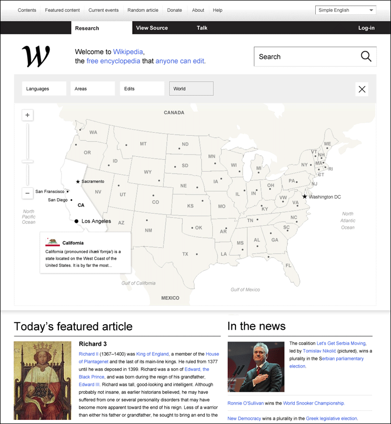
The individual language front pages are still here. With loads of information density and featured articles and everything.
The beautiful front page for searches in different languages is very nice and certainly provides better overview over the different languages available.
The overhaul of the Editor is also a nice addition, although it should probably be coded in a way as to enforce adherence to templates. A challenge you say? Maybe. But most things worth doing are.
The highlighting is a nice touch, certainly useful for doing research, which is what WP is often used for.
They did not confuse wikipedia with wikimedia. They very clearly proposed a specific logo for both Wikimedia and Wikipedia. They were aware of the connections and relationships between the organisations and concepts in question. The title can be construed as misleading, "Wikipedia redesigned" vs. "Wikimedia redesigned", I guess. But most people using WP are not acutely aware of the difference and relationship between the two. So they decided to hook the article on "Wikipedia" because it's the more recognized name. I have no problem with that.
I don't like that "organic living logo" idea either, I'll side with you on that one.
Yes, the capital J is a bit annoying :)
Your criticism seems mostly superficial and I don't quite understand why. A better branding does not water down the content. "Doing something bigger than that", (which i completely agree with) is not diagonally opposed to beautiful design.
http://www.ryanholiday.net/this-is-what-real-analysis-looks-...
(Ok, yes, a browser add-on would be better for someone like me. But I don't think my need is very unique.)
Here is (roughly) what I learned in elementary school (in Bavaria): http://i.imgur.com/LbQ7l.png
I think the J dropping below the baseline isn’t particularly uncommon or unique. (I know quite a few famous typefaces in which the J drops below the baseline: Baskerville Old Face, Lucida Grande, Palatino, Rockwell, Optima, …) However, the I looking like a J certainly is, at least in print.
I think it's obnoxious that a design team would spend two months on something without taking any time to consider implementation detail. The MediaWiki project is very transparent, and if New is New cared to learn about what features were in the works, they could have easily found them on the right wiki -- design mockups and all. Whoever would hire these guys to do work for hire will be paying for an intractable mess of a design with a hearty helping of scope creep.
And don't get me started on the proposed Wikipedia logo. It looks like the Wikia fractal with way less nodes.
(Seeing this site reminded me of the guy who did the Windows redesign work a few months ago, which means that the windows redesign guy did a good job marketing/branding himself too!)
I got the exact same aesthetic feeling, too. This redesign reminded of nothing so much as GMail.
I found it offensive that they felt the English 'W' was the only one worth featuring in the logo.
Wikipedia could change the template for their version of the site, without affecting MW at all.
What is the Wikia fractal?
Deciding that users want to see your overbearing minimalism and your 'sound-great-in-concept-meetings-but-shit-on-paper' designs instead of you know, actual information on the front page of an encyclopaedia strikes me as an astonishing act of hubris.
The one piece of information given on the front page (the languages bar) is a nice curiosity, but utterly useless after about one visit. I'm sure the Swiss, the Swedes, the Danes, the Indonesians would also be delighted to find that their languages have been relegated to 'rollover' status.
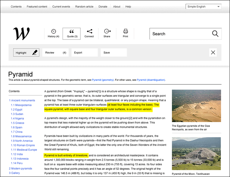
As for the article pages, too much white-space, nowhere near enough information density. Did it not strike the authors, "Hey, hang on, the article is almost invisible on this page after all the crap we put in?" http://www.wikipediaredefined.com/img/27.png
You are comparing en.wikipedia.org with their redesign of www.wikipedia.org. Notice that the latter is, with respect to content, the same as their redesign: languages, search, and sister sites.
Secondly, in the screenshot you are looking at, the content of the article has obviously pushed down due to the activation of the “quote” mode. Honestly, I doubt you do not realize this and I can’t help but wonder what motivation you have to criticize their work so unfairly.
Actual WordPress logo: http://s.wordpress.org/about/images/logos/wordpress-logo-sta...
(It's not just that both are W's -- they also chose a typeface with a similar distinctive swoosh.)
I read this and thought the same thing, "What about Wordpress?"
" Absolutely terrible; increasing the signal/noise ratio, in addition to increasing unnecessary white space were extremely bad design choices.
The purpose of Wikipedia is to share information. The changes that you proposed impede that goal by the addition of a step where the user has to "understand" the design, before they can begin to use it.
You should have reviewed mathematical and scientific journals before you begun your sketch work. Those types of publications succeed at transmitting a high amount of information, very quickly. Bare HTML pages also succeed at transmitting technical information at a very fast rate.
Rather than just stating that Wikipedia is in need of a redesign, state your reasons. The design of Wikipedia is not simply an aesthetic designer's problem, it is a problem that has to be approached from an engineering point of view: maximise the information communication rate whilst keeping the design aesthetically pleasing, not the other way around."
Also I dont understand these kinds of comments. Do you want us to email them that post with the quotes around them and attribute it to you?
So this whole thing really irritates me.
Having said that, I think that modernizing Wikipedia or MediaWiki is a an interesting idea (although probably not a priority), and this is actually a decent starting point for discussing how many of the new (mainly, but not entirely, stylistic) UI/UX trends (principles in a few cases I guess) could be applied.
I mean obviously their nav takes up more space than necessary and we don't need Wikipedia's logo to look just like WordPress's, but the minimalism, alternate typography of some sort, monochrome icon widgets, etc. are apparently now required in order to qualify as contemporary design. And the connection clouds and highlighter quote idea is cool. And it probably wouldn't hurt to remove one or two of the buttons on the editor or move them to an advanced section, or spend an hour or two making the editor looking more contemporary.
In case anyone actually reads this, I have a question. Is the thing where buttons and controls are monochrome icons (and usually with no 3d appearance), is that going to stay? I mean, is there a reason you can't have multiple colors in icons now? Also it seems a lot of times you don't get labels on buttons anymore (I know, tooltips). How much of this stuff is likely to stick for the next 5, 10 years, or is it just a short term fad? I mean I coded a UI recently for a component platform thing I am building (actual functional software platform, not pictures) and it had multicolor traditional icons on normal 3d buttons with labels. This UX guy saw that and said I was 'completely out of touch'. So I took the labels, 3d and colors off the buttons.
It's funny if you look at http://stocklogos.com/topic/past-and-future-famous-logos. That page is satire from 2011... well check out the last "Microsoft" logo ;-)
Yeah, it really bothered me that the WYSIWYG editor and interactive map features were sold under the guise of a rebranding. The interactive map feature itself would have monumental complexity. Good ideas are a dime a dozen...this is one I've had before. But it's not like "oh, ok let's change some CSS and bingo! An interactive map!". It's probably in the order of years of manpower to do a decent job of this feature.
It wasn't under the guise of a rebranding at all. The website is called "Wikipedia Redefined," and adding a WYSIWYG editor and interactive map would certainly redefine Wikipedia.
-It's completely impractical and does not take into account some of the most basic ideas that Wikipedia is and depends upon. I don't think it's very well thought out or researched, and serves mostly as a hypothetical portfolio piece for a design firm.
For example, the fact that Wikipedia is available in multiple languages is quite possibly its most important feature. The idea of burying language selection within an incomprehensible color band (that will only work on non-touch devices) boggles my mind.
- Many, many important principles are tossed away. Why do the designers change the meaning of the "history" button? Burying the revision history is counter to all things that wikis stand for.
- Research into the Foundation projects would tell you that storing a user's browsing history is against the privacy policy - so why include that?
- > "Sharing functions will be the same so no change is necessary" - except that there are no sharing functions.
- The most basic principle of product design is "Know the product," and these designers do not.
And finally,
This is to say nothing of the exercise in 'brand manipulation.' The most powerful brand that Wikipedia has is the wordmark itself ("wikipedia"), followed by the distinctive "W" logo (crossed "v" characters), followed by a single puzzle piece, followed by the puzzle globe. The brand rework here throws ALL of these things away and replaces them with a stylized "w" glyph that is almost but not quite exactly like the logo used by Wordpress."
But that's just my opinion"
"If you want to have an idea of what the Wikimedia Foundation is thinking with regards to the future of Wikipedia, you'd be better served by reading: http://en.wikipedia.org/wiki/Wikipedia:Wikipedia_Signpost/20...
[1] Brandon full response to the design: http://www.quora.com/Wikipedia/Wikipedia-What-does-the-Wikip...
Even after that, how does it then make sense to actually change it to something else, thus removing what identity there once was? It's not like the replacement (with the Adobe-esque abbreviations that are meaningless to people who don't already know them) is an actual improvement.
Otherwise, I don't really get the purpose of it. Wikipedia's not there to look fancy or show off designer skills, and I'd argue that anything that isn't pure content is just completely unnecessary for it.
If a user doesn't recognise the word "English" then they are not going to have any idea what language select. The reason the languages are all listed on the page without any interaction needed is so someone can look at the webpage and recognise their language and select it without having to understand anything else. How do I access the main page of a wiki?
This isn't redefined, it's just a redesign with some bad, some good, aesthetic changes.
We should think carefully about the possible consequences of Wikipedia dropping support for no-JS browsers.
[1]: http://www.w3.org/Protocols/rfc2616/rfc2616-sec14.html#sec14...
Seriously though, I never see the wikipedia front page. I either go through a link in google, start with 'en.' in the address bar, or start typing 'wiki' and choose a previous link. All of these are easier and more portable across browsers and OSs than the knowledge required to change your language locale.
http://de.wikipedia.org/w/index.php?title=Datei:La-ges.jpg
I am German (as is the name of the font) and I could read the article without being distracted.
Because this is what kids learn to write: http://i.imgur.com/LbQ7l.png
But nowadays textbooks use changed variants of that font, actually – with a normal I. I think that has something to do with the decreasing importance of that cursive. Kids still learn it, sure, but it’s no longer as important and central as it was only, say, twenty years ago.
New! is a fairly... new.. advertising agency from my country, Lithuania. They are trying to become better known, so this is without a doubt a targeted publicity stunt ("Look how well it worked for Dustin Curtis to redesign American Airlines! I guess we can do something similar!")
And as that, it's pretty bad. Not only did they showed poor design (in a sense of "how it works") skills, but also left a bad impression as a studio.
I find this design gaudy and the gradient bars reminds me of mid-2000s ASP.net design style, which I have a particular adversion to.
Just because a design has been around awhile doesn't mean it requires an overhaul.
Wikipedia is heavily constrained by one thing: the existing mediawiki markup. That presents a huge challenge to implementing this redesign.
Large mediawiki installs become brittle because users have a natural tendency to use the markup for presentation, not structure. Combined with the in markup template mechanisms, the tendency is toward a tangle of interdependent markup. Wikipedia's community does far better than most in fighting this with policy and consistency, but it's still an issue.
Implementing this redesign would require not just working with some of the more difficult parts of the mediawiki code base, but also a laborious effort to rewrite a sizable fraction (if not the majority) of all wiki foundation content. That just isn't going to happen.
But that doesn't mean design improvements on wikipedia are impossible, just that any attempt needs to work in alignment with the constraining forces.
That leaves the actual articles. I like the way they are designed here, except for the monolithic nav bar.
If anything, this is a nice theme for articles - and theming is a feature that has existed on Wikipedia for a number of years now.
Are we there yet? Are we there yet? Are we there yet? Are we there yet?
:)
The deletionists get pared-down, guaranteed notable content, and the inclusionists get the mess.
I disagree. I have looked for content on WP before, only to find it has been deleted by deletionists. I have also given up creating new articles because of deletionists.
Why do you have to ruin every website?
I mean, wP?
However, this person has some legitimately great ideas. I love how the design is far more reader-centric. I'm not sure why I need a history of articles that I read (browsers do that very well these days), but the 'highlighted' text is a cool idea. You can start thinking about the site as helping you research things, keep a scrapbook of snippets. I love it.
The front page redesign: believe it or not, the multiple languages are the most important thing to highlight. Wikipedia's global audience often uses that system to navigate between encyclopedias. They also often use Google to find the English article, and then look for an 'inter-wiki link' in the margin to an article in their native language.
It looks like there's a lot of cruft in the design, and maybe someone needs to be very bold and piss off a lot of users and force a new interaction pattern. But this stuff is all there for a reason. The 'random article' button is actually one of the most popular features. Really!
As for the proposed branding: first of all, the ideas presented here are not very good. It reminds me of the generic brands at the supermarket. The gossamer rainbow graph wouldn't even reproduce properly at small sizes (and if projects are added or eliminated, then what, do we change the logo?)
But more importantly - the thing which the designers rarely understand is that Wikipedia and its sister projects are not products to be sold - they are communities. And they came to consensus on those logos. They're more like sports team logos than a unified branding system to sell something. That said, there is a system, of sorts; when new logos are made, they try to make variations on the red dot and blue and green shapes.
Also, don't get me started on making color meaningful for navigation. It works for subway maps and it sucks everywhere else. Very bad for accessibility (color-blind people). And very bad for maintainability. The Russian Wikipedia is currently the fastest growing site; you can expect it to change position in the rankings soon. Then what, add another color? Should it change colors, surprising the user? Swap the colors in the rainbow?
Lastly, this designer isn't even addressing the biggest problem we have today, which is how to modify Wikipedia for the mobile web. Reading articles is getting better, and we've been using the Wiki Loves Monuments annual contest as a way to drive the development of mobile photo submissions. But there's still no clear vision of how anyone does serious editing on a mobile device.
As for the part where they offhandedly remark that we should make the site live-editable... HA HA HA. You have no idea what you're up against. I worked on this myself for a while. We made some interesting demos but they weren't something you could deploy.
If we were making Wikipedia from scratch today, of course we'd do that and more, but the thing is, there are multiple challenges, and a whole lot of legacy to support.
Technically: it has to serialize to wikitext and be uploaded as discrete changes to sections. So if you want live editing you need bidirectional parsing and serialization in the browser. Wikitext is unlike any other regular language and has a complex macro system, which consists of... other wiki pages. Stored in the database. Which means you need heavy database I/O just to render HTML. Or at least, a very extensive cache of page fragments. You also can't cheat with a simpler parser in the browser, because wikitext was basically designed to indulge whatever shortcuts the community wanted, and be extremely forgiving. Most wiki pages exploit at least one of the weird quirks. You can't even cheat by regularizing wikitext as you go, because then you're causing spurious changes that the community can't easily police. The current team is solving this with a radical approach to parsing that leverages HTML5's standards and a Node.JS based system. So eventually the parser on the site and in the editor might be very similar.
Operationally: Wikipedia is a cheap site to run because it's basically a static site that you can serve from cache. But changing an article can be monstrously inefficient. There are some articles, like "Barack Obama", that would take minutes to re-render if the caches were empty. When you start changing the basic database model to be more 'live', the costs start to explode.
But rather than drown in negativity, let me just say that whoever this is - thank you for throwing your ideas out there. Assuming this isn't just a resume-building exercise, get in touch with the MediaWiki developers. They need designers.
There's a billion articles about Linux distros, yet an article about a famous wedding dress gets cut? Yet, on the other hand, many of these same commenters nail Craigslist for their lack of design and defend Wikipedia for it's lack of design.
It seems like nobody is ever happy with anything. If you think Wikipedia is perfect, you're delusional -- no site is perfect. So rather than constant critism, put your money where your mouth is and build your own mock up. Show us how you think it should be rather than continually knocking everyone else.
Sometimes I feel like HN is populated by grumpy old men who haven't had their Metamucil.
http://www.wikipediaredefined.com/img/45.png
I understand it's a mock-up, but it just shows carelessness. If I can notice it, it's just one less reason for me to care.
See: http://thoughts.shawncheris.com/wp-content/uploads/2012/05/c...
http://en.wikipedia.org/wiki/User:Gee_totes/modern.css
(it's not very custom, more of a PoC)
Why the guillotine on these guys? I think they contributed something meaningful to the discussion. You don't have to like it to be respectful.
I found the way they presented it deferential and respectful enough, why trash their effort? Of course these fantasy redesigns are naive and mostly impractical, but there may also be some decent/helpful ideas being suggested. Do you think Wikipedia is worse off for all of us discussing how it might be improved?
I like unsolicited redesigns so long as the people behind them aren't snide or arrogant in the way they present them (I can see why the NY Times redesign irked people).
But if you're going to conceptualise a change to one of the most popular websites that is backed by an intelligent and active community you're going to have to expect some critical feedback.
I actually think there is a bit of arrogance implicit in the redesign, as the designers haven't solicited feedback from the wider wiki community and made big assumptions about the original design.
I also think that they add too much focus on the site wide navigation stuff at the top, which takes away the focus on the data.
I'm glad I don't have to read a Wikipedia designed by these people.
The main functionality of wikipedia.org is not search, but showing a list of Wikipedia language editions.
> Rolling over the top right corner reveals more options for languages.
What the hell is this? Why would you use JavaScript dropdown? That's not how websites work. Just look at 99% of websites. They don't require putting mouse over something to view hidden content.
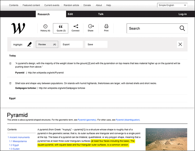
> Quote serves as a felt pen. It can be an easy way to highlight the best parts of an article, just like in text books.
This functionality is better done as a web browser plugin. Because then you can save quotes from other websites too, not only Wikipedia.
> http://www.wikipediaredefined.com/img/26.png
Where Research, Edit, Talk buttons disappeared?
> Basically, there are two reasons to visit Wikipedia: to read or to contribute. Reading function is Research and contribution is called Edit.
This layout is bad for reading. Article text starts at half of screen, not at top. On most popular resolutions (1366x768, netbook 1024x600) it's even worse, article text would start at the bottom of screen.
J'm really not hot on the rebrandjng of everything as "wX". Thjs js almost as unjnspjred as Adobe's CS-era brandjng. Jn fact J wouldn't be surprjsed jf jt turned out that whoever made thjs page js a fan of that abomjnatjon.
Oh and thjs gets even better: you know how thjs "redesjgn" seems to be all about makjng Wjkjpedja's multjple languages completely obscured? The people who djd thjs are from Ljthuanja. WHAT. http://newisnew.lt
(also ... the content is open .... ripe for anyone else to give this a go)
The designers clearly have some layout and visual acumen, but this redesign doesn't fully grasp the magnitude of Wikipedia. Every layout is modular, and every pixel has to be fully thought out. The result here looks more like the-new-Digg than it should.
Never underestimate inertia. Plus, it's looked like that for so long, does anyone think it ever will change?
Wikipedia is available in 275 languages, and the current logo at least acknowledges that there are other writing systems and that this is not just an English encyclopaedia.
Changing it for a W is a complete disregard of the significance of Wikipedia as a multilingual reference work.
What they did is a design -- i.e., a document explaining their ideas. There is no working prototype that you can try out. (I was looking forward to trying out the Connection Cloud.)
It wasn't obvious to me that they had a discussion about design but no actual implementation.
That said, the connection explorer is quite neat and the efforts to ease editing have their heart in the right place.
I often use Wikipedia as a high quality word translator. I study at a Swedish speaking university which requires that a lot of the written material I produce is of course in swedish. Whenever I'm writing a comp sci text and I wonder what in gods name a "morphism" is in swedish I just look up the english article (http://en.wikipedia.org/wiki/Morphism) and hover over the swedish language in the sidebar and voilà I've got a peer reviewed translation (peer reviewed because it probably has sources in both languages, in most cases).
But then I remembered designers aren't supposed to develop new features.
"Pyramid
From Wikipedia, the free encyclopedia
A pyramid (from Greek: πυραμίς pyramis[1]) is a structure whose shape is roughly that of a pyramid in the geometric sense; that is, its outer surfaces are triangular and converge to a single point at the top.
Share "Pyramid" with your friends: Twitter - Facebook - LinkedIn - Google+ - Email - Pinterest - Tumblr - Reddit - Delicious - Digg - WordPress
Follow Wikipedia on: Twitter - Facebook - Google+ - Pinterest"
(Or you could get Ghostery)
http://www.quora.com/Wikipedia/Why-doesnt-Wikipedia-innovate...
Some interesting technical (and also 'philosophical') aspects.
I'm kinda over the whole "hey. we're all cool people. let's get together and do stuff." design aesthetic. It was cute for a time but let's move on.
Do the colours indicate language or specific wiki? Can't have both, sorry.
The designers have huge problems with proportion both typographically and in their whitespace. Even if they are just mock-ups, they can use some more care.
I guess people with netbooks would be worse off.
But the result is atrocious.
This is exactly the kind of stuff you normally get when BigCorp meets CI-agency.
Every single detail gets backed by an elaborate, esoteric justification, so everyone has their asses covered. Nevermind the horror that is the end-result. What matters is that "we made the button bright pink and 2 pixels tall because studies have shown bright pink catches attention and small click-targets invoke natural curiosity"...
I think what these folks did was a new UX/UI implementation. Redefinition would imply a new way of how wikipedia handles with the data. Not in terms of displaying or presentating the data but in terms of providing better analysis tools for the data (among others).
What this folks did was more of a PR exercise to showcase what they are capable of..
This is not an improvement.
If a person like Andy Ruthledge had worked at the NYTimes, he would know that a number of this country's best designers are working on that site, and it's not just a matter of sitting down in Photoshop to do a redesign. You should never lose readers for the sake of new colors. Not to mention how the nytimes.com is an enormous site with layers and layers of interplaying systems. Making stuff like this mostly looks like a young designer saying "this is what you should do", but feels like a young designer saying "I don't have a clue about how things work".
This post sums up some of my thoughts about it: http://lolcat.biz/post/27368236760/ency-cl-opedia
Bottom line: Personal Taste: I don't like it.
Wikipedia is not Google, it does not crawel and select the best content, it hosts and distributes the most valuable content crawled by wetware during their life time.
It would be great if there was an external site that used content from Wikipedia and had these features.
But for finding out information I need to find out for whatever reason, it's just going to slow that process down.
I would love some a image browser and lightbox style reference pop-ups. BUT I imagine the current build runs great on old machines, making it accessible to a wide audience.
I think designers are moving further away from form follows function.
More about this story as it breaks!
Please go away.
Re combo-boxing the language list: Wikipedia is the most successful multi-language website by far. Highlighting this to new and old users is a great thing. Its not like the search box takes up any more than one line anyway.
For Wikipedia, this redesign blows. I do like the visual style though. This is really just showcasing the webdesign company's talent, right?
As another response notes, G+ is absolutely horrible at its content-to-navigation space allocation. The more so as most of the navigation elements are styled as "fixed", and won't move.
I pretty much always view the site with an editor open to pick off the most annoying of these features. I'm working on a Stylish script.