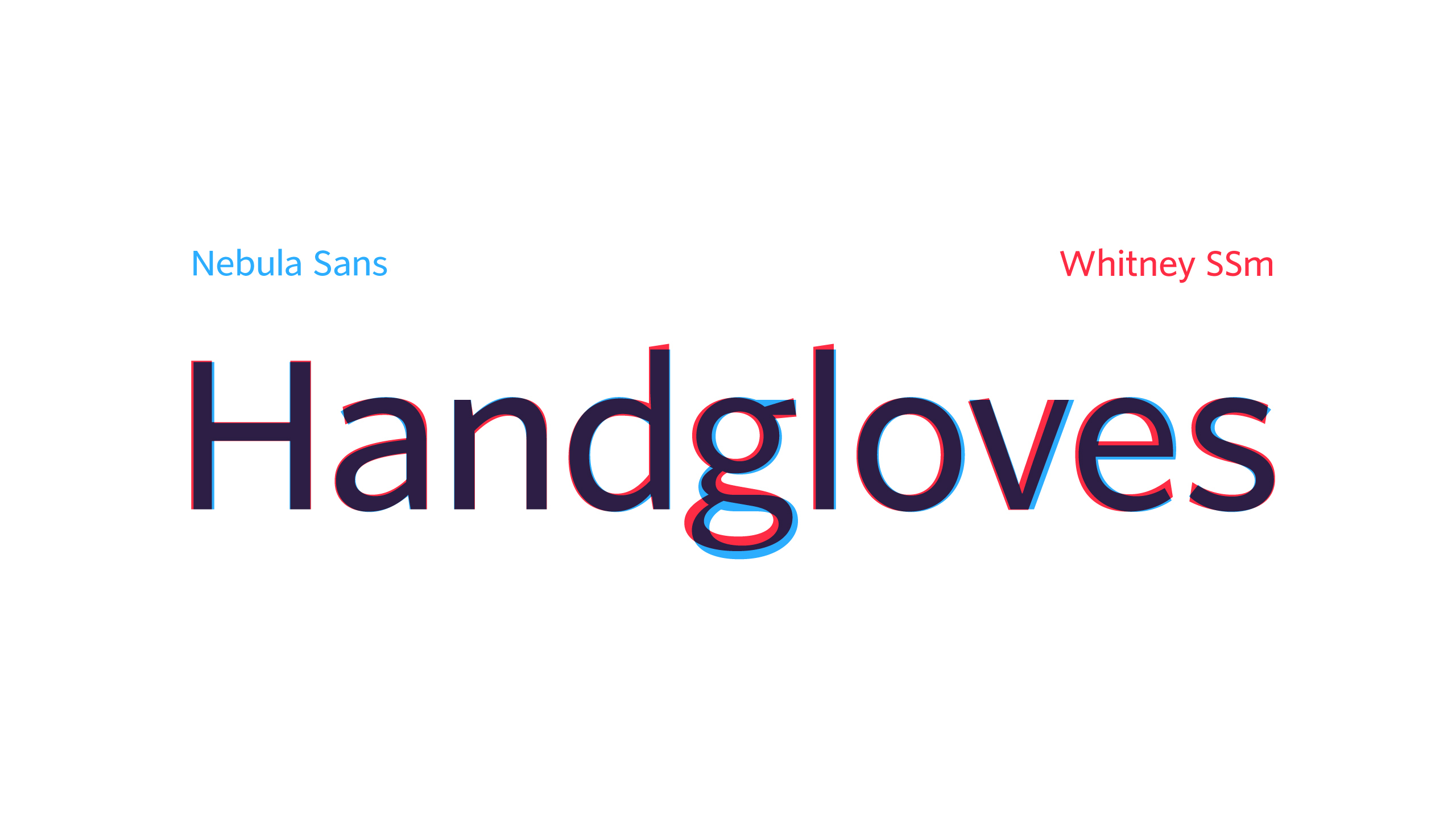
Glyph proportions between Whitney and Nebula are almost identical. As are their weights. Source Sans is substantially heavier and more dense looking.
While individual glyphs may be closer between Nebula and Source Sans, but the overall feel of Nebula is that of Whitney.
I'd rather use Source Sans then.
* the latest OTF
* the Source Sans 2.020 TTF, which is the last version (at least, the last version released in the GitHub repository[0]) that has manual hinting