Tabs at the top is wasted space, I much prefer my tabs on the side instead, as most web content is taller than it is wide, and I have a widescreen monitor. I understand the choice of tabs on top when 640x480 was the most common resolution, but for desktop usage today? Tabs on top seems like an outdated layout choice.
What I want on an ultrawide isn't what I want on a portrait 16:9 side monitor.
Now it’s all micro transactions so an MBA doesn’t have to work anymore.
Now those are power user and dev tools and users get what they decided was the just right info dense or sparse design.
It's too bad I'll have to dump Vivaldi soon, now that Google is killing adblockers.
Side note: it infuriates me that Microsoft’s web-Office will “helpfully” remind me that it auto saves when I do Cmd+s but also captures the event so that Arc can’t handle it. Which reminds me…I can probably whip up a quick Boost to get rid of that - yay rubber ducking in the comments!
Vivaldi & Floorp offer this through being highly customizable but they tend to have cracks around the edges of their use for the same reason.
I was first introduced to this with a Chrome flag back in 2011 https://www.askvg.com/how-to-enable-new-compact-navigation-f... but they ended up backing out for various reasons (the largest of which was probably the specific design used a pop-down url bar which went over the page area, so could be spoofed).
In 2021 Safari became the largest browser I've seen roll this out as a 1st party feature to general users, but it faced some backlash https://www.zdnet.com/article/how-to-get-more-space-in-safar... I'm not a big fan of their particular styling choices but the layout was pretty decent.
So I think it's reasonably easy to see that this is not and was never the actual driver behind this decision. It's completely retconned.
Widescreen monitors afford that wasting of space better.
[0] http://www.onenotegem.com/uploads/allimg/191124/12310QH9-3.g...
But, I do agree that this was likely never the driver. In fact, I've always thought the "obvious" explanation is simply that window controls and title bars are at the top, and since tabs are like nested windows inside a window, they would follow basically the same patterns...
Even on large monitors you'd be surprised the number of people at 150% zoom with small windows opened instead of fullscreen.
And unless you have a browser full of tabs, vertical tab lists usually have massive amounts of purely wasted white space and are generally much less space efficient overall.
Every once in a while I wouldn't mind for a specific window to have vertical tabs with nested tabs, as a psuedo live-bookmark organization system for a current project. But it's not a daily driver for me.
Are you kidding? I'm willing to bet 99% of users run their browsers fullscreen.
Using the drag-and-drop feature that splits the screen between two GUIs already marks the office power user, a third windows on a single screen brings us into the territory of the hardcore nerds running tiling window managers.
The Firefox and Edge implementations have a collapsible panel for the vertical tabs. I agree if they didn't, it would be worse than horizontal tabs.
However, my pet peeve is that it's now impossible to disable tabs altogether, say when using a tiling WM that implements tabbing itself, controllable with the usual shortcuts. Firefox has an extension that always moves tabs to a separate window, but it's janky.
Also, if vertical screen estate is a concern, just turn your monitor 90° A lot of professionals working with paper sized documents (legal, bookkeeping, administration) do this.
As a software engineer, I've tried it, but I prefer splitting windows (tiling, or panes or such) horizontally. So my estate is limited in width more than in height.
This is one of the things I love about my Emacs config. I just hit a key to get things like buffers or file trees up when I need them, then they disappear.
I'd love to have a keyboard driven browser but whenever I've tried I always end up with one hand on the mouse anyway so it doesn't work.
Not if your screen is in portrait orientation.
But that wasn't the point of the person you are responding to anyway. The point is all the empty wasted space that was above the tabs before it was removed and the tabs moved to the top.
TBH in general I find tabs less useful as they multiply. Most of the time I just Cmd+A in chrome to search for the tab I need.
At 640x480 resolution, the toolbar was tiny but powerful.
Now at 1920x1080 resolution the toolbar is relatively huge and dumbed down.
All the benefits of higher resolutions and larger monitors have been lost on stupid UI trends.
It is changeable. With enough dedication you can go a long way just with CSS.
In this case it is even rather easy because the "unified toolbar" the thing containing the search box, the menu bar (if shown) and the tab bar are three elements in the same flex box. They can be reordered by setting the order property.
Only downside in this case is that (if client side decoration is not disabled in the settings) the window buttons (close, minimize) are also part of the unified toolbar and would end (without further fixes) below the tab bar.
As a quick (and dirty) experiment I moved the tab bar left to the search bar in the same row just with:
  #titlebar {
    flex-direction: row;
    > unified-toolbar { order: 2; width: 50vw; }
    #tabs-toolbar { order: 1; width: 50vw; }
  }
Finally Thunderbird's own customization dialog can be used to fill the empty space around the search bar. By default it has a spacer left and right but that is easy to change even without custom CSS.
hell no. I want the title bar, the scrollbars and the window border back. I work with more than one window.
While that does speak to the strength of TB’s Quick filters it’s also an indictment of its search
Considering the plethora of options, I'd say it's impossible to say what is better until an alternative is tried. And then you can only say that particular alternative is not better than basic, but you still can't say basic is best.
People that style their apps try many alternatives, and often find things that work better than basic for them.
Sometimes it can also drive me to switch to a different app, like with Firefox. FF used to be my secondary browser, but Zen (a Firefox fork) aligns with my needs and preferences better and doesn’t require userChrome mods and addons that are likely to break after some random update some day, so I switched.
Thunderbird would benefit from its own Zen-like fork in my opinion. Its UI has always felt clunky and awkward, and the “new” design just shifts around the awkwardness.
On desk-bound machines hooked to 27” displays, this isn’t really necessary, but the UI being built around vertical tabs as the standard (as opposed to most browsers, where vertical tabs are a tacked-on afterthought if they’re even supported without addons) is still a relevant selling point.
yes, I'm not wasting my time customizing something unless I use it frequently.
Not a Thunderbird user, but the Outlook default looks similar to the screenshot on the linked page. Initial things that drive me crazy; 1) left pane is a complete waste of screen real estate. I have mine collapsed to just be icons, it's about 1/6th the width as what's shown. It expands if I need it to (on tap/hover). 2) I like my inbox above my message preview not next to it. On the inbox pane, I get From & Subject on line 1 and initial message text on line 2. Same real estate with more content and context. I really like having the message preview line without actually clicking on the message.
Also, by having the message preview pane wider than tall, long paragraphs do not wrap so abruptly and I get more content on the screen. This lessens my need to scroll unless the message has a lot of paragraphs or images. Same for the initial message preview that's visible in the inbox line 2, if it's wider I can see more text. For a lot of emails, I find they are short enough that I can read it all in the inbox without even looking at the message pane. This means I can scroll/scan my inbox quickly without opening each item in the message pane to view it.
Anyways, I wouldn't care if I didn't use Outlook daily. For some people, maybe the defaults work but I feel like I get a lot of productivity out of these minor customizations
I still have Thunderbird installed and configured for the odd "advanced task", but my daily driver has been Geary for over 10 years now. Precisely because its so much better looking than thunderbird.
Looks, done properly, are an important part of a good UX. For me, less clutter, more whitespace, clearer focus, works far better than the "widgets thrown onto a square" that Thunderbird is (I have ADHD, it may contribute to this preference for clean, simple, focused design)
  So  much  padding

  So  much  wasted  space

  Such  low

    information  density
For normal Thunderbird, I swapped from the more compact options to the most loose/padded options.
(Couldn't resist...)
I love the translucency look of "Fluent" design though. Windows Terminal has a "Use acrylic material in the tab row" which I like to enable. It feels like a callback to Windows 7's Aero which I miss.
Perhaps together with Microsoft's Fluent/acrylic design and Apple's WIP Liquid Glass UI, and with projects like this Thunderbird theme bringing the design to OSS projects, we can bring back some of the optimism and beauty of those early glass designs.
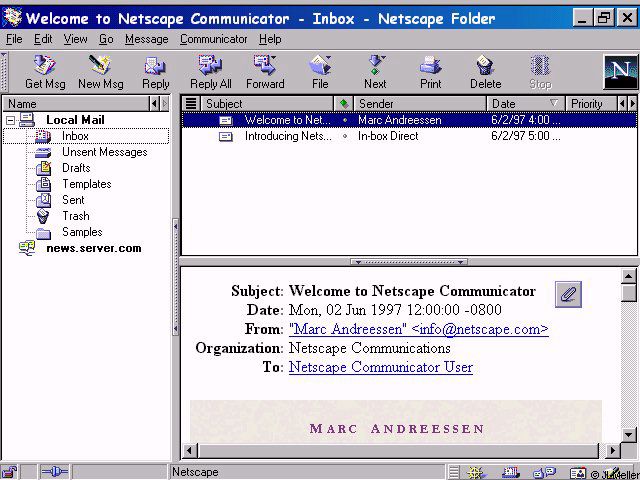
Netscape 2.02 or Microsoft Mail client from back then looks amazing by comparison.
Normal Thunderbird still gets two to three dozen email subject lines on the screen. I absolutely love it, I've been using it for over 20 years through the rough and through the good. We're in a good period now, and it's been a good period for quite some time.
I was impressed that it correctly inferred the IMAP and SMTP settings for my custom domain name, but after using it for ~30 seconds random old emails started appearing at the top of the email list, above my latest emails.
Maybe I'll try again in another 5 years.
edit: someone thinks i didn't wait for imap to finish. I did. My latest email appeared at the top. Then 30 seconds later some ancient emails popped up above it, seemingly triggered by scrolling in the email list pane.
Also, which use-cases do you have where you need to see 20 emails at once?
[^1]: https://www.pixelbeat.org/docs/netscape_email/ns_4_email.jpg
And I’m sorry, you really can’t fathom why someone who gets a ton of email would want to see more of them in their inbox at the same time?
Look at the Thunderbird 1 and 3 screenshots on that page
And Netscape in 1995 look good in comparison to.. Pine?
Now if only Thunderbird weren’t a clunky POS. I’ve lost track of how many times I’ve given it another chance after people swear “it’s really better now” again.
Still refuses to follow chosen settings for how much mail data to download/store locally (it always eventually downloads everything).
I have the opposite problem: I absolutely cannot get it to download everything. What it does do, however, is constantly re-download mail, to the point that it's extremely slow and regularly pops up "folder cannot be compacted because another operation is in progress" errors when I'm just trying to click on folders.
With some limitations it is possible to restyle Shadow DOM elements. It is just a lot harder to select the right element if it is inside a shadow dom.
I found a workaround (don't remember where I found it) which I use extensively in my personal userChrome.css.
The basic concept (afair) is that you can write selectors which match inside the shadow dom as long as they do not need to "cross" the shadow dom "boundary".
A good starting point for me is often to select by tag and part attribute, e.g. image[part="icon"] { ... }
Now the trick to style a particular instance of a web component (shadow dom instance) is to use variables and defaults.
With a selector which targets the "root element" of the shadow dom I set variables for any value I want to change and with a selector which is fully inside the shadow dom I add styles using the variable (which is then only defined for that particular instance) or a default which effectively cancels my custom style anywhere else.
As concrete example the dialog to create new calendar events has a drop down box to select the calendar where each entry is prefixed with a dot with calendar color. The menulist has a shadow dom and the menupopup another. I styled those dots as squares (for fun and because I think the modern web is to round). So to set the variables on the "outside" I have:
  menulist#item-calendar {
    --parthack-boxmarker-radius: 0;
    --parthack-boxmarker-image-size: 1em;
    --parthack-boxmarker-border: inset 0 0 0 1px color-mix(in srgb, black 20%, transparent);
  }
  menuitem.menuitem-iconic > hbox.menu-iconic-left > image.menu-iconic-icon {
    border-radius: var(--parthack-boxmarker-radius) !important;
    width: var(--parthack-boxmarker-image-size, revert-layer) !important;
    height: var(--parthack-boxmarker-image-size, revert-layer) !important;
    box-shadow: var(--parthack-boxmarker-border, none);
  }
Now this will change only the icons only in the menulist with id 'item-calendar' and leave others unchanged. Whether I use revert-layer as default or something else depends on what style the element has by default and try and error.
> it is also not possible to theme the settings areas.
I don't see a reason why this should not work. If by settings area the author means the settings page which in modern Thunderbird is more or less a web page in the content area, it should be stylable with userContent.css instead of userChrome.css.
The hard part is to find the right @-moz-document selectors for each individual content page.
Also, by the way, when JavaScript addons get involved: userChrome.css is applied quite unfortunate in the css cascade. It gets low priority that is why they are usually full of !important rules. With JavaScript it is possible to add custom css instead as so called author stylesheet which makes it easier to override default styles. (never tried it myself)
https://old.reddit.com/r/FirefoxCSS/comments/msoqte/how_can_...
2. Windows 11 design on macOS would be trippy.
macMail is _okay_ with fastmail
I always go "I'll check out Thunderbird again" then "nope" out when I see it can't handle this kind of set up in the OOBE and most extensions don't receive ongoing support and thus stop being compatible.
I use Gmail on my phone and Pixel Watch, so ditching this setup is a non-starter as reconfiguring something as basic as email every time I get a new device or switch distros isn't my idea of a good time.
Ahh, does it still have the bug that may accidentally delete/corrupt all your emails?
Some widgets, or rather the repeated reinventions of widgets in HTML+CSS, use variables and the next equally looking widget has none, or other variables with the same values.
From an outsider perspective it looks like a mess.
* or almost the same with minimal, likely unintended, differences like one button has a slight border when hovered but another button right next to it has none
(I use a modified https://johnnydecimal.com/ for email folders, and have probably close to 100 folders, though most stay collapsed so you might see ~20 at one time.)