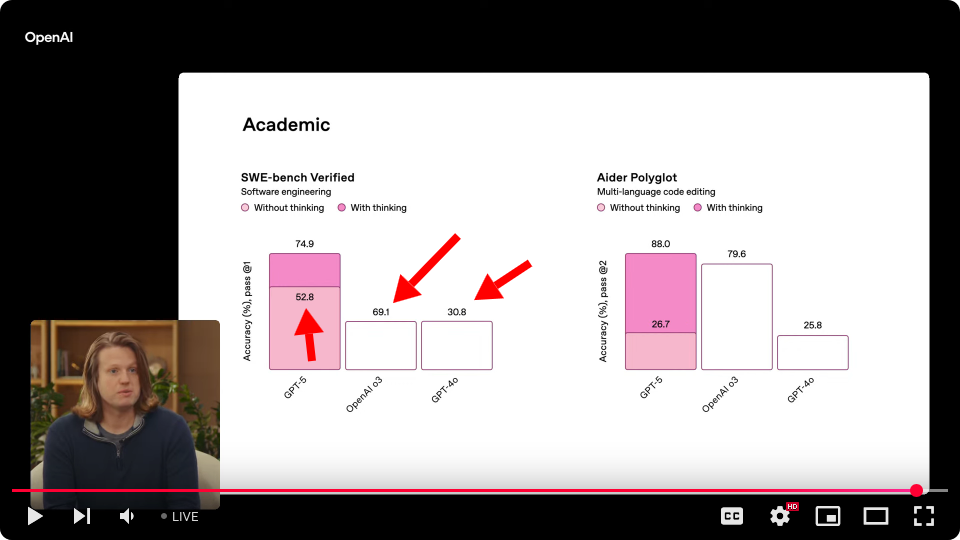
GPT-5 non-thinking is labeled 52.8% accuracy, but o3 is shown as a much shorter bar, yet it's labeled 69.1%. And 4o is an identical bar to o3, but it's labeled 30.8%...
Even the small presentations we gave to execs or the board were checked for errors so many times that nothing could possibly slip through.
They talk about using this to help families facing a cancer diagnosis -- literal life or death! -- and we're supposed to trust a machine that can't even spot a few simple typos? Ha.
The lack of human proofreading says more about their values than their capabilities. They don't want oversight -- especially not from human professionals.
> good plot for my presentation?
and it didn't pick up on the issue. Part of its response was:
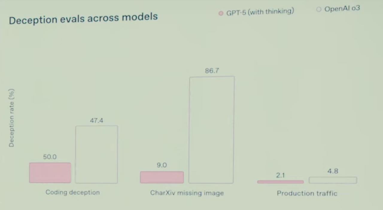
> Clear metric: Y-axis (“Accuracy (%), pass @1”) and numeric labels make the performance gaps explicit.
I think visual reasoning is still pretty far from text-only reasoning.
Even with the way the presenters talk, you can sort of see that OAI prioritizes speed above most other things, and a naive observer might think they are testing things a million different ways before releasing, but actually, they're not.
If we draw up a 2x2 for Danger (High/Low) versus Publicity (High/Low), it seems to me that OpenAI sure has a lot of hits in the Low-Danger High-Publicity quadrant, but probably also a good number in the High-Danger Low-Publicity quadrant -- extrapolating purely from the sheer capability of these models and the continuing ability of researchers like Pliny to crack through it still.
1 - The error is so blatantly large
2 - There is a graph without error right next to it
3 - The errors are not there in the system card and the presentation page
1. They had many teams who had to put their things on a shared Google Sheets or similar
2. They used placeholders to prevent leaks
2.a. Some teams put their content just-in-time
3. The person running the presentation started the presentation view once they had set up video etc. just before launching stream
4. Other teams corrected their content
5. The presentation view being started means that only the ones in 2.a were correct.
Now we wait to see.
{"data":{"error":"Imgur is temporarily over capacity. Please try again later."},"success":false,"status":403}
But also scale is really off... I don't think anything here is proportionally correct even within the same grouping.
Thanks for the laugh. I needed it.
Look at the image just above "Instruction following and agentic tool use"
Completely bonkers stuff.
Screenshot of the blog plot: https://imgur.com/a/HAxIIdC
Edit: Nevermind, just now the first one is SWE-bench and 2nd is aider.
https://x.com/sama/status/1953513280594751495 "wow a mega chart screwup from us earlier--wen GPT-6?! correct on the blog though."
It's like those idiotic ads at the end of news articles. They're not going after you, the smart discerning logician, they're going after the kind of people that don't see a problem. There are a lot of not-smart people and their money is just as good as yours but easier to get.