There's SO much padding and wasted screen real estate, disjointed looking floating inner panels, window corners that are so rounded you see gaps in full screen apps, inconsistencies everywhere and - well, I could go on.
Basically the vibe I get from it is that they think their users are dumb - they won't care about things like this and that they want everything to look like a preschoolers tablet.
Apple has a thing against people with OCD. Or taste.
The thing is horribly wasteful of screen real estate, and as someone who’s been writing a Mac blog for over two decades, I am so happy I started using Fedora two years ago—GNOME has its flaws, but it looks nicer than Tahoe.
1. the way window UI elements float in bubbles on the top over a white background is horrible. It looks amateurish.
2. Icons look low detail and blurry. At first I thought they were using low resolution placeholder icons, but no, the layered diffused glass effect just kind of translates to blurriness on many app icons.
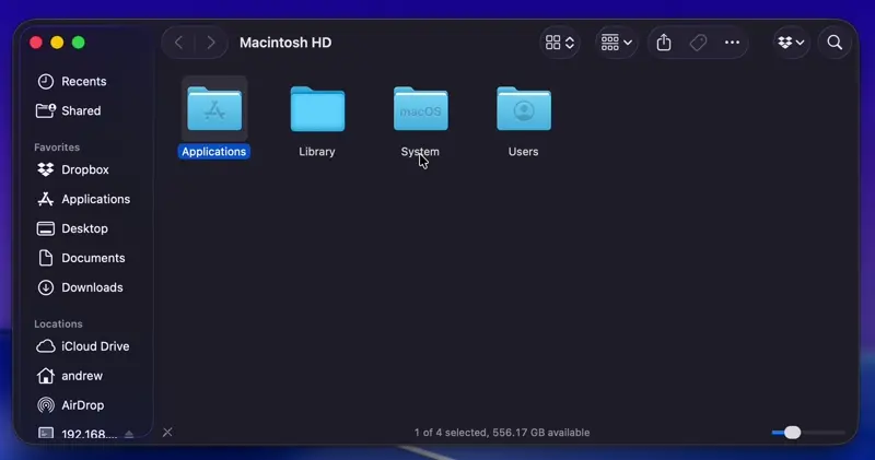
3. The side bar, such as on Finder, just kind of floats there. That is fine and looks kind of neat on the Maps app as you can see some of the maps behind it, but on the Finder it is just a white bubble over top of a white background, which... is a choice.
4. The app launcher is gone, and replaced by Spotlight, which is worse.
I could go on. The point is it is bad and Apple should be embarrassed. I say that as someone who likes Apple products alot.
It's so bad that it's kind of fascinating. Unfortunately, even "Reduce Transparency" doesn't fix the LG update.
I couldn’t watch the WWDC and when I saw the screenshots I thought it was a joke. Giant buttons with weird padding and extreme transparency effects.
This is going to sound harsh but it looks like when “working” from home, Apple engineers outsourced their work to amateurs online.
I simply cannot believe that Apple is shipping an OS this out of touch with elegance.
Steve Jobs said in his inauguration speech that he slept on the floor to take typography classes and later obsessed over having great typefaces on Macs. Steve would’ve burn the place down instead of shipping a crap like this.
I'll begrudgingly get a couple more years out of this personal M2 Air, but my engineering team is prepping to do upgrades on some older M1 Pros we've had since launch, and after seeing Tahoe, the CTO and I formed a plan to give devs the option of getting either an M4 Pro or a Framework. We haven't launched yet, but I think a solid number of our engineers are going to opt for the Framework, hopefully as high as half.
It doesn't look or feel modern, its ugly, inconsistent and just all around crap. God knows what they were thinking with this.
Also who on earth green lit these low resolution looking blurry icons everywhere?!
I'm contemplating rolling back to Sequoia.
That seems to be a growing trend ever since "UX designers" started taking over (early 2010s?), to the point that I wonder if they're trying to see how far they can take it.
I feel like if you replaced all of the paper in a company's printers with transparency sheets you'd be fired because that's obviously a stupid idea that would never work. But then I guess that's why I'm not a software UI designer.
No idea on macOS, but turn on Reduce Transparency on iOS and there’s tons of padding most of the time, but then sometimes zero padding. And I mean zero. The edges of buttons and text are at the edge of the underlying background. It’s…embarrassing.
1. Apple photos redesign from last year sucks and I’m already frustrated with iCloud abstraction and lack of cross platform friendliness
2. Switch to an alternate cloud photos provider
3. Find out about Liquid Glass, looks like shit, impulse sell my MacBook Pro in favor of a Framework
4. Surprise surprise, it’s actually the year of the Linux desktop. My gaming situation is way better on Linux and it does everything my Mac did. The only compromise is my need to carry a big extra battery around.
Remember in the beforetimes when we decoupled themes from OS updates? Wouldn't it be nice if once again we discovered this lost technology that let different users have different UIs?
So: that is Apple's CEO for you.
Your point would have been much more convincing had you refrained from this sort of pejorative assigning of motives. It wasn't necessary.
I've been running the betas to the final release and there are a number of basic affordances and system improvements that are definitely worthwhile. I will not be going back.
Having said that, while I know they had good intentions with this whole design, and probably really thought they were pursing a winner, what a massive, massive miss. This is such an aesthetic disaster that I'm just in awe. I feel like they had a huge push to do some seemingly substantial change, particularly on the mobile side, given the stumbles in the AI space, so they changed a lot of things maybe without quite enough thought.
Ugly as hell. More dead space. On the mobile side they released an update to iOS just today from the RC a few days ago that removes some of the particularly stupid animations (the app tray did some dumb thing where it expanded and shrank, and that and a few similar things are gone).
The Control Center (or however they call the drop down window with quick controls for volume, wifi, brigthness, etc) has floating isolated icons like crap.
Bring back Scott Forstall. Give him a big bonus. Let him fix this shit.
Otherwise, the code changes and actual features are probably fine.
Aren’t they/we? :-)
*majority of
Well, hasn’t this been the single biggest reason for their sustained stellar returns year after year where often (or maybe most of the time) the biggest change their devices (like iPhones) used to see was the version number change e.g. iPhone 13 -> 14.
For the rest of their users — they make a noise (which is not even feeble in comparison), bicker around, lament the fact that the other alternative is Google (Windows and the Wild Linux West), and they stay. Rinse, repeat.
Look how far we've fallen.
I see grossly rounded corners in some apps, but I don't see the other stuff like gaps in window corners for full screen apps. I may have some config bit flipped that has disabled those.
Yeah, the new corner radius is ugly but by and large, it's not much different than before, from what I see so far.
I recommend not overcomplicating your life and just staying on the latest macOS.
I just tried it and maybe I've just been primed by the internet, but by god, I did not like it.
The side-bar design is terrible and lots of application (Maps, Music, etc) always look like they have a window overlapping the current application. So even with a single window open, my desktop already looks messy.
For people like me, with a slight OCD about certain details (don't talk to me about notification-bubbles), this is absolutely infuriating.
I'll disable auto-updates on all iDevices and Macs, and just keep on security-updates for previous gen OS as long as I can.
Eww.
I mean, how do you even provide constructive feedback to such a pathetic design choice? Not that this company ever deals in feedback (unless it's a strong feedback directly to its wallet).
I do believe they are just exhibiting sheer incompetence and intellectual bankruptcy as a corporation. Is it beginning of an end? I don't know. Do giga corps even die anymore?
1. Old bugs are not fixed.
2. New bugs are introduced, and I have to spend hours online figuring out workarounds.
3. Old features I depended on are removed, and I have to spend hours online figuring out how to replace them.
4. New features I don't need are added and they get in my way, and I have to spend hours online figuring out how to disable them.
My workflow productivity takes a months-long hit every time Apple upgrades MacOS. As a result I rarely upgrade MacOS until it's around 3 years old and I have no choice.
It appears that Tahoe is going to be the worst example of this in a long time.
Which is why I'm moving as much of my daily workflow as possible to Linux.
Now if they could just produce a touchpad as good as a MacBook's, give me 8-10 hours of battery life, and make the construction feel slim and solid, and not like it's going to get crushed in my backpack, and I'd be satisfied.
If Apple would open source some of its OS apps, this would probably be a non-issue, I could see people putting in bugfix PRs the second Apple chooses to open source their core apps.
I don't see them doing this any time soon sadly, but it would make macOS much more stable, and probably secure.
The more I have thought about my views on Open Source vs Commercial software, I strongly feel that infrastructure code (an OS) should be more open source, I dont see Microsoft or Apple open sourcing any time soon, but it would make a world of a difference, imagine a world where Windows XP had been open sourced, and the community took it fully over and maintained its security, you'd have a drastically better version of Windows without all the fluff, or heck even Windows 7, which some argue was the last good version of Windows as well.
I wish ReactOS was drastically more usable.
[1] https://mjtsai.com/blog/2019/10/11/mail-data-loss-in-macos-1...
This is specific to almost every new software.
As jwz said "But that's what happens when there is no incentive for people to do the parts of programming that aren't fun. Fixing bugs isn't fun; going through the bug list isn't fun; but rewriting everything from scratch is fun (because "this time it will be done right", ha ha) and so that's what happens, over and over again. "
Now I understand why plenty of old timers just leave the OS version on the MacBook that it came with. All you ever really need is the security patches.
Unless there is some specific new feature that you absolutely must need or some push factor, don't upgrade.
These are only a big problem if those bugs bugs are major, and/or widely applicable to different user setups, and/or very annoying.
3) is the worse though, especially when it happens for no good reason, or for novelty value.
4) is not that bad
To be honest Im new to macos, but after spending years suffering with gnome, that did removed a lot of features, Macos seens like it dosent suffer of this that much.
https://arstechnica.com/gadgets/2025/09/macos-26-tahoe-the-a...
Sadly, this often applies to Linux as well, so there's no escape. I guess Xfce is still around at least.
https://cdn.arstechnica.net/wp-content/uploads/2025/09/tahoe...
But I do not understand how the color-tinted UI/icons ever got shipped. They just look... bad...
Personally, I'm sticking with macOS Sequoia for now, and if macOS 27 goes even more in the less-information-density direction, I'll probably fully move off of macOS, which is a shame as a 20-year Apple user.
On the few screencaps I saw from external ~100 DPI non-retina displays, everything looks a lot blurrier.
is this an attempt make, users buy bigger screen models ?
Maybe some people took remote working really seriously and just delegated their work to amateurs online while they traveled the world.
Just saying. There’s no other explanation to how bad this is.
My very initial impressions on MacOS:
(1) I like the look of Safari better and the Mail app compared to the prior designs. They both look really nice to me and the Mail app especially looks like a huge improvement in terms of design unification with some of the features like summaries and unsubscribe options that looked bolted on in the past now blending in seamlessly.
(2) I really, really don't like the new icons! Especially so on iOS.
(3) On iOS the app group/folders look terrible to me with the way they distort my wallpaper. Not a fan.
(4) A lot of people are complaining about transparent icons. It's not a valid complaint and is strong evidence whoever is saying that hasn't used the new OS as that is a choice you can make if you want. The default is not transparent.
(5) The increased radii in some places doesn't seem to have any meaningful impact to my information density. A simple comparison of Chrome (old styling) and Safari (with the liquid glass design) shows that Safari has a few pixels fewer in height search + tab bar as a concrete example.
(6) Messages app in MacOS looks like shit. I hate almost everything about it.
(7) Spotlight search has marked improvements! UI is nicer and functionality has expanded greatly (eg clipboard search).
It’s a strange omission.
As a KDE Plasma dev, I always counted on us getting better, but I didn't expect the competition to get so much worse. We'd be flamed to high and heaven for shipping broken notification popups and rendering glitches like that in a prod release.
What happened internally to cause this, I wonder?
As for what happen at Cupertino: it seems that they replaced people who knew theory and practice, principles of interface design with designers who were told to make a product that looks "fresh" and will diverge attention from Apple's AI failure.
Because why this Liquid Glass now if not as "rattling keys" effect? It's not a technological breakthrough - we've seen translucent plastic/glass/acrylic elements and fancy animations in operating systems before. Hell, even Plasma had that glass stuff in initial line 4 of release. And OSX had Aqua interface, window animations long before Microsoft wasted years for Longhorn finally releasing it as Vista with Aero. Not mention Compiz on Linux around same time.
My partner is already baffled with lack of polish and consistency across the system in this release. In some places it's just a transitional animation added on top of flat style for "wow" effect because hardware nowadays doesn't tax much for that. Tahoe feels like it tries to follow GNOME/Adwaita big interface elements that should stay exclusively on mobile devices, and it does this quite late and also really bad.
Looking at the screenshots and review videos, I cannot believe how ugly and out of proportion it is. Normally, there would be a consistent design and some people like it while others don’t. But this is simply ugly.
My theory is that big companies like to compress salaries. To compress salaries, you hire young and fire old, which means losing historical knowledge.
The other theory is that people who grew up with Kde-look.org are now running the asylum, without ever going through the sort of formal training that the previous generations of UI designers had to experience.
I really wish Asahi Linux had more support, I would have bought a couple M4 Minis.
In fact, AMD and Nvidia have been the de facto high-performance combination for so long, that I can't remember when it was any different. But prior to that, it was Intel and Nvidia. Apple was never a real high quality hardware competitor. The only thing they ever had to offer were products produced by a production process almost no one replicates.
Razer started used CNC unibodies for their laptops 14 years ago, but they're maybe the only company I can think of that does so other than Apple.
And MSI has shipped high performance laptops for so long that even Apple used their laptops for comparison during the M-series chip releases in the MacBook Pro.
I'm donating to them and hoping they eventually get those implemented.
Me too. Just wonder instead of reverse engineer to SOC to get Linux running? Why can we just use the Darwin Kernel (which is suppose to be Open Sourced right? ) and build something like FreeBSD desktop for the M3/M4? Would that be more long term viable than reverse engineering SOC? Is there any project in that direction?
What the hell happened to the Apple design guides. Did all the engineers who read them retire.
Funny enough, it's the only time period since 1999 that I was apple free for a while. My MBP broke. I've previously had a butterfly keyboard on my work mac, and it got replaced on a regular bases. While unfortunate for a work computer, this was not acceptable as my personal one with no spares)
Thankfully Apple returned to making great products that work, and I bought the next MBP.
Seeing that Apple's returning to it's "design roots"[2], I really hope they do not loose sight of building great products that work well for their customers.
[1] https://apple.fandom.com/wiki/Butterfly_keyboard
[2] https://www.bloomberg.com/news/newsletters/2025-09-14/apple-...
There's a very important and relevant design quote from Steve Jobs that keeps popping up in my head:
Same here. After the butterfly keyboard era, I spent about 5 years with Windows 10/11 and powershell, then WSL. There's still a lot of annoyance in the Windows space (NTFS is slow due to all the filesystem filters), but Linux package managers are much better than homebrew and WSL does make Windows a pretty reasonable developer system. I'm back on the MacOS now but I wouldn't hate a nice Windows machine.
This statement describes pretty much every mouse Apple ever made, from the circular ones to the horrendous magic mouse with charging port underneath.
At this point I'm doubtful that these will be addressed in the 26.X updates, so the wait begins for 27.0...
Fixing this mess will surely take a while but then they use that as PR in future keynotes, saying how hard they were working on it.
I ran the whole beta on all my devices. Every new beta I'd ask myself "Surely they fixed 'x' by now, right?" and we advanced, beta after beta, with the same bugs and performance regressions all the way up to launch.
The icons still need to redraw in the settings app and app library. It's overall sluggish. The drop shadows are huge in the finder and other apps top bar. If you turn on always show scrollbars they get cut off at a weird angle due to the excessive corner radius.
My iPhone 16 PM runs hot all the time, even on release now, vs. iOS 18.
I don't mind the transparency or glass effects. I actually like it in some areas. But man does it need some serious polish and bug fixing, and a lot of time and effort spent on consistency.
This should never have went live in this state. I consider .0 just another beta, really. Actual release will probably be .2 or .3
For what it’s worth, there where threads here on HN where people complained at length about the bugs and inconsistencies in the previous version of the Apple operating systems.
I might be in the minority on hn, but I’m using iOS 26 for the first time today and am pretty happy with the new design. For one, it’s a lot snappier and faster. I’m glad they finally did something about the slow-ass animations iOS had in a lot of places. Secondly, it has a lot more personality. I enjoy that. Thirdly, they finally moved more basic UI stuff close to the thumbs instead of literally 6 inches away at the top of the screen. Love that. Knowing app designers, my apps are about to get easier to use just by migrating to the new UX concepts Apple is pushing.
The glass look is mostly fine. iOS had contrast issues before, and I don’t think it’s any worse. If anything, it’s more adaptive to different types of backgrounds now.
There are some visual glitches and weird things, but they’re pretty minor and will be resolved with time. The glass panes for, say, folders look nice, and I like it more than the previous blur.
Here’s some of the UX regressions:
- Apple Music: the “next track” button is only visible if the tab bar is expanded. So now we have to scroll or tap, wait for an animation and then click next. - Web views search web for selected text: previously we could highlight, swipe the action menu and then tap the button. Now we have to highlight, tap the small arrow, wait for the horizontal list to animate into a vertical list, tap the button. They removed the ability to swipe the action menu. - Tab bars: since 2007, you could change tabs with one tap. Now it’s one or two taps, depending on whether it’s collapsed or expanded.
Quick way is to pinch out with two fingers but that is impossible one-handed.
Another is to swipe up (or left/right) on address bar but that often triggers app switching because he indicator is 3mm lower
Edit: Also, information density is down across the board. Of course.
Transparent UI, with controls sitting on top of arbitrary and changing content can NEVER be legible/discernible. Apple knows this, but fashion was more important than function and they decided, "who cares about disabled people, anyway."
Microsoft learned this lesson back in the Vista era but Apple's charging ahead with this terrible set of changes that will literally disable millions of users, people who will need to visit the accessibility settings to reduce the transparency.
It's a sad day when a company that has often lead in accessibility ships the least accessible OS in modern history. I guess it was a nice run having a Big Tech company to point to as a good example of doing various accessibility things well. Damn.
She could read eBooks & emails, listen to audio books, view photos and call her family by herself (iPhone use extends to many uncles/aunties/cousins).
Every few months I would help her recalibrate her iPad as it was a vital life line.
I'm confused. You're condemning them for not accommodating the disabled, yet admitting they provide an accommodation in the same sentence.
Did you enable the relevant accessibility options that are there for this purpose?
I've pretty much given up with submitting feedback though.
It's also a symptom of consumption addiction where there is demand/motivation for drastic, superficial changes that don't really offer any value except to those who are consumed by the need for constant change for change's sake.
Apple used to care more about disabled people because of how the Accessibility APIs worked and were required for most apps.
Tahoe is Apple's very own "Windows 8".
Generally I think the toolbar settings needed more testing, they can be wonky (e.g. in Automator for text+icon it causes the traffic lights to misalign, in Safari toggling the sidebar on and off is janky).
I haven't touched Windows for over a decade, does it still have a decent story for disabilities? They've certainly regressed in other areas ...
I’m not a fan of Windows but I believe that probably the best modern UI design system for desktops right now is probably the flavor of Fluent used in Windows 11. It still retains somewhat desktop-like information density, doesn’t go overboard on radii, and has a touch of depth. I’d like to see more design languages exploring in its general direction.
KDE or Cinnamon (Linux Mint) are good though.
In the coming month will install Fedora+KDE on 5 more machines for family members due to Windows 10 hitting end of life.
KDE also can encode entries as QR codes, so you can make URLs transferable to your phone or whatnot.
-- Sent from my MacBook Air.
It'll be one of the first things I turn off whenever I get around to installing it ~6+ months from now.
The only reason I even have to "upgrade" to a higher version number is how quickly app developers (including Apple themselves) drop support for older OS's. My iPhone which is stuck on iOS 15 runs just as well as the day I bought it, but every other app I download tells me (in essence) "LOL your phone is too old and our developers are too lazy to keep our software running on it. Upgrade your OS or get lost loser".
That's literally the only thing motivating me to upgrade anymore: The treadmill of software compatibility. Apple doesn't have to innovate--they just need to make sure the ecosystem is broken after ~5-10 years or so.
- Terminal.app now supports 24-bit color and powerline glyphs
- Vehicle Motion Cues to reduce motion-sickness when in a moving vehicle
I'd heard from people who were running the betas that it's not ready and they are surprised Tahoe wasn't delayed.
No way I'm upgrading any time soon to Apple's least cared for OS with a change this big (and this untested).
Windows, on the other hand…
edit: Things are even worse — they already made newer apps much more difficult to read, likely because they have been brought from mobile to desktop. Now fonts are even smaller in System Settings, for example. What are they even thinking?
It's worse on the iPad. They apparently think an iPad is now also a mouse and cursor device because they made touch targets so small, and the fonts in menus shrunk down making them more difficult touch targets as well.
Metal 4 is interesting: https://developer.apple.com/metal/whats-new/
New enterprise-y stuff: https://support.apple.com/en-us/124963
FireWire support is gone, and this is the last macOS release for Intel.
People will get used to it. Apple will refine some things over time.
It will be ok.
Good Afternoon,
Apple released its new operating system today, macOS Tahoe. This is a full version upgrade (26.0) with a new look, feel, and many changes. At this time, I recommend NOT updating to Tahoe for the following reasons:
Stability: Version 26.0 is the first release and, like most “.0” versions, contains glitches that will take time to fix. Later versions (26.1, 26.2, etc.) are expected to address these issues.
Release Cycle: Apple now releases a new macOS every year instead of every two years. These initial yearly releases are often closer to “beta” products, and Apple typically patches problems over the first 6–8 weeks.
There is no real advantage to upgrading right now. It’s best to wait 6–8 weeks until the system stabilizes and then reevaluate.
How to Skip the Upgrade
When prompted, simply do not click “Upgrade Now.” This upgrade may pop up on your machine over the course of the next few days.
Close the upgrade window, or scroll down to select other updates.
For reference, macOS Sequoia (15.x) is now at version 15.7, which means it’s very stable and well-patched.
I might be interested in trying Tahoe if they'd undone whatever the awful policy is that puts a tonne of unwanted apps and desktop pics etc into your desktop that cannot be removed. I don't want Apple News, the clock in the menu bar and even Airplay - I purchased the computer, why can't I have what I want on it without compulsory apps from Apple?
It's little accessibility features like that keep me coming back to macOS everytime I switch to Linux.
Also these colors make my eyes bleed. And the border radius is ridiculous.
What makes me worried is how much money that they probably spending su supress youtube content creators and the press. Everyone is talking about how Tahoe is good like they are given some sort of script. I have seen a youtuber that talking about the features while the visual glitches are right there in front of him and he was desparetly struggling to not take attention to there.
I'll just stay on Sequoia for the time being, and then switch to Linux.
I personally pray for that "MacOS classic" switch... It's sad to enter that decay era for Apple where every next software upgrade for the device feels effectively as a hardware downgrade.
    More ways to express yourself with images.
    Mix emoji and descriptions to make something brand-new. In Image Playground, discover additional ChatGPT styles. And have even more control when making images inspired by family and friends using Genmoji and Image Playground.
Other than old people that always send gifs on Facebook and children who this is probably one of the only AI art things they have access too, idk who else uses this.
If one tech giant has it then they need to too for feature parity. Not a whole lot of use cases for generative AI for the masses, so if someone comes up with one, gotta copy!
Remember, those of us on HN aren't really the target demographic. They are targeting people who use their device(s) for fun and entertainment.
The day I got my only Apple device, an ipad, only to know they will kill my browser download as soon as I switch to a different app, it became my last. I don't want to pay a company only to be subject to their decision of what I can and cannot run on my machine.
If I vote for that with my wallet, I deserve it.
I don't want to use "the worst UI thing they've ever done" lightly, but it is hard to think of something that feels this unfinished and hard to use. Why are none of the corner radii consistent? This is literally the sort of thing Apple's entire reputation is built on getting right! It's like an amateur hour Linux skin.
Let that one get under your skin.
I don't like transparency - it's flashy but in overwhelming majority of cases is just a gimmick distraction (like transparent terminals on linux)
Sticking to Squoia
So what changed exactly? Change is understandable but this is a full 180. - floating anything was verboten - accessibility was paramount - clarity was prioritized
How did this release come about??
Other than that is just windows vista visuals, but not as shit as windows vista.
It does not show the current path, no button to go up the file tree, the only text input is behind this search button and it does not understand relative or full paths.
Well, thank god I have a terminal and an IDE at hand.
Text on frosted glass over other text is really hard to read
We need an option to turn these “improvements” off
FWIW my system does feel more snappy and the improvements to Spotlight are nice
AppleScript was never good, but the tooling has been left to rot and other language bindings steadily deprecated. And it seems it has not improved in Tahoe. I know the product manager of scripting for macOS ran it into the ground before being let go, but I've seen no discernible improvements.
For a platform touted as the first choice for technical users, this is a really poor showing.
It's embarrassing that it took them that long but they have in fact fixed it.
What I want is my single row Safari address+tabbar back - why did they take it out? And where the hell is the newly refreshed Terminal.app?
It will take a bit of getting used to, but there are some design elements that actually do make sense.
"...all with a whole lot less effort."
Seriously Apple, a whole lot less?
edit: replaced dock with icon, because it affects much more than just dock
I love that the copy was directly copy pasted from iOS copy. I don't think vehicle motion sickness is a big concern with macOS
Other than that I tilt slightly towards the 'like it' side. Really like it on iOS
All I hope is that the design language stays contained in Apple ecosystem and does not spread.
But: 24-bit color support in Terminal.app!
Finally.
(Next year, macOS Ukiah will use Apple Intelligence: just describe the UI you want in Spotlight, and macOS will vibe-code it up for you.)
I like the new feature in tvOS to see incoming calls on the tv.
It just sounds like a shampoo commercial.
The internets suggests the following disables glass effects:
defaults write com.apple.universalaccess reduceTransparency 1Two different fonts (Mac vs iOS) for the same data display?
And replacing all humans by AI avatars, to make it easier for spambots to impersonation people?
It's so laggy on the home screen now. Absolutely ruined the poor thing.
They don't have Tahoe support yet, but almost certainly will in the coming months.
I highly recommend doing this instead of throwing away a 5 or 6 year old computer as ewaste!
(Windows and Linux also work on Intel Macs.)
Things that are "meh": the "apps" thing that replaces the previous launch pad, the translucency, the "dark" icon theme.
Things I don't like: stop wasting my f'ing screen real estate. Stop it with the unnecessary whitespace and the f'ing thicc menu bar. This is a desktop/laptop and it's for real work. It's also ugly. Speaking of ugly, I count several different window corner radii. Why do Windows need gigantically rounded corners?
All entirely inconsequential -- I've seen nothing yet that will affect my workflows in any way.
- File save dialog has a massively reduced width sidebar. It has a resize handle. But the resize handle does nothing. This is the most infuriating thing for me because all of my sidebar locations are cut off. - M4 Pro Macbook Pro and I'm now experiencing stuttering when scrolling. - Why is everything in Spotlight enormous?! Was it always like this and I just seemingly never noticed?
Otherwise, if you 'reduce transparency' and turn off 'tint window background with wallpaper color' (both of which I had done already anyway), things are decidedly nicer visually.
I'm ok with most of it but let us get rid of the stupid rounded corners. Apple clearly does great HW and it does great systems. OTOH, its UI is faddish.
I don’t think it’s that bad, nothing to get upset over - but yeah sort of like candy iMac aesthetic.
When I updated to iOS 18.7, it automatically re-activated iOS updates! Fuck you very much, Apple!
So be warned, if you don't want to update, check your settings.
Hard pass.
More than that, I love the new Spotlight features, and the ability to remove apps from the menu bar without installing Ice (or the legacy Bartender).
It reminds me of Cydia Themes
day one upgrade here nothing broke, im very happy so far
m3max mbpro 14
Can't wait to write a beamline control application for crystallography on this sumbitch!