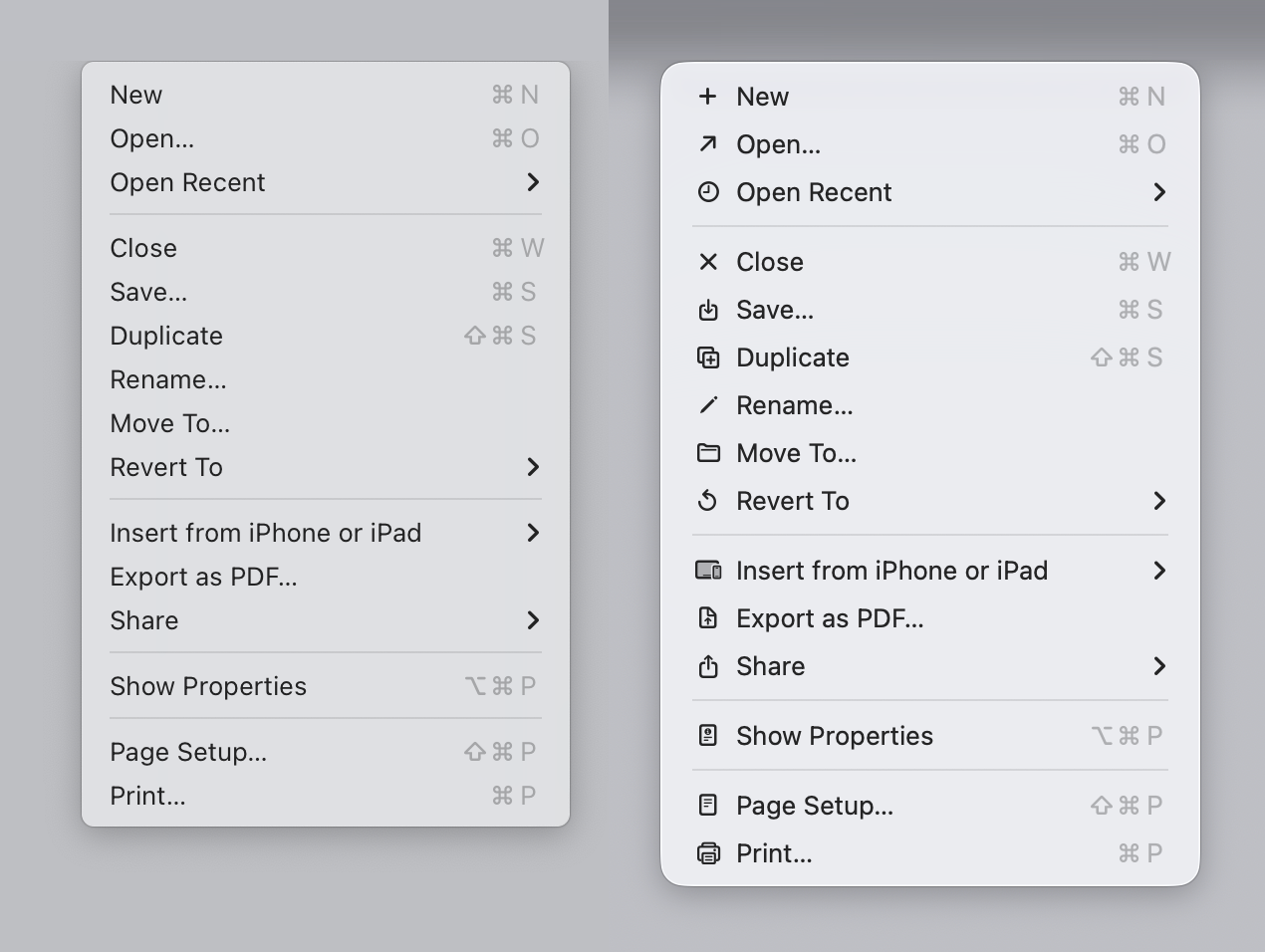
But answer me this. You say "but most [but not all? - interesting] of the icons do make it easier, faster and more pleasant for my brain to parse the menu vs no icons."
How does a list of icons that are used inconsistently, duplicated, used in other places, sometimes used and sometimes not used, not to mention illegible, positioned inconsistently, go directly against the broad (reasoned) rules of the Apple HIG, help 'make it easier' as you say?
This is literally what half the article is explaining and you are just saying - no it's easier to not be able to tell an icon apart, and it's easier to have the icons sometimes be the same or move locations, be so small as to be illegible.
How many did you get when the menu text was removed ? I just don't believe it makes it easier. But who am I to argue against someones 'subjective opinion evaluation' I'm just a guy on the internet.
ps I assume by the opening image, you mean the first screenshot supplied by the author of the article - the Sequoia to Tahoe menu comparison, which he brilliantly posted below a shot of the HIG which literally is explaining the exact same thing and why not to do it the Tahoe way. That in it self is confusing.
It makes no sense why Apple chose to do that with Tahoe?
I'll add a general comment - one of the reasons I use Apple systems was they had the UI stuff nailed down. Stuff was consistent. It looked and behaved in proper ways. It felt like a properly designed, holistic approach to UI design. Lately it's just a mess. This article touch the surface of the issues. My current beef is this stupid 'class of window' that appears now and again which is half-way between a dialog and a window. Best place to see it is immediately after a screenshot - click the thumb that appears. This window type doesn't behave like any other window. Z-order, closing, focus, actions that occur when you click certain things, are all different and inconsistent. But it does look a little like IOS though.