Look at a traditional dashboard. The air conditioning knob is a different shape and size from the stereo's volume knob, and located in a different place (ideally). Those things make it easy for the the driver to distinguish one from the other, and find them while keeping their eyes on the road.
There are other cues that usually exist to help as well, such as a blue-to-red graphic around the temperature control, the volume control being next to other audio features like the radio display, etc.
In an environment where the user has to keep a 3,500 lb steel machine safely controlled while traveling 100 feet per second, the rules of usability become incredibly important.
You've nailed it sir. Shape coding[1]. If it's good enough for F-14 fighter pilots, it's good enough for my Toyota Camry.
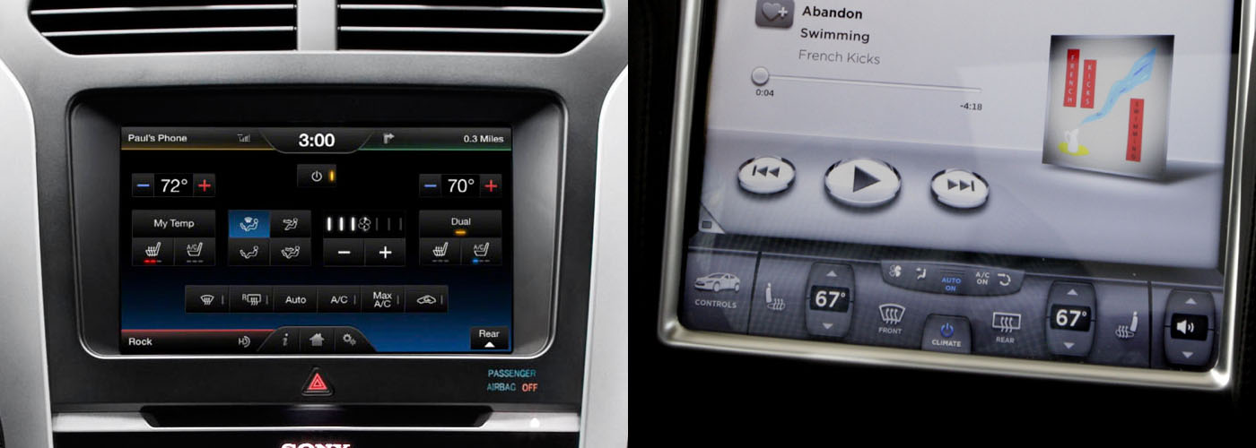
I echo the sentiment of others. The OPs heart is in the right place here. Mimicking sight free displays on a touch screen is laughably terrible. Take this picture [2] from OPs post. Why are the media buttons ellipsoids? They're just smaller targets to hit compared to squares!
In academia, we've been researching this problem, eyes-free mobile interaction, for a very long time. Particularly in the context of interaction while walking.
There are numerous approaches (e.g., Flower menus [3], utilizing pressure [4], utilizing motion [5], the list goes on). The big takeaway is that it seems like more successful systems result from the multimodal approach.
OP, you've done some good work here, but consider incorporating other sensors. Voice? A camera for in-air gesture recognition? A biometric sensor that gives reasonable defaults automatically based on learned use of the driver? Touch is only one part of the problem if we move away from shape coding, and we will very likely need to utilize multimodal input if we hope for success...
...or, you know, we could just stick to that whole buttons and knobs thing.
-----
[1] http://en.wikipedia.org/wiki/Alphonse_Chapanis
[2] http://matthaeuskrenn.com/new-car-ui/images/statusquo.jpg
[3] http://www.youtube.com/watch?v=QRSASiEBw5k
[4] http://www.mobilevce.com/newsite/sites/default/files/infosto...
[5] http://katrinwolf.info/wp-content/uploads/2013/05/MobileHCI2...
In this case, I'm simply trying to make a point that touch screens can be more control panels with buttons and sliders on them.
SimCity has a tool pallet of various building and editing tools, which are related to each other in various ways, and have different costs, functions and properties. I tried to arrange them into a set of submenus that made those relationships and differences more obvious and easier to learn. I also arranged the static tool palette on the screen to reflect the layout of the pie menus and submenus, to serve as a kind of map to the pie menus (which foreshadowed the spatial map design I explored with Method of Loci, described in another posting).
Here is a screen dump of the multi player version of SimCity running on a Sun workstation on TCL/Tk/X11: http://www.donhopkins.com/home/catalog/simcity/SimCity-Sun.g...
The top level menu includes: magic marker and eraser (for drawing on the map), roads and rails, power lines and a bulldozer, and submenus for common zones and bigger buildings. The zone submenu includes residential, commercial and industrial zones, police and fire stations, and a query tool. The building submenu includes a stadium, park and seaport, coal and nuclear power plants, and an airport.
As you can see, the size of the icon reflects the cost of the tool. The borders of the icons are color coded to reflect the cursor you see on the map that shows where the tool will affect. (That was useful for multi player mode, so you could see which tools the other players had selected, so the tool palette served as a legend for the cursors on the screen.) And the tool palette looks kind of like a totem pole, which is vertically asymmetrical, differentiating different kinds of tools and making them look unique, and horizontally symmetrical, reflecting pairs of similar tools and making it look aesthetically pleasing.
If all the tools were the same sized squares arranged in a regular grid, it would be much harder to differentiate them and quickly select the one you want. Instead, they're arranged more like a bouquet of unique flowers that each have their own special features that make them easily recognizable and memorable, while telling you something about themselves.
Designing user interfaces this way is a artistic balancing act, highly dependent on the set of commands, and requiring a lot of iteration, testing and measurement, as well as willingness to explore and experiment with many different alternatives. It is not easy, and there is never a best solution, or even always a good one. It's not something you can expect end-users to be able to do with their own custom built menus. But it's worth the effort to try, and I think it's also worth the effort to train designers and even users to promote a literacy in interface design.
One idea I've had is to develop a game called "PieCraft", that has user-editable pie menus that are first-order in-game player craftable artifacts. World of Warcraft and its rich ecosystem of user interface extensions supports a wide range of player customizable user interfaces, because there are so many different commands, spells, buffs, weapons, armor, etc, and each role of each character of each player requires a totally different set of them in different situations. The more casual MMPORG "Glitch" had bags that users could arrange in hierarchies and put their items inside, which were surfaced on the user interface as buttons they could press and objects they could drag in and out of the world and other bags. How well you arrange your items in WoW and Glitch had a significant effect on gameplay.
PieCraft could take this further, to train players in user interface design literacy (much like "Code Hero" aims to train players in computer programming). You could find empty or pre-populated pie menus in the world, pick them up and make them your own, and edit them by moving items around, putting them inside of other menus, and modifying them as you leveled up and earned more powerful menu editing skills and resources. The capacity and layout and allowed contents of some menus could be restricted, to constrain the ways you used them, forcing you to figure out which were your most important items, and giving them front row seats so they were easiest to select.
To put further pressure on players to design efficient menus, your menus could be vulnerable to attack from warriors and theft from pickpockets while they were popped up, and only be able to take a limited amount of damage, before they would break open and spill their contents out all over the world! Then you (and your enemies) would scramble to pick up all the pieces, and you would be compelled to arrange your most important items so you could find and select them as quickly and easily as possible, so you could "mouse ahead" swiftly during combat and in crowded public settings, to avoid damage from attack and loss from thieves.
So, since I have the opportunity to fanboy out a second: thank you for your contributions, both to gaming and human-computer interaction.