2. In my suggestion I thought about using the same indentation style (which is nice and space-saving, indeed), but just using different opacities of the accent colour instead of individual colours for each indentation level. But again, that's probably personal preference and not a hard rule :)
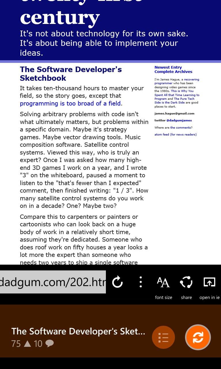
3. The share icon is common enough by now that I know it, but I had to tap the last one (open in browser) to know what it does. Hopefully the IE icon may be used in that context. Perhaps labels for the buttons might still be added, in the usual fashion: http://hypftier.de/temp/wp_ss_20150103_0002.jpg – they'd be hidden below the screen's bottom edge by default; dragging up a bit would reveal them as usual. Also your dragging gesture behaves the same as elsewhere, which means that dragging up just a bit to reveal the labels would drop the bar to the bottom again after letting go.
However, looking at IE now, it doesn't do that for the single icon on the app bar that you can choose, but that might be because you can choose it and therefore know its purpose. Back, Forward and Refresh indeed need no labels.
4. I think I found out why it looks off. The pressing and releasing animation where the icon drops a bit down and bounces up again plays at the same time, which means the button comes up again during the scrolling animation, making the rotation look wiggly. But right now my tired eyes fail to discern any difference. Disregard this, then ;)
5. I'd be glad to, although I'm not that much of a heavy reddit user. HN is bad enough in terms of a time sink :D
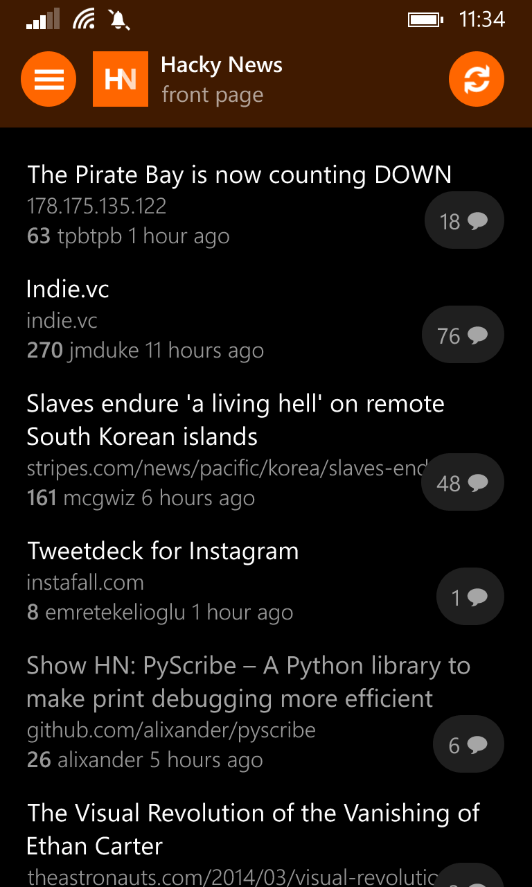
6. Another minor thing: Up until now I didn't even see that there's a screen to the left of the headline list. And now I noticed that you get there by pressing the ⇄ button. I'm not sure, as I've never designed a UI like that, but it seems to me the more-or-less default idiom for invoking such a thing is a hamburger menu button on the top left of the app (http://hypftier.de/temp/wp_ss_20150103_0003.png) or using the app's icon in the top left for the same purpose. But that's more an Androidism, I think. The canonical way on WP would probably be a Pivot control, but that'd kill the swiping for going back to the browser. Not sure right now. Interaction feels slick and is nice with Hacky News, it's just not really native to WP in some places. The lack of the Pivot control also means that you have to swipe back to the start screen from the browser on the app/address bar, even if there is no browser history to go back to.
7. A few typos: »Water you doing here ?« There should be no space before punctuation (except in French where people do that ;)). Settings: »Always use a colored (orange) til« should be »tile«. Credits: »open source libraries« should be »open-source«.
8. My usual view on a help section for mobile apps is that if you need it, you should probably redesign your UX, but there are only so many things that can be made discoverable, admittedly. Also I may have an interest in UX, but am not an expert ;)
Again, it's a slick and well-designed app, and thank you for making it. Just because there are 8 points above doesn't mean I don't like it ;)