"Firstly, it’s not change for the sake of change."
Unfortunately, due to the nature of company politics, this kind of thing usually happens because a new CMO or other exec comes in and needs to "mark their territory". Marketing in tech right now is having a big problem with people rising to the leadership ranks that really don't understand the basic fundamentals of the craft.
Can anyone explain why all the 'incidental' graphics on the website are printing press related (halftone dots, mis-registered colors)?
What the hell unique lineage does slack trace to the printing press? Also how does that align with the new ultra generic could be any kind of business logo.
And let's not even talk about that sweet negative space swastika.
Oh god, cannot unsee.
Edit: It's not even negative space. I just see it as a swastika.
It's not facing the same way as the Nazi one, first off, and would you also say that's a problem for Sun, or for Columbia (bikes/outdoors)?
(Call it the Miracle on 34th Street response.)
And you might be surprised by how often the client, rather than being reassured, simply takes it as proof that that design firm is not "with it" since they can't see what is (to the client) obvious deficiencies in the branding.
Generally speaking, brand owners who are happy don't reach out to design firms, and brand owners who are unhappy won't suddenly become happy just because one firm told them the brand is fine.
Uber went from a stylized Ü to the Chase Bank logo [0], as part of a grand brand strategy that fractured regular polygons that somehow supposed to make you think that they weren't just cab service. (Seriously, they called their 2016 suite of logos "Bits and Atoms" [1].) People literally lost the app on their phone. If it wasn't a mistake, they wouldn't have changed their logo to simply the word "Uber" in less than 2 years if it wasn't seen as a mistake.
Grandmas use Google, Facebook and Amazon but generally have not adopted Uber or Instagram yet. Winning over those kinds of customers requires a different GTM strategy and different marketing than your first couple million.
Yep; exactly. These companies are successful and their logos are recognizable. Google had the right idea, they become successful and then they tweaked their logo over the years: https://www.digitaltrends.com/web/history-of-the-google-logo...
>Marketing in tech right now is having a big problem with people rising to the leadership ranks that really don't understand the basic fundamentals of the craft
Can't blame them; tech industry has been focused on tech and some business and of course people from other departments are starting to figure out they grow their career in leaps and bounds just by switching to a tech company rather than fighting in the highly competitive playgrounds of ad/marketing agencies and other companies.
Better to be a big fish in a tech pond than a small fish in a marketing pond.
Nobody will care in about a week.
It does feel generic. I'm actually retroactively impressed that the old one looked so classy using so many colors (pour one out for https://metalab.co, who is doing just fine). I actually loved the different treatments—the Slack brand always felt like one of their strongest assets. It looks like the Joomla logo now – https://www.joomla.org/
> I'm reminded of the Philip Morris rebrand to Altria
IIRC that rebrand was done to distance the company from cancerous associations with the name "Philip Morris", whereas the only reason I can think of for Slack to do this now is to give them a quick short-term publicity boost to make them more relevant to "retail investors" -- that is, this corroborates rumors of a public offering later this year, and imho means that it's going to happen sooner rather than later.
https://www.goldennumber.net/wp-content/uploads/pepsi-arnell...
Still, I love these kinds of process breakdowns. Having been involved in writing a few of my own, I know there’s probably a lot of pretentious nonsense to fill in the blanks (i.e. designers mess around a lot when working) but still it’s a nice read, short as it is.
But Pentagram didn't let that stop them, did they. Guess that's why they get paid the big bucks
It's like they recycled left overs from the EFF logo job.
Pentagram is hit or miss depending on who leads the project. Michael Beirut is one of the better partners and designers at Pentagram.
https://pentagram-production.imgix.net/618d5092-a542-4dae-bd...
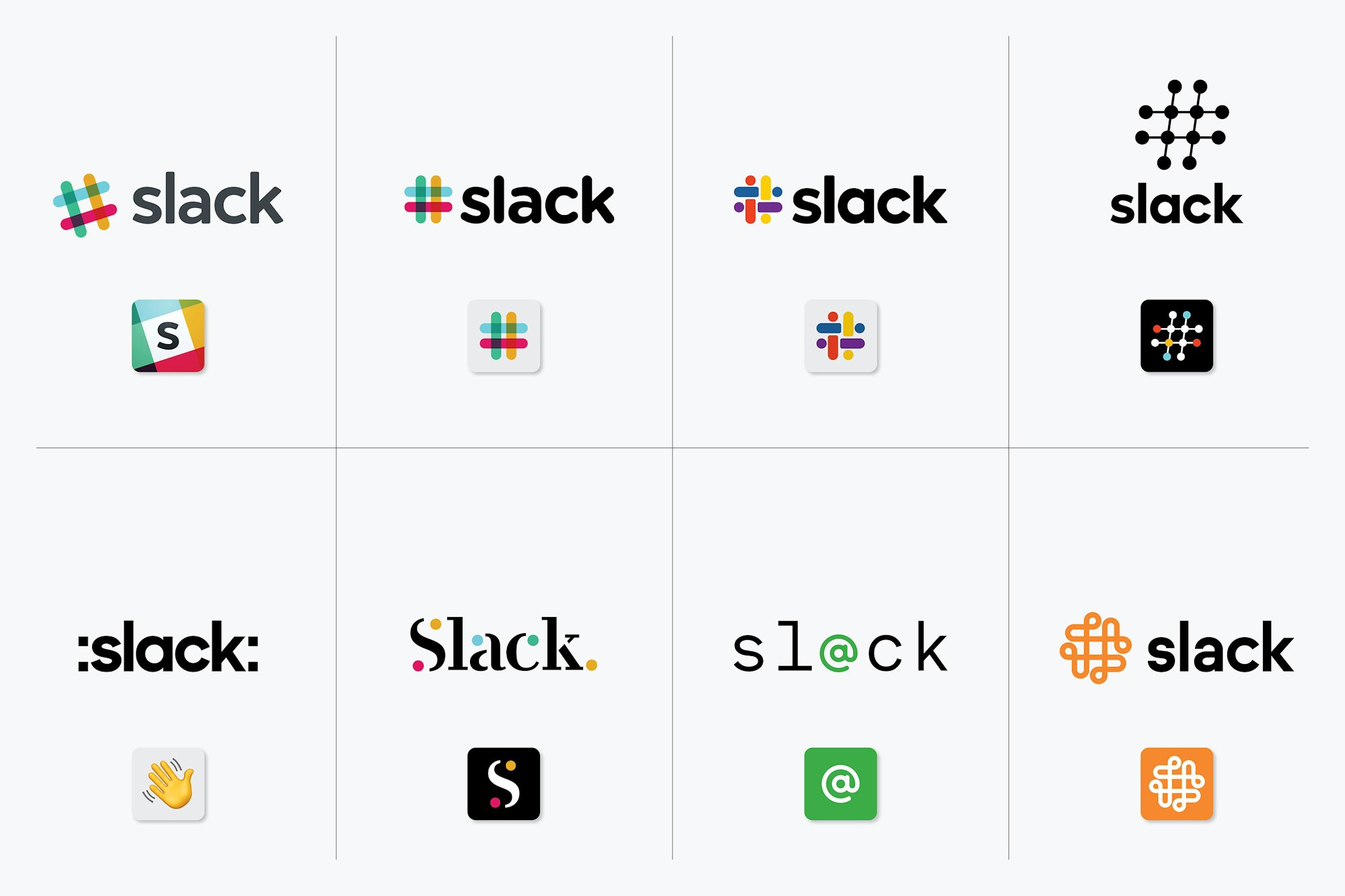
One is just colons added to the name and the wave emoji. The one beside it looks like it's from a 1997 tech company. The whole bottom row seems like it should be titled "We created these to show what not to do."
Edit: apparently HN doesn't support emojis. https://emojipedia.org/splashing-sweat-symbol/
Except Slack's UI doesn't use message bubbles. I wonder, is this a signal that that's about to change, or is it just artistic license?
There is a swastika hiding in the negative space in the middle of the logo.
Anything with rotational symmetry runs a high risk of somehow incorporating one.
Well, anything featuring right angles, four lobes, and rotational symmetry. Drop any one of those and the accidental swastika risk drops tremendously.
https://latticelabyrinths.wordpress.com/
https://goodlogo.com/extended.info/sun-microsystems-logo-238...
https://goodlogo.com/extended.info/columbia-sportswear-logo-...
Once I see it, that's all I'll ever see.
[0] https://events.ccc.de/congress/2018/wiki/images/9/99/35C3_Lo...
Top comment on DN:
"Looks like a swastika made of dicks."
Everyone, please look at the FedEx logo. notice the arrow between the E and x? You're welcome.
Now I can't unsee.
Amazon.com, Apple, McDonald's, Walmart, Fedex, UPS, Nike, Coca Cola, 3M, Target, Visa, Square, PayPal, Facebook, Uber, Lyft, Twitter, YouTube, Netflix, Samsung, Sony, Intel, Cisco, Oracle, IBM, SAP, Starbucks, Lululemon, Under Armour, NY Times, American Express, GAP, Best Buy, Costco, Exxon
I was thought quite the opposite for logos (re: colors): fewer colors is better, and the logo should be instantly recognizable in monochrome. It being something a layperson could draw reasonably well is also a good thing.
Edit: Did I just miss the sarcasm train here? It's very possible.
Nonetheless, least props to Slack team to putting reasons on why the logo needed to change, instead of a generic "we wanted to go to new horizons with our product" or "the old logo was getting behind the new design trends" or something else.
(Technically, in IRC, they could be prefixed with an ampersand (&) as well, but nobody ever did that. Great for making super-secret channels, though.)
> We’ll not bore you with the design thinking
With a logo like that, you had better at least link to it. Oh, you did. But the link's label was just "Pentagram," so I thought it was to the company's home page, not its specific story about this work.
I understand their complaint about the complexity of color, though I disagree. I thought it was beautiful, maybe worth the complexity.
Regardless, they seem not to know that the new logo is more complex, and therefore harder to be distinctive. They have traded complexity of color for complexity of shape. If you concentrate on the logo in outline, you can see that it has so many lines going so many different ways, all tightly packed, that the overall impression is a drop of rain after hitting the pavement.
It's hard to make good logos. For people whose only job is to make logos, it might in fact be harder. They're tempted to overthink it. They go through 40 revisions. The first two or three are often the best. This was the case here too, based on Pentagram's development artifacts. After a while your secret reasons behind each jot and hook overwhelm your judgment.
Maybe the best thing is to take a month off after you think you've got it, to get a fresh pair of eyes. All those fancy reasons you came up with to justify it fade away. Like, what are those raindrops around it? Oh, you say they're supposed to be speech bubbles. Well, they kind of look like speech bubbles now that you mention it. But not really, because speech bubbles are shaped differently when they contain actual speech. These look like drops. Scattered around the logo like that, it looks like what happens when you drop something.
I appreciate the quick blog post much better than the old Uber brand which tried a bit too hard to explain every thought behind each part of the rebrand.
A pity that Slack’s still lacking such a seemingly easy to implement feature.
However, I like the new logo!
Yes, that's essentially it. Most projects are make-work to some extent when you're paying for people's time in monthly or yearly increments.
The # at least was related to the channels and showed some relation to chat programs because of IRC channels.
I'm sure they had their reason for this change, I'm just not sure if it was a good reason.
I'm not sure if it's enough to call it a mistake though. (My mistake for not spotting the entire thread discussing this...)
But they look like squirts. Emoji squirts. Which are associated with sexting. And squirting is kind of associated with sex in a lot of people's minds...
I'm trying to keep an open mind. But the logo is four squirts around four lines of roughly phallic proportions and rounded ends.
Seriously. This was literally the first thing I saw when I saw the logo. And judging from some of the other comments here, I'm clearly not the only one.
Really suprised this got approved.
And stretch though it may be, GP isn't alone in seeing this. Whether people continue to see the phalluses and associated droplets in everyday usage of Slack, that remains to be seen, but good design doesn't need time to run its course so that people stop noticing the bad bits.
I recall when I designed a logo for the radio station at which I worked. The concept was a flat circle with a cutout of a set of headphones. Unfortunately, the headphone cutout was a bit too low on the side, so what was supposed to be the space in between the headphones wound up looking like a bloated penis. It can happen to anyone.
To me, it seems a bit useless though, but I don’t have any relevant knowledge about Marketing nor Corporate Design to provide useful feedback. There’s probably some value in a re-brand even though the company is not facing any criticism for their colors, logo, and slogan.
> It was also extremely easy to get wrong. It was 11 different colors—and if placed on any color other than white, or at the wrong angle (instead of the precisely prescribed 18° rotation), or with the colors tweaked wrong, it looked terrible.
I stand corrected, these are good reasons to justify the rebrand.
That being said, I felt a bit scared this morning when I opened Slack and found that the colors were slightly different to what they used to be, I freaked and thought someone had hacked my corporate account, then I went looking for answers and found this post, my heart was immediately at peace.
I hope this change brings them more opportunities to grow.
---
EDIT: Interestingly, their “Release Notes” says version 3.3.6 [1] but 3.3.3 [2] in the download page.
The :slack: emoji is also showing the old logo. I wonder if they are going to change “slackbot” avatar as well.
I don't understand.
I had a coworker that had similar reactions to things. "My stuff is missing" = immediately wants to call the authorities, without asking the roommate. Which had moved the stuff due to some petty squabble.
Similarly, this. You had default avatars. Default avatars got changed. Why would someone go to such trouble and make them immediately known? It is more likely to be a change by Slack themselves. Because they provide the default avatars.
Now, if you got custom avatars, and they all got replaced with some activist banner? Ok, hacking gets higher probability.
Not trying to criticize, I just want to understand the line of thought that leads to this.
* [ ] Doesn't look like 4 sets of you-know-what arranged in a circle
* [ ] Whitespace between elements doesn't look like swastika
Someone mentioned these, and now I can't unsee them. Way to go, Slack.
If they really just wanted to change it, they could have just simplified the colors. Oh well, now they just look like every other generic company (it reminds me of bank logo but I can't remember which one).
Interestingly, some Slack groups that I’m part of still have the old colors.
  Theme: Aubergine
  *(Old)* Normal Color: #4d394b
  New Background Color: #3f0e3f
Solution:
Let's spend loads of money on a new logo!
> The answer to “Why?” is “because why the fuck else would you even want to be alive but to do things as well as you can?”. Now: let’s do this.
They hired someone really fucking good at making ugly lower-case As.
We used to be able to see if there was new messages, or if someone tagged you, directly in the favicon without opening slack, now it is impossible.
You are forced to go check slack all the time to see if there is something new. I'm disappointed :'(
Google is red-green-blue-yellow
Now Slack is red-green-blue-yellow
Who is next?
The symbol was and is a part of their product as well.
Now it’s just a multicolored blob.
I feel like this would be equivalent to Starbucks dropping the mermaid.
Then again I’m not a professional logo designer who gets paid hundreds of thousands dollars per “project”, so what do I know.
More than they do, apparently
http://wcontest.com/wp-content/uploads/2018/06/1529781727_;w...
I hope they release new desktop and mobile apps soon
The old ChallengePost logo used 4+ colors, which meant every shirt we printed came at a $2-5 premium over a single color.
When we rebranded to Devpost, we came up with a 2 color design (so we could do spot colors), which was an improvement - but I still wish we had gotten down to 1 color.
I was confused by this claim in TFA. I see 4 colors of lines in the old logo, plus 4 colors where the lines overlap. 4 + 4 = 8, obviously. Even if we counted text and background (which doesn't seem commonplace when discussing how many colors a logo has) that only brings us to 10. I get why 4 colors is preferable to 8, but I don't know where the number 11 is coming from. Anybody know what I'm missing here?
Honestly the old logo is four colors visually, you brain is shortcutting the overlaps because it understands them.
I like the old logo better.
Looking at the new logo again, I also think of sprinkles.
This is a wrong way of thinking.
You may have heard of the term "Throwing more developers at a problem doesn't help or too many cooks in the kitchen."
Slack should absolutely work on those issues - I agree, but not by sacrificing the rest of the business needs such as Branding.
https://www.dreamstime.com/stock-images-arrows-logo-designs-...
Are you sure about that chief?
Actually yes, it is.