Today I learned!
So if you're playing a video and you open a web page, and the webpage has the same green color, it looks like there's a hole on the browser window and you can see the video playing "behind" it.
My feeling about OS X at this time was that it was the right choice but that it was "too late" and that Apple took too long and the window of opportunity had passed.
I take that now as startup advice: It isn't too late!
The one I remember so clearly is back when I was using Pidgin (or Adium I think was another thing I used?) with a few different messaging apps, and my company was trying to figure out how to make chat work, maintaining an irc server that we of course couldn't get the non-nerds to use, looking at HipChat and a couple others that seemed really expensive for their feature set at the time. Basically none of this stuff supported mobile well.
This was 2008, maybe 2009. I remember thinking "this all sucks, but it's waaaay too late to make a chat app; I've been using IM apps for over a decade, totally saturated and commoditized".
But then I watched the rise of WhatsApp, Facebook Messenger, and Slack, all of which were tiny or non-existent at the time, and became gigantic businesses.
I would never have taken that bet. I want computers to be fast now. It was the right bet.
There was an audible gasp when they announced it was based on KHTML. What the %^&$ is KHTML?
> double buffering everything was OK because graphic cards would get there eventually.
Apple had millions of users, an already profitable business (by 2001 barely), and marketing reach that was far outside its market share.
They had the best marketer and product guy in the business for a CEE and one of the best logistics experts for a COO.
A startup probably has none of those things.
It appears to have all the basic functionality expected from a modern operating system, I instantly feel right at home although I've never used it.
I find the review terrible though, one of the major changes was the user interface, revolutionary I would say. It's way more important than wether the GUI configuration options are well thought out or not.
The aesthetics is called „Frutiger Aero“. Lots of colors and especially of blue, lots of transparency effects and fake light reflections. It all is inspired by natural landscapes with blue skies or blue water surfaces. Also skeuomorphisms everywhere.
Windows 7 could be called the pinnacle of the use of Frutiger Aero in UI design when Apple already started to move away and embrace material design. Windows 8 was the big cut where its UI forcefully pushed material design onto its users without any transition grace period. That’s one of the reasons why everybody hated it.
Edit: On Macs even the hardware design reflected the transition from Frutiger Aero to Material Design: The early 2000 Macs were all semi-transparent plastic shells with bright shades of blue and green. Then Apple discovered Aluminum and silver unibody cases. Now there is no color left in the design universe. This also marks the time MacOS interfaces started to look decidedly more "grown-up".
I wonder what will be next or are we going to stick with heartless, cold metal designs forever?
Windows Media Center was the origins of the Metro UI, Windows Phone 7 was the industries 21st century intro to a typography first flat design.
Sadly the good design aspects of Windows Phone 7 mostly got forgotten about by the time Windows 8 came along, IMHO it is because WP7 had a small dedicated design team compared to whatever large group I imagine did Windows 8.
CARI has probably cataloged it already. Apple is already going all in on colorful aesthetics recently, not sure if it will spread into hardware.
If any design folks have an opinion on which way the winds are blowing, I’d love to see an example.
I miss skeuomorphic design. :(
I hate how flat everything is these days.
The truth is, for the most part operating systems haven't really advanced that much, at least from a ux standpoint. Speaking as someone who started using computers in 1997 on windows 95 and a 133mhz pentium. All the basic metaphors and mechanisms have stayed the same. Tabs in browsers were considered like a huge leap (I know it's not strictly an OS thing), and that was almost 20 years ago.
Flat is just so... flat. And boring.
And also harder to read, because it's harder to orient yourself in a big textureless area than in a space with some texture in it.
OS X 10.6 Snow Leopard was the peak for me.
I vaguely remember dual-booting Mac OS 9 and X for a while, but it wasn't long before Mac OS X took over full time.
Remember how cool those confirmation buttons were? Nice blue pill that said "Click me!" They really looked like you could touch them. If only Apple hadn't taken away the customization capabilities of the UI. Remember themes with Shapeshifter? I would love to have that back now to get some old school OS X widgets.
I can no longer navigate to settings I frequently used and need to search for just about everything. Perhaps I shouldn’t expect things to stay the same after 20 years(!), but for long time users, it’s bewildering.
Although, OS X was painful for many years.
I guess it depends on how you define "many". I bought my first Mac in 1998 (the "Smurf" G3) and used MacOS 8/9 for quite a few years after that. I remember looking forward to OS X once they announced it—it was literally the coolest shit ever. Like, the ability to run Photoshop and Emacs on the same system at the same time? Wow, was that cool.
There was definitely a period where you had to dual-boot between MacOS 9 and OS X for a while, but by the time I bought my first iBook in 2002, OS X was the standard, and was way better than anything else out there. I don't think I ever booted into MacOS 9 on my iBook, except for shits and giggles.
I just don't think there was any question that OS X was leaps and bounds better than OS 9, to the point where when I had to use OS 9 for work 4-5 years later (the video editing world always lags 5-6 years behind the rest of us) I was a little bit peeved about having to used such an antiquated system that literally had no modern web browser support except for something called "iCab".
Anyway, all of this is to say… I wouldn't call 1-2 years, at the most, "many".
10.1 made things a little more stable but wasn’t revolutionary.
10.2 Jaguar on the other hand… holy cow. It was so much faster and more stable on my iMac it was absurd. The speed gap was still there but nowhere near as dramatic, making it a lot more usable. This is where I went almost full time booted OS X outside of the odd random thing that didn’t play nice with Classic.
Meanwhile, the Mac OS X Finder is not spatial. You can have the same folder open in multiple windows, each with different layouts. There's no longer that illusion that the window and the folder are one and the same – it's just a browser showing you the contents of the folder.
This article goes into a lot more detail. https://arstechnica.com/gadgets/2003/04/finder/
For example, in https://www.youtube.com/watch?v=rf5o5liZxnA at 35:00 you can see how an application is loaded from the network and a live chart dragged from one app to another. That isn't a one-off gimmick, it's how the OS and that version of Objective C worked.
I bought a Macbook because I was excited by this idea, but I quickly realized it was not even surface deep. I could drag some on screen elements around, but it was inconsistent at best.
But I guess there was a conflict with Raskin's idea of making everything resemble a real world equivalent (object as in "toaster app," rather than decomposed feature of "can toast") and they wanted to let third party applications do their own thing. If the whole OS (and network) was effectively the application, what's their product? Never let profound world changing innovation get in the way of a trillion dollar company, I guess.
I think of it, in my muddle headed imagineering way, this way: https://wiki.zooid.org/wiki/20120407/Raskin_vs_Engelbart
I suppose by now we would think of it all as a graph rather than OO, just add coordinates (and the required couple decades of cultural development of how they would relate) and you've got your spatial interface.
I’d come from a NeXT background and was surprised how slow OSX (OpenStep in essence) was on PPC.
Getting Quartz née "Display PDF" up to where it was took the better part of a decade as Mike Paquette explained in detail on comp.sys.next.advocacy
It wasn’t done very well and was clunky. The later re-write to Obj-C was an improvement.
As for the rest of OSX, most of the inbuilt apps were just direct from NeXT. Even today, Mail and TextEdit are still similar.
ProjectBuilder was much the same as on NeXT as was InterfaceBuilder. Their merging into the blob that is now XCode was a mistake IMO.
With ViaVoice, the training app was a PowerPlant port from the older Classic version. It wasn’t hard to munge PP to get it to work.
I did the UI for the VoiceCenter (a HAL-like UI intentionally) and the Preferences given my AppKit skills. One advantage we made use of is we used a UNIX voice engine that ran as a process on its own.
The OS really was just a NeXT with skinning for Apple and a few apps using PowerPlant. I think the old Sun based network management was still present (NIS??).
Obviously, a lack of Display Postscript made a difference as Apple had to develop their own renderer using the same graphics primitives. That may be why it was so slow back then.
Just because it’s old, doesn’t mean it NEEDS to change, but I can imagine the need to at least explore a bit if something stays mostly the same for 20 years.
If you’ve grown up with phones and tablets, anything that’s a change to the device, even if it’s an operation and not a setting, is in “settings”.
I get it, doesn’t mean I agree with it to be fair! I miss old system preferences as much as you.
https://web.archive.org/web/20011017155749/http://www.mozill...
So the transition for me took a while at the start. Think it was Jaguar, or maybe Panther when i moved 100% to MacOS X.
> Being based on BSD Unix, MacOS X inherits many useful unix features such as real security and user accounts.
> This means that, for example, you can create a special account for someone else to play games and don't have to worry about them deleting system files, accessing your personal files, or changing system setting.
> This can be somewhat confusing to users who are used to having complete control over their systems in earlier versions of MacOS. To do things like install software you must be logged in as the Administrator. While this can be annoying it prevents users from accidentally messing up their system or from malicious programs or viruses that could otherwise infect the system. There is also a hidden "root" account that has slightly more privileges than the Administrator, but this is rarely needed.
Reading this now in 2023 it seems laughably primitive, but I remember the mass confusion at the time! Very similar thing happened with Vista. When old people like me pine for the simpler days of yore, it's hard to imagine just how much simpler those times were (mostly in a good way!)
I love modern Linux and use it on my family PC and it's great having full multi-user tooling for my kids to have their own spaces with no root, but I do fondly remember the days before user accounts were a thing on your PC. Not to mention how open and interopable things were. Those days don't come back
What we were just barely starting to grasp then was that, among the “other users” we need to be protected from, were the software vendors themselves.
In other words, I am not a single user; the combination of me and various groupings of binaries are the user, and they must be carefully isolated. And now, it turns out I want still another layer of protection too (e.g. multiple browser profiles/containers).
Back then, most people were still on dialup internet. It was still relatively rare that software would record everything about us and report all of it to HQ. We used to call software like this “spyware”, which isn’t really a word that even exists anymore.
The idea for the need for something like Qubes OS would’ve been completely alien.
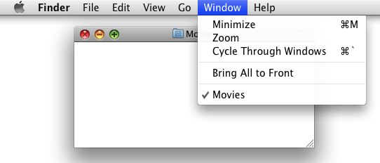
The "+" symbol is Zoom, not Maximize. https://iili.io/H6a1uAG.png
That is more useful than the icon view it has now.
The macs of the era had a matching theme to their design. Zoom into the front face of the Power Mac G4 "graphite" tower here:
https://upload.wikimedia.org/wikipedia/commons/c/ce/Apple_G4...
They really didn't look bad, though. I think if you zoom the image larger it will give you a better impression of what they actually felt like.
In hindsight, the pinstriping in the first couple of releases was a bit much, but sadly the buttons also got toned down at the same time as the pinstripes, and they've never looked as good since.
/s
This may feel unexpected and out of place but Safari was first released only in 2003.