A worthwhile read that I thoroughly enjoyed.
I was quite surprised by the first comment because I did not expect that a font was so emotional (especially that I do not remember any particular fonts in the movie)
On his commerical use page, he just asks for a $20 donation if you use a font commercially. I wonder if he realised that his fonts would be used in billion dollar movie franchises.
And thus started a new chapter in the exploitation of film crews, where you don't get paid enough but hey, at least your name is in the credits. All the other producers were immediately like -- that's a genius idea to pay the crew less! So now all movies (and even TV shows) are full of hundreds and often even thousands of names in the credits.
Funny story: I usually sit through the full end credits when I go to the movies, just in case something interesting happens afterward. So I'm doing the usual thing at the end of Sonic the Hedgehog, and suddenly, there's MY REAL NAME jumping RIGHT out at me! It wasn't even on its own line, just in with a bunch of other folks working in the same group (I presume), but there it was, and I SPOTTED it!
Maybe it's just me, or maybe we just tend to take notice when our own names pop up, even in a crowd.
Anyone else have that experience?
Someone can correct me if I'm wrong, but I believe these days the various film-industry unions essentially require individual credits for anybody who even tangentially had anything to do with working on the film or on the set of a film. E.g., I'm pretty sure I've seen the names of catering staff in movie credits.
Some·times it is it al·so seen
To cla·ri·fy the way
That syl·la·bles and me·ter meet
In things we say to·day
Which ex·tends from hea·vy use
In pla·ces not so mer·ry
For proof of this phen·o·men·on
Con·sult a dic·tion·ary
From the footnote on page 219 of Word by Word by Kory Stamper (formerly a lexicographer at Merriam-Webster):
> Here is the one thing that our pronunciation editor wishes everyone knew: those dots in the headwords, like at “co·per·nic·i·um,” are not marking syllable breaks, as is evident by comparing the placement of the dots with the placement of the hyphens in the pronunciation. Those dots are called “end-of-line division dots,” and they exist solely to tell beleaguered proof-readers where, if they have to split a word between lines, they can drop a hyphen.
    - Which ex·tends from hea·vy use
    + Which re·sem·bles hea·vy use
U+00B7 MIDDLE DOT = midpoint (in typography); Georgian comma; Greek middle dot (ano teleia) • also used as a raised decimal point or to denote multiplication; for multiplication 22C5 is preferred
U+22C5 DOT OPERATOR • preferred to 00B7 for denotation of multiplicationhttps://typesetinthefuture.com/2014/01/31/2001-a-space-odyss...
    While he’s doing so, there’s a dramatic…

    COMPUTER MALFUNCTION

    …in the hibernation pods, which causes the life support
    machines of the hibernating science crew to start reporting…

    LIFE FUNCTIONS CRITICAL

    …and end up with their…

    LIFE FUNCTIONS TERMINATED

    …which isn’t what they wanted AT ALL.

    Still: if it is going to happen, it may as well happen in what is
probably Univers 67 Bold Condensed.In this case, a caligraphy font https://www.1001fonts.com/calligraphy-fonts.html used, ocassionally on real signs, would be a great way to show the road into the dystopia.
The Hello Dolly footage servers + trinkets serves a similar function.
Somewhat off topic, but stuff like this always leads me back to this reconstructed video from 1902. It feels like you almost there. I cannot fantom all these people walking peacefully now are dead, and they never heard of silicon circuit, let alone internet or an iPad. Worth watching once or twice a year it always makes me appreciate my life just few inches more...
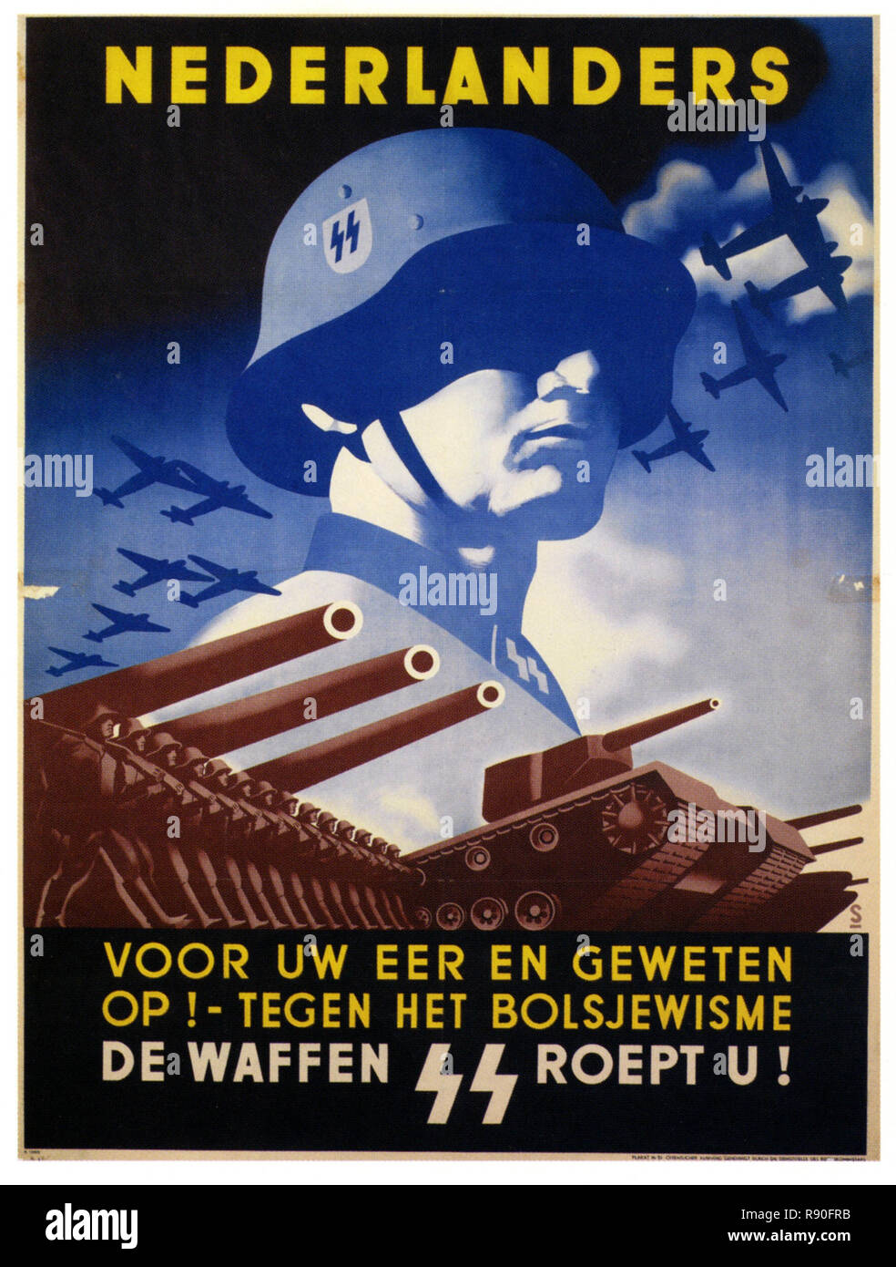
I'm not sure about the poster though. This is not necessarily communist, as this was just the style of propaganda posters of all kinds, that came up in the first half of the 20th century.
Personally, it reminds me more of a Nazi poster for the army, which includes tanks that look similar to these robots: https://c8.alamy.com/compde/r90frb/ss-freiwilligen-panzer-gr...
> The implication of this design choice—that communist values are the solution to decades of rampant consumerism
Completely absurd. The association is not with communism, but with propaganda posters. It's true that Americans are commonly conditioned to associate propaganda posters with communism, but the assertion above is an unreasonable leap.
Made my whole day, fantastic.
https://en.wikipedia.org/wiki/The_Hero_with_a_Thousand_Faces
I was surprised to see an article about type that didn't involve code editors so heavily upvoted on HN, but as soon as I read the first few paragraphs, I realized why-- it was clearly written by an engineer that has learned a lot about design, and not a designer. There's nothing wrong with that! It's a cool and very well-researched design history deep dive that explores the network of references and roots of the type used, how it was used as a storytelling element, and that sort of thing.
If this was written by a type designer, they'd have been discussing very different things-- why the letterform shapes hit like they do, what design problems they solve, the conceptual and emotional references these shapes make rather than which concrete symbols they relate to, the general rounded square shapes, their negative space, how the lack of stroke contrast makes it hit differently than similar less uniform characters, kerning concerns, etc.
For example, here's Matthew Carter-- one of the more famous type designers-- digging into some of the more unusual type design he's done: https://www.youtube.com/watch?v=RojKQ-w9zn8&t=745s
The person that wrote this article knows a lot more about how this type is used from a modern art perspective, but there's a difference between knowing art history and being able to wield the underlying principles to work with these things as an artist or designer. I think a good example of this is film fans that spend a lot of time on TV Tropes an the like, which are rather like informal film critics. That knowledge is a base requirement for great critical analysis, but if I needed to hire someone to create a film, I'd favor an undergrad film student that was in diapers when the film fan started digging into TV Tropes. Why? It's just a fundamentally different way of reasoning about the same thing. The fan is more concerned with the "whats" and "whens", and the student is more concerned with the "hows", and that gives each of them have a totally different perspective on the "whys". I think creators need to watch out with this. Especially in the nerdier genres, if they're so focused on the film itself that they disregard factors like context and overall story continuity, watching that film is a meaningfully worse experience because they're often more invested in the universe/characters/etc. than they are with the making any give story arc or character pop for a given movie. On the other hand, if we hand too much control to the people primarily interested in the context and story continuity at the expense of any individual film's story and artistic value... well... have you seen the Star Wars prequels?
Back to the article, I could see someone without education in type design reading this article getting the impression that they understand the typographical elements in this film. They definitely understand how the typography was used, but that's a lot different than being able to reason about these things like designers do. A more concrete example would be an in-depth article about the cars in the fast and furious movies, complete with the cultural references of each modification and the purposes they serve. It would be cool and informative, but it wouldn't bring the reader any closer to being an auto designer.
A lot of developers, in particular, get annoyed when I push back against their misconceptions about design. It's not an insult-- it's just not their area of expertise. Usually, they don't know enough about it to realize how little they know about it-- like anybody else with any deep topic they don't know. I've heard designers that have cargo-culted tutorial code into some wordpress plugin spew absolute nonsense about everything from data structures to network architecture with the confidence of someone that just got accepted to a prestigious CS doctoral program. That said, it's easier for non-technical people to see that they don't understand software development because it's easy to see they don't understand the terse error messages, stack traces, code syntax, terminology, etc. It's more difficult in the other direction. Visual design, broadly, is visual communication; for a design to be good, at a bare minimum, it must present cohesive messages or ideas to its intended audience. Many things that look the simplest while still solving all of their goals were the most difficult to make-- you can tell when non-designers copy it because it might look simple, but it probably doesn't effectively communicate everything it needs to-- and that's every bit as true for UI design as it is branding and identity design, and poster design. The complexity in that process is only apparent if you've tried to solve difficult, specific communication problems with a bunch of real-world constraints, grappled with the semiotics, tried to make it stand out, etc. etc. etc. and then had it torn apart by people who've done it a lot longer than you. I can see why someone that doesn't understand what's happening under the hood thinks a designer's main job is making things attractive, like an amateur interior decorator. In reality, that's not even always a requirement-- it often is a natural result of properly communicating your message. What we do is more akin to interior architecture: the functionality comes first. So the next time you see someone suggesting something like allowing custom color themes to your app to "improve UX," maybe consider consulting an experienced UI or UX designer to see what they think. If their suggestions revolve around making it prettier or hiding everything behind menus because functionality is ugly, I conceptually owe you a beer.
(When I was in design school, I heard that it was "Pickup Truck of Severed Heads Found in Georgia" but I haven't found a single citation that supports it. I imagine the person that told me was mistaken.)
> The interpunct is still in use today—it’s the official decimal point in British currency (£9·99)
When the linked wiki specifically points out that it isn't:
> In British typography, the space dot was once used as the formal decimal point.
My theory is that some academic or idiot government official told Microsoft they're not using the official separator who duly fixed it. But in practice every "normal" person in the country used a period as a separator.
By default, Excel now uses a comma separator for decimals. Which unless I change it, makes it especially fun when I want to paste values into my banking website which (like most of the country) uses a period as a separator.
Really, it would have been way more pragmatic if South Africa just changed its official decimal separator.
It also caused some annoying issues on our .NET with SQL Server software project. For example SQL seed scripts inserting decimal values would break depending on if they were being run on Windows 7 or 8. On the upside, it did teach us all to have our code be properly locale aware.
People then had a lot of fun being unable to extract their .postcode archive files which suddenly came into existence...
Unfortunately, I'm the sort of pedant who on seeing somebody state an incorrect fact with such certainty, I doubt the veracity of the rest of what they have to say. I wonder where the author got this idea from?
The “still in use today” part is quite definitely wrong though.
----
[1] https://en.wikipedia.org/wiki/Arabic_numeral_variations#Old-...
So hard to see in what sense it's "official".
To show I have no ill will toward outlandish Britishisms, this one applied in Parliament until relatively recently...
"To increase their appearance during debates and to be seen more easily, a Member wishing to raise a point of order during a division was, until 1998, required to speak with his hat on. Collapsible top hats were kept for the purpose."
https://www.parliament.uk/globalassets/documents/commons-inf...
Being a factor of ten off when writing out such a common SI prefix as Mega is a bit impressive.
Thus, 99⁶ should be interpreted as 99E6, hence 99 million, as the author says.
We know already that SI isn't universally followed. As a rough comparison, if a food item contains 160 calories, we know that's 160 kilocalories - and calorie isn't an SI unit. Or, 1GB of RAM is often 1024^3 bytes, with relatively fewer people using GiB.
RAM is always GiB - it’s how it works. I’d love to see an example of it being mangled though
> Some authors recommend the spelling Calorie and the symbol Cal (both with a capital C) if the large calorie is meant, to avoid confusion;[8] however, this convention is often ignored.
For example, the US FDA page on calories at https://www.fda.gov/food/nutrition-facts-label/calories-nutr... has:
> 2,000 calories a day is used as a general guide for nutrition advice, but your calorie needs may be higher or lower depending on your age, sex, height, weight, and physical activity level.
As for 'RAM is always GiB - it’s how it works.' - that's my point.
RAM by convention is in GiB even if the notation uses GB.
The "Crucial Pro 32GB Kit (16GBx2) DDR5-5600 UDIMM" at https://www.crucial.com/ is actually GiB, because the convention for RAM is to use "GB" to mean "GiB".
Even though that doesn't follow SI prefix conventions.
Just like the predicted currency of 75 years from now uses 99⁶ to mean 99 million, even though the superscript 9 is not currently a suffix meaning "million".